
Responsive Ecommerce Web Design, Demystified
SEO. Social media marketing. Audience engagement.
A lot of buzzwords have made their way into the marketing lexicon this century. And we’re not done yet.
If you haven’t yet, now’s the time to add responsive web design to your bucket of buzzwords. And for good reason.
Ecommerce store owners must understand and implement responsive web design. While it may sound as simple as clicking the magic “responsive web design” checkbox, that’s not the case — or at least, not the whole case.
Let’s talk about responsive web design for ecommerce stores, its crucial elements, and why you need it.
What Is Responsive Ecommerce Web Design, Anyway?
At its core, responsive web design is simply creating a website that looks great across different screen sizes. Practically, that means page elements rearrange based on the visitor’s screen size, whether that’s a phone, tablet, laptop, or massive desktop monitor. Users can then navigate and interact with the site easily, regardless of the device they’re using.
But truly effective responsive ecommerce web design isn’t quite that simple…
Just because your site is usable on various screen sizes doesn’t mean it provides a great user experience for visitors. And there’s no one-size-fits-all solution across all devices.
In that case, how do you create effective responsive web design for your ecommerce business?
3 Things Ecommerce Owners Need to Know About Responsive Web Design
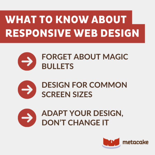
1. Forget About Magic Buttons
When many websites and themes claim they’re “responsive,” they likely are. Their page elements collapse and rearrange depending on the user’s device, and you don’t have to do work on your end to make it happen. Easy!
The problem, again, is that “responsive” doesn’t equal “well-designed for a great user experience.” There’s no magic button for that.
An effective responsive user experience requires an intentional strategy put into each screen size’s design. Looking okay on a phone or tablet doesn’t mean a website will function well for users, or that the new page element arrangement creates an intuitive customer journey.
You don’t want to leave the user’s experience up to chance, which means intentional design is key.
2. Design for Common Screen Sizes
To avoid losing potential customers to poor responsive web design, ecommerce stores need to design for multiple screen sizes. With so many variations out there, however, you likely can’t design for every scenario.
Instead, we suggest picking the top three most common sizes for your audience and customizing for those. For most stores, these breakpoints will be:
- Smartphone: 480px wide
- Tablet: 768px wide
- Desktop: 1024px wide
To get an idea of what screen sizes and devices to choose for your responsive design, look at your analytics and see which device types your audience already uses to view your site.
For each screen type, select design priorities based on what you know about your customers and how they likely navigate your site. For example, you might hide a slider on phone screens because it takes up too much space. Or you might change your navigation menu layout for tablets to make moving through your site easier.
3. Adapt Your Design, Don’t Change It
A responsive website isn’t the same as a mobile website or mobile app; it doesn’t fundamentally change the way a visitor uses the website.
Responsive web design is about adapting the existing experience, not changing it entirely. For ecommerce stores, this often means making the browsing and shopping experience seamless and easy, regardless of device.
If your mobile users are after a very specific experience — say, booking an appointment on the go — you might create a mobile-specific website or app instead.
To learn more about when designing a mobile website or app makes sense, check out our post, “Do You Really Need a Native App?”

Is Responsive Web Design Worth It for Ecommerce Businesses?
So, is responsive web design a good investment for your ecommerce business?
Absolutely.
As a society, we’re constantly becoming more and more tech-obsessed. With millions of smartphones sold daily and over 50% of web traffic now coming from mobile devices, your site must function seamlessly on mobile devices.
The first time someone sees your website, they may be using a phone or tablet. Even desktop screen sizes vary. Your visitor could be on a 13″ MacBook Air, a 6″ Google Pixel, or a 27″ monitor at work. Without great responsive web design, your ecommerce site will look bad and/or function poorly on at least one of those screens.
Every interaction with your website moves a person closer or farther away from becoming a customer. Make sure your site’s user experience removes friction and draws them in, no matter what device they’re using.

