Instantly Boost Your Online Revenue By 15%
Lenox Corp, a long standing luxury glassware company, came to us with a common dilemma. They built a successful business online with a website with plenty of traffic. However, only a small fraction of their site visitors were converting.
As we lifted the hood on Lenox’s site, we discovered that they shared the same key problems as most of our previous client’s with conversion torment.
We went to work.
With the help of the following three small user-interface tweaks, we were able to boost Lenox’s conversion by 24% and increase their overall revenue by 15% in less than 6 months.
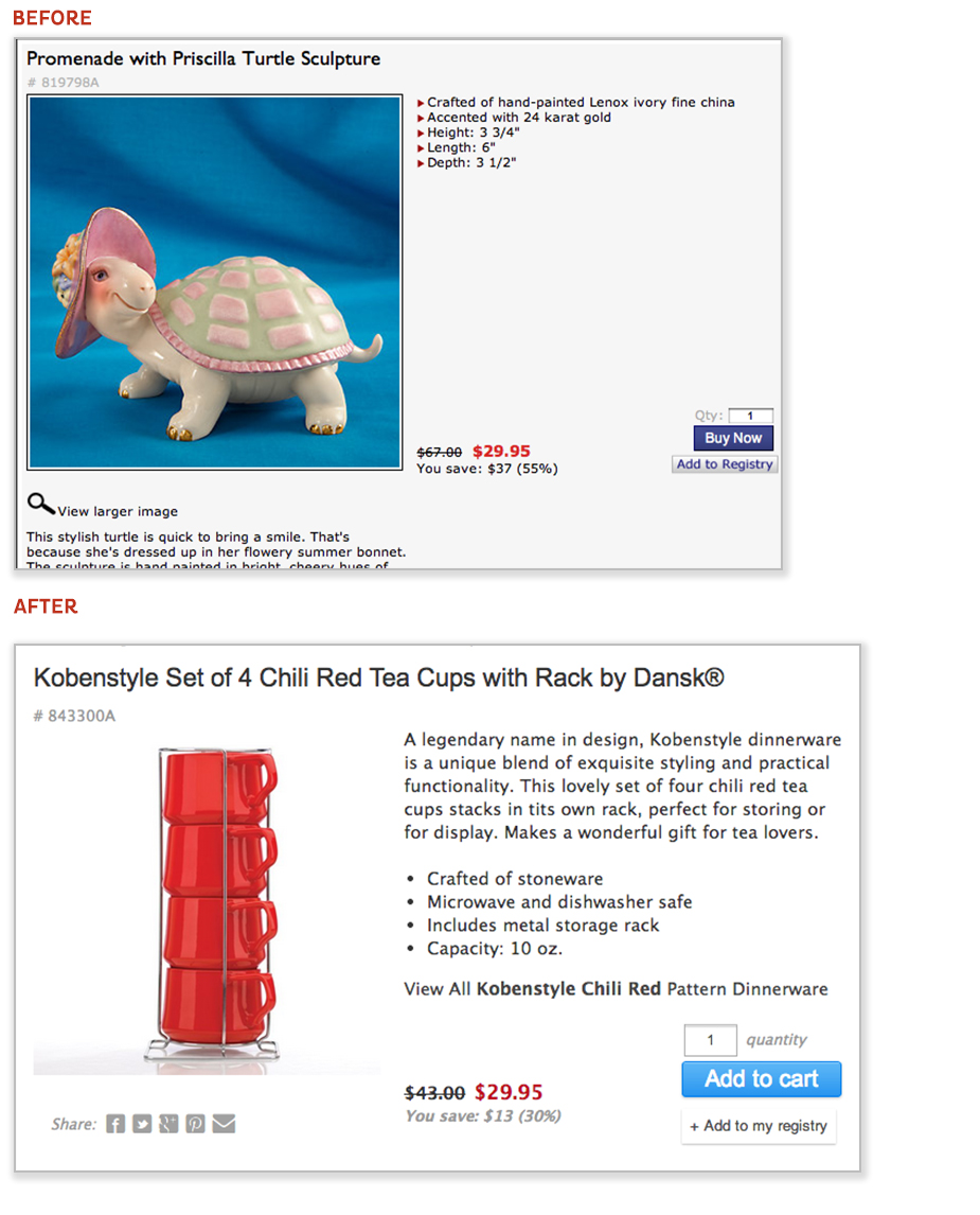
1. Simplify Design & Language.
We started by simply simplifying.
We evaluated the elements of each page in the check-out process and cut everything that wasn’t absolutely necessary to making a purchase.
This involved removing…
- Main menu bar for navigation
- Additional product upsells
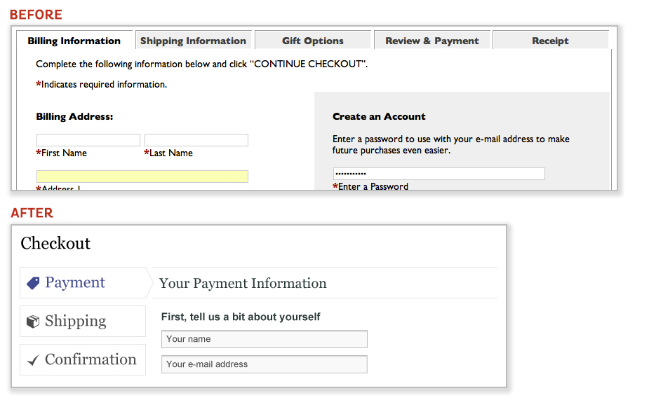
2. Shorten Purchasing Process.
The average online consumer’s patience for load times and data entry is less than 8 seconds. Understanding our tendencies towards impatience, we lowered user friction by cutting a 6-step-and-5-page check-out process to a perceived 3-step-and-1-page experience.
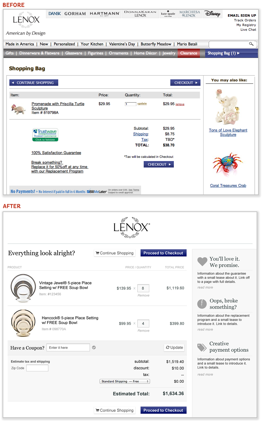
3. Focus on Action.
Once we’d removed all distraction and shortened all processes, it became all about visual priority – also known as, what grabs a visitors attention first. We needed to guide the user to what we wanted them to do next without them knowing it. We redesigned every page of the purchasing experience to point eyeballs to ONE call to action per page. This involved…
- Designing bright & unique colored Call-to-Action buttons
- Being specific in the CTA copy. We replaced generic “next step” copy with more actionable and specific copy informing the user what the next step was… ie: “proceed to payment details”
- Removing secondary calls to action. This included upsells, mailing list sign-ups, etc. We needed to make sure all checkout buttons were most prominent.
- Creating lightbox pop-ups for support links and FAQ’s to keep the customer on page and on the purchasing track.
The project was a raving success and it goes to show that sometimes being intelligent about the small things can have quite the collective impact on the whole project – even the financial ROI.
Now it’s your turn. As a consumer, what part of purchasing a product do you most hate? Or as a marketer, what are some conversion hacks that you’ve either seen success using or come across online?
Additional Resources We Love… Conversion Hacking via MindValley Insights. | 5 UX hacks that can immediately increase revenue via Conversion XL. | Landing Pages Demystified: 21 Conversion Hacks (With Examples) via Corey J Pemberton. | Case Studies in Conversion Hacking via Optimizely.