We spend a lot of time analyzing and designing consumer product detail pages.
You might think all product details are created equal, for the most part. A product image, basic details, the price and a buy now button and you’re set! Right?
Well, those may be the essential elements, but if that is all you have on your product pages, you are likely missing out on some easy sales.
Here are a few examples of product pages that we think got it right and what you can learn from them.
First, a few things they have in common:
1. Beautiful Product Photos
This is a must. Without great product imagery, you are doomed to failure, even if you do everything else well.
Don’t have quality photography? Check out this Power Product Photography. Just send your product off to them and they’ll take quality photos on a white background for you that you can use on your site.
2. Social Proof
First a disclaimer: if your product or service isn’t good, adding social proof can be dangerous. It can take down a company as easily as it can improve your sales performance. But assuming your reviews are good, adding social proof is a great aspect to include on your product pages. It’s the thing that will push customers on the edge over into the checkout funnel.
3. Looks Great on Mobile
All of these examples below not only look great and work well on a desktop, but also on mobile.
Here are a few that we think got it right.
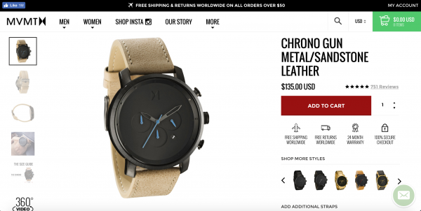
MVMT Watches
Elements We Like:
- Clear CTAs and catchy icons clearly communicate all key selling points.
- Comprehensive product photography shows the watches from all angles. As if that wasn’t enough, they also have a 360 product video.
- The available band options are displayed in a way that is apparent, but subtle so as not to distract from the main product image.
- The Instagram feed gives examples of the product in context.
- Customer reviews and questions answered leaves no room for confusion about product quality.
- The product details visualized explain feature clearly. This is probably our favorite feature. Here, instead of a long list of product specs, the site shows the details in context, pointing out where the feature is on the watch and how it works.
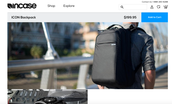
Incase
Elements We Like:
- Lifestyle photography is an upgrade from standard product images. Of course, you still need image of your product alone to show more details, but showing your product in context helps potential buyers to visualize themselves using it.
Twelve South
Elements We Like:
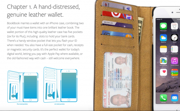
- Very deep product content provides all the information you could possibly need.
- We love the magazine type layout which makes the plethora of product content look interesting and worth the read
- Rather than just including customer reviews, Twelve South includes thought leader reviews.
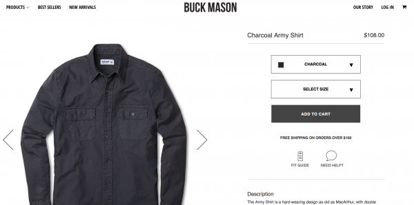
Buck Mason
Elements We Like:
- Meant to make shopping easy for men, they include a clear fit guide on their product detail pages along with height and weight information on the model so you can compare sizing.
- What we like about this product detail page is that Buck Mason’s product pages are not build around their product so much as an in-depth knowledge of their audience – guys that want to look good, but don’t know how. They even offer the option to order entire looks or outfits rather than individually pieces to facilitate the process.
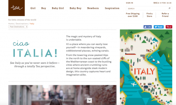
The Tea Collection
Elements We Like:
- The design may be a bit outdated, but these product detail pages not only show the products, but the inspiration behind their product design. Inspired by travel, they include full pages about the story behind each design. This is a huge opportunity that more ecommerce stores should follow.
Take learnings from these product pages and you should be on your way to excellent product pages of your own. The key is to have your customers in mind first and discern which of these components will resonate with them.

