Picture this: You’re about to launch a new advertising campaign, complete with captivating Facebook ads, a killer video, eye-catching Google ads, and clever email content. You’ve covered all your bases, right? Think again.
As a marketer, where you land your potential customers is half the battle for a conversion. In other words, you can have an amazing campaign set up, but if your ads and emails don’t lead to an effective landing page that continues that conversation, you are likely losing a ton of potential purchases.
Why use landing pages for ecommerce marketing?
When you’re running marketing— whether it’s an exciting promotion or just evergreen awareness campaigns— it’s important to create as personalized of a path as possible, from the ad and its messaging, to the page where users land, and on through the rest of their session. The more personalized the experience, the higher the conversion rate will be.
This is why we use landing pages. They allow us to create specific pages that are tailored to the targeted audience with the right message, making it as connected and familiar as possible to where the customer began. They should be so easy to spin up that any marketer can create one for any campaign they run. So why don’t all marketers direct their campaigns towards personalized landing pages? Well, the primary reason is ease of creating those landing pages. Second to that would be the understanding of how to construct those pages. In this article we will walk through the top 10 best practices that we use when creating marketing landing pages for ecommerce brands. We’ll also give you some ideas on how to make the process easier.
What about the home page?
Many people drive all traffic to the homepage, but the homepage is actually meant to be a catchall, routing many different types of people to the right place. In terms of a marketing campaign, this is the exact opposite of the personalized experience we are trying to create. If you captured a user with specific targeting and relevant messaging, a landing page will allow you to continue the same story for that particular user and keep them focused on the action they came in looking for.
What about product and category pages?
Product and category pages are great if you are advertising a specific product or line of products, but they still fall far short in emphasizing the exact message you are communicating in your marketing to certain visitors. Let’s say you are running a campaign targeted at a group of people that would find one particular feature or benefit of your product extremely useful in their particular life scenario. Well, a landing page will let you emphasize and dig into that specific benefit while still showing all the product details and buying options. However, the generic product page will simply not be able to do that and therefore you will likely have a higher dropoff rate.
How many landing pages do I need?
This really depends on your team’s capacity and how specific you want to get. A good goal would be to have several landing pages on hand that target your top audiences respectively, showcasing the different types of products and solutions that are relevant to each.
It’s also worth noting that these well-structured landing pages can contribute to a successful SEO strategy too. When done well, some of these landing pages can serve as your core content (or hubpages) for the primary categories of audiences or products of your business.
10 Best Practices You Can’t Afford to Miss
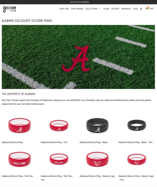
Now that we’ve discussed the purpose of a landing page, let’s dive into 10 best practices that are key to driving high-converting landing pages. We’ve even provided a few visual examples from one of our clients, Groove Life silicone rings.
1. Branding
Put your brand front and center on every page you create, especially for cold traffic. Make sure your landing page passes the “five second rule”: Potential customers need to know who you are, what you do, and why you’re different in five seconds.
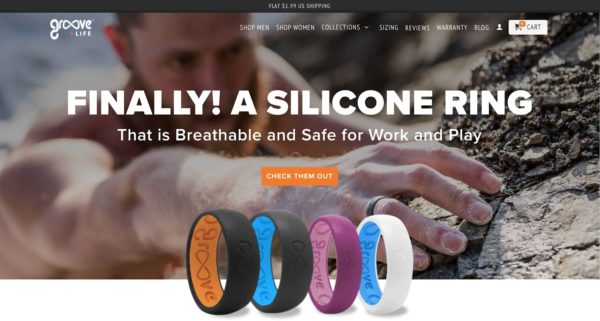
2. Consistent Visuals
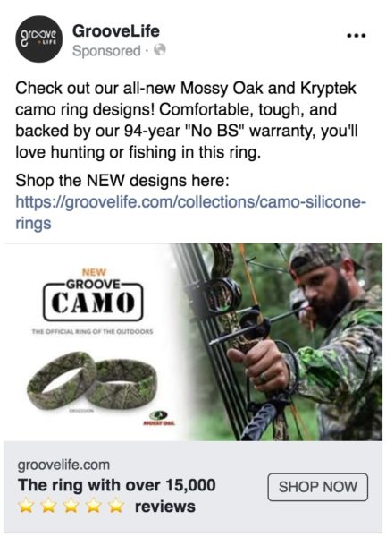
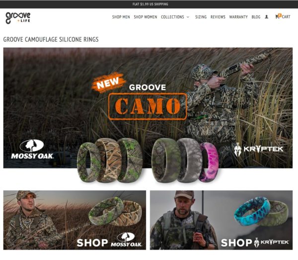
Keep a consistent look between your ads and the landing page. Be sure the look and feel of the ads carry over to the landing page, especially in the imagery used and products promoted.
3. Connecting Copy
When writing headlines and supporting text, make sure visitors know they’re at the right place. Tailor your messaging to reiterate what they read in your ads. If your ad or email focuses on particular products or certain features and benefits, that should be represented on the landing page.
4. Consistent Offer
If your ad contains a special offer for the customer, this should be clearly displayed on the landing page.
5. Product Listing
Make it easy for site visitors to purchase quickly by listing all products relevant to their particular audience. Focus just on the collection or products your ad promoted or that this target audience will find useful.
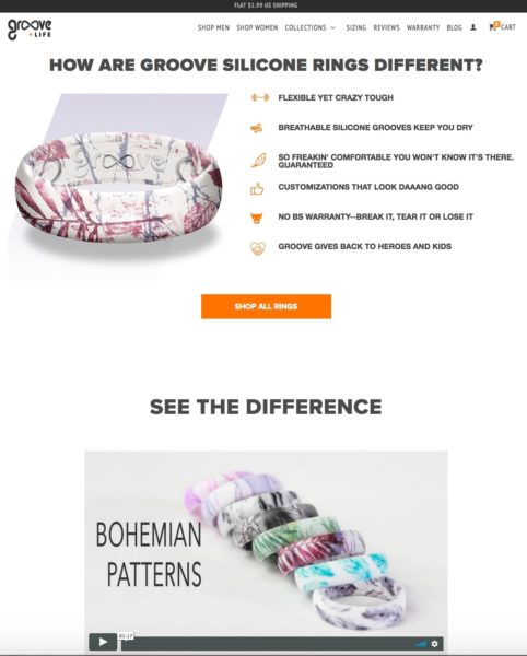
6. Features and Benefits
Even after seeing your product or a special offer, some customers may want to learn more about why this product is awesome and why it’s important to them. So below your product listings, outline important features and benefits for those who might not be quite ready to purchase. Take the time to list why it’ll make their life better!
7. Multiple Calls to Action
In addition to the products listed, include more hooks for people to click on at any point on their journey down the landing page. These pages can get long, so something as simple as “shop now” buttons throughout will be more convenient than scrolling back to the top.
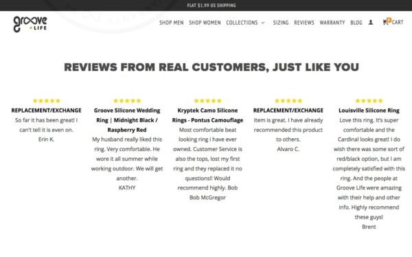
8. Social Proof
Ready for one of the biggest factors in converting a user? Amazing, transparent social proof. We’ve talked in depth about the extreme value of social proof in other articles. On a landing page, this can be in the form of a handful of your best reviews or testimonials. If you can, pick specific ones that resonate best with the audience your landing page is targeting.
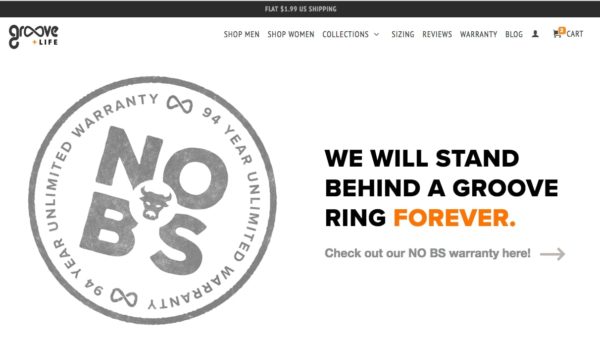
9. Risk Reversal
We often talk about creating an irresistible offer and a huge part of that is reversing risk. The best way to do that is with a genuine, no-risk guarantee. See below for an example of a bold, effective warranty.
10. Other Products or Categories
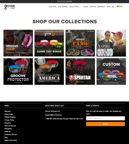
Depending on your product line this may not be relevant, but it’s important to give the user a way to access the rest of the site at the bottom of the page. This way, if visitors decide this product isn’t right for them, you can still direct them to other areas of your brand they might be interested in.
How should a landing page be structured?
There are several tools out there that make building landing pages easier. Our favorites are Leadpages, Zipify, Shogun, Instapage, Unbounce and more. Whichever you choose, at a minimum, the basic page structure should include the following:
Hero image: Carry imagery used in your ads and emails over to the landing page so users know they’re in the right place. A bold, beautiful hero image answers the questions “Who are you?” and “What do you do?”
Informative copy: Include one or two small paragraphs that reflects or reiterates the messaging from your ads. This should answer the question “Why are you different?”
Products: List specific products that are relevant to your audience. This answers the question “What are you offering?”
Features and benefits: Some customers won’t be convinced right away, so add more info below the products. This will help customers who scan your products and still ask, “Why should I care?”
Bonus tip: In Shopify Plus (or any ecommerce platform), we usually use a collection page (or category page on other platforms) as the basis for a landing page. This really helps with categorization.
Driving your site visitors to the homepage may seem acceptable, but your best bet for conversions is to create a landing page that tells the same story as your ad or email campaign. Follow these guidelines and you’ll be on your way to creating a truly personalized experience for your users!
