In the ecommerce world, we spend most of our time optimizing product and checkout pages. After all, that’s where the sale happens, right?
Although technically correct, this hyperfocus on the product page often leads to neglecting the rest of the customer journey, including all the steps that lead up to the purchase decision. Prior to landing on a product page, many of your customers will find themselves on non-product pages, and research shows that the majority of a browser’s buying decision is made there. The product page is just the last step to close the sale.
How do you maximize customer time spent on non-product ecommerce pages on your website and optimize them to boost your conversion rates?
What Are Non-Product Pages?
Non-product pages are anything that isn’t a product page. It’s important to note that there are certain pages that are most important when it comes to non-product pages. Pages like the About Us page, the Customer Service page, FAQs, and more are areas of huge opportunity that you can’t afford to neglect.
Why Is It Important to Optimize Non-Product Pages?
These non-product pages play an important role in selling your brand story and building an emotional connection with the user. But they only do this if they’re built intentionally and optimized correctly.
We find that most brands we work with have a significantly higher conversion rate on customer paths that lead users through an “About Us” page, FAQs, etc. before heading to the product page. And that makes sense — most visitors need proper context, peace of mind about warranties or returns, and an emotional connection in order to click “add to cart.”
In this post, we’ll identify the core non-product pages of a successful ecommerce website, explain what role each page plays, and how to optimize them for increased conversions.
What Do You Need to Consider Before Optimizing Pages?
Before you begin optimizing any page, there are a few things you need to consider in order to make the most of your efforts and not waste valuable time.
Is Your Data Accurate?
We can’t overstate the importance of good data. In fact, running your company based on data is a key to success.
Unless your data’s being properly tracked with analytics, you have no way of knowing what’s working and what isn’t. Once you have accurate, clean data to work with, you can watch the paths users take through your site and be more intentional about guiding users where you want them to go.
How Are You Going to Optimize?
Next, you’ll want to have a plan in place for how you’ll optimize, test, and then optimize some more. Here are a few things to keep in mind.
A/B Testing
Even though non-product pages aren’t directly doing the selling, testing them still fits with a conversion rate optimization (CRO) strategy. Check out our guide to increasing purchase conversions or learn all about A/B testing in our book “Oh, the Ways You’ll Grow.”
Use the Right Tools
Dialing in your strategy is one thing. You’ll also need to make sure you have the right tools and platforms to implement your tests and measure the results. We recommend user experience testing tools like Optimizely or VWO.
Marketing Campaigns
Another way to test and optimize is to run content-based ads on Facebook or Instagram that lead to a non-product page. For example, the ad may share a part of your product’s story, send the user to your About page to learn more, and then the call to action on the About page leads to your product page.
Additional Pro Tip
If you’re running paid advertising on Facebook and Instagram, consider testing retargeting ads off these non-product pages. Oftentimes, brands will run “site retargeting” for all site visitors, those who’ve visited product pages, or visitors who added to cart but didn’t purchase.
If you have enough traffic going to your non-product pages, you can get more specific with your site retargeting. Create custom audiences for those who’ve viewed these pages and serve ads relevant to the content they were just reviewing on those relationship-building pages.
What Are You Trying to Optimize For?
We all know that you’re ultimately trying to increase purchases, but when figuring out how to optimize non-product pages on your ecommerce website, you need to think about actions taken earlier in the customer journey. Each step in your funnel has a different primary goal, eventually leading to the sale. When optimizing each page, you need to determine what purpose this page serves in your funnel and how to measure it.
We’ve discussed the value of your category listing pages (or collection pages) before. When optimizing that page, you’re looking for CTR, not purchases, to determine if that page is doing its job. For non-product pages, you’ll likely want to optimize around events like clicks, time on page, low bounce rate, and add to carts.
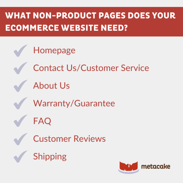
What Non-Product Pages Does Your Ecommerce Website Need, and How Do You Optimize Them?
Here are the most important non-product pages:
- Homepage
- Contact Us or Customer Service
- About Us
- Warranty or Guarantee
- FAQ
- Customer Reviews
- Shipping
Let’s dive into the details of each of these pages below.
7 Non-Product Ecommerce Website Pages and How to Optimize Them
1. Homepage
The purpose of the homepage is to introduce site visitors to who you are, what you do, and why they should care — all within five seconds. After that, the page’s primary job is to route users where they need to go.
As the homepage routes your visitors, the page’s content should have a balance of selling and storytelling. Showcase your product, create urgency, and provide plenty of CTA buttons to click on. You should also weave in elements of your story and purpose to start building an emotional connection right away.
When you’re optimizing the homepage, the primary metric to focus on is a low bounce rate. The homepage should be “sticky” enough and have enough CTAs to effectively route customers to a product page or one of the other non-product pages we’ll cover below.
For more info, check out our post on how to optimize ecommerce website homepages. We’ll walk you through each element of an ideal homepage, including a free template to use as a guide.
Examples
Pura Vida’s homepage covers all the elements that we discuss in our ecommerce homepage best practices template, featuring a good blend of product selling, story selling, customer reviews, category routing, etc. This section is a great example of directing users to the categories they’d be interested in.
Groove Life also has a very intentionally designed homepage. We particularly like the section “Why Groove Life” and their warranty. These are what make the brand unique from its competitors, so they’re front and center on the homepage.
2. “Contact Us” or Customer Service Page
The purpose of this page is to quickly get customers to the help they need. Ideally, the page will help users solve problems themselves first and provide an option to speak to your team if necessary.
Most ecommerce brands don’t consider how to optimize this page on their website, but it’s critical to scaling your business. When it comes to creating raving brand fans, customer service is your front line.
If all you have is a contact email and phone number, you’ll get bombarded with questions; if all you provide is self-serve help, people will get frustrated. We find a combination of the two (self-serve followed by contact info) is your best bet for happy customers and a manageable customer service workload.
For optimizing this page, take a look at the click-through rate (CTR). Make it a rule to never have a dead end on your site, including this page. Always have a next step with an opportunity for more — a contact form, an email signup, or a button to get back to your products.
Another way to track whether your customer service page is doing its job is by monitoring customer service activity. Are you seeing fewer inquiries in your customer service inbox? Are there fewer people asking easy-to-self-solve questions on your site chat? A strong customer service page should help manage this kind of communication.
Check out our post on customer service strategies to grow your ecommerce business for more info.
Example
Groove Life truly is the GOAT when it comes to the Contact Us/Customer Service page. They have a simple grid with a box for every customer service need someone could have. Each box has a CTA that routes the customer to where they need to go. It’s easy to navigate and very effective.
3. About Us Page
Ecommerce stores often undervalue the “About” page or one that’s labeled “Our Story” or “Our Mission.” More often than not, this isn’t out of laziness — it just feels like there are other pages to focus on. However, the reality is that this type of page is a foundational piece of the story-selling process (which ultimately sells more products).
The purpose of this page is to sell someone on the “why” behind your brand. The About page isn’t just for a quick synopsis of how long you’ve been in business and who your founder is. That information doesn’t contribute to the customer’s buying experience at all.
Use this corner of your site to get deeper, explaining why your brand and product exist, what your values are, and what sets you apart from your competition. If you can sell your story here and appeal to your visitor’s emotions, you’ll be much more likely to win a purchase when the visitor gets to the product page.
When optimizing these pages, there are a few metrics to consider. One is the time spent on the page. Are customers sticking around for a bit to read, or are they bouncing away? The second is the overall conversion rate for the paths that include a visit to this page. If traffic is going here and there are CTAs present to take them to product pages next, the conversion rate should be higher after visitors see this page.
Examples
Albion Fit isn’t a giveback-centered brand, and its About Us page is simple. But we appreciate that they still made this page relatable, and it has an emotional component to it. It’s concise but still gives a good feel for who they are.
ROOLEE has a very personal feel to its About Us page. It’s professional and easy to follow, but they also have a way of making you feel like they’re your soon-to-be best friends.
4. Warranty or Guarantee Page
Beyond outlining the warranty or guarantee for your products, the deeper purpose of this page is to eliminate any sense of risk for the customer. This is a huge part of increasing your conversion rate and should be built into your business model.
Instead of just stating the policy, elaborate on it and give examples. Make it feel engaging so visitors can interact with it, believe it, and trust it. They should leave this page feeling more confident about purchasing than when they arrived.
When optimizing this page, here are a few metrics to consider:
- Time on page: Similar to the About page, this is one that you want customers to take the time to read and interact with.
- Overall conversion rate: Customer paths, including this page, should have a higher conversion rate since the information on this page is supposed to “de-risk” the sale for the customer.
- Form submissions: This is relevant if you have a warranty that requires a registration or other request.
Don’t have a warranty or guarantee? Let’s fix that as a first step! A good guarantee requires strong margins and can be built into your business model. Read more about the importance of margins here.
Examples
REI has a famously great return policy. It’s outlined here, and there are boxes to easily get in touch with customer service at the bottom of the page.
Groove Life’s return policy is as good as it gets. And to show it off, they have a great page to outline how it works.
5. Frequently Asked Questions (FAQ) Page
The purpose of this page is to satisfy your customers’ logical side. You’ll find that different customers ask the same questions over and over — in social media comments, emails, and customer service phone calls. Create a system for recording those questions and add the most repeated ones to your FAQ page.
This doesn’t mean you need 100 questions on your page. Many inquiries are variations of the same question, so try to boil it down to 10–15 top questions.
Having the answers to popular questions ready for curious site visitors will improve your site’s conversion rate, and it’s also a great search engine tactic.
As you’re considering how to optimize this page on your ecommerce website, consider the data on time spent on the page. Users should be there if the questions are relevant and the answers are helpful. Similar to other pages, you can also look at the ecommerce conversion rate when this page is visited.
Example
Albion Fit’s FAQ page is very simple and easy to navigate, with streamlined categories and a search option.
6. Reviews Page
Social proof is an important factor in building trust with your customers and increasing conversions. Customer reviews are the most common form of social proof. Most often, these are featured on the product pages, and some may be included on the homepage.
You can also have a page specifically for customer reviews so site visitors can take a look before exploring the product pages. Presenting all these reviews early in the customer journey is a great method for winning your site visitors over.
When determining how to optimize this website page, focus on metrics like time spent on page and the ecommerce conversion rate.
For more tips on social proof and why it’s so important for your ecommerce conversions, check out this post.
Example
Groove Life has a page dedicated to customer reviews so site visitors can get a feel for what people are saying before visiting the product pages.
7. Shipping Page
In the ecommerce world, shipping is a necessary evil that’s a big factor in making or breaking your customer’s experience. The purpose of a page dedicated to shipping is to inform the customer of shipping rates and times and to set their expectations upfront.
Amazon and other delivery services have conditioned online shoppers to expect shipping to be quick and free. That’s not always possible with smaller (or even normal-sized) ecommerce companies, so it’s best to manage customer expectations upfront. Make this page simple for your team to update throughout the year.
For optimizing this page, consider how the time spent on the page and conversion rate (when this page is in the customer path) look in the data; pay attention to both the website’s ecommerce conversion rate and the conversion rate at the checkout step.
Example
YETI does a great job of outlining a detailed shipping page, including adjustments they make for holidays.
How to Use Non-Product Pages to Optimize Your Ecommerce Website: Final Thoughts
Next time you’re tempted to put off non-product page updates, remember this: Most people who end up buying from you are “sold” before they ever hit “add to cart.” As an ecommerce business, it makes sense to spend time learning how to optimize the steps leading to your product page on your website. When it comes to conversions, a compelling story or strong customer service will have much more payoff than the color of your add-to-cart button or where the product description sits.
The most important thing is to start somewhere. Get started testing these pages along your customer journey, and if you need help with that, reach out to us. Our team is equipped and ready to show you how to optimize and give your ecommerce website the boost it needs.