The About Us page is a pretty standard page for ecommerce stores, but how often do brands really take the time to make it an effective part of the customer journey?
More often than not, this page is just a box to check off. Someone will write a brief explanation of why they’re in business or who their owner is and call it done. Don’t be one of those ecommerce stores!
There’s a massive opportunity to make this page a helpful and effective part of the customer experience. In this post, we’ll outline the ideal structure of an About Us page for ecommerce websites that tells your story, builds trust, and creates brand fans.
Goal of the About Us Page
We often talk about the importance of selling your brand, not just your product. You want to gain true, loyal customers, not just one-time buyers.
These days, when there are so many places to buy any given product, your brand is the one thing that sets you apart. Take advantage of any area of your site that could help tell that story, including the About Us page.
With that in mind, the goal of the About Us page is to establish an emotional connection with the customer, which makes them much more likely to purchase and become a fan. By explaining your “why” and demonstrating your expertise, you can then earn the customers’ trust.

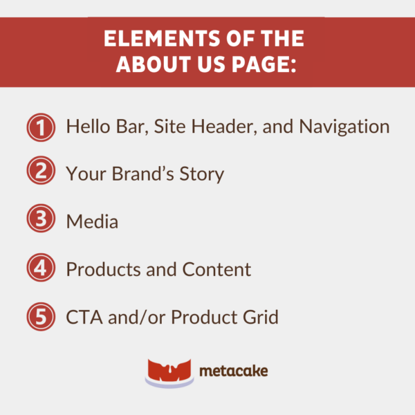
Elements of the About Us Page
What elements should be included on the perfect About Us page? Let’s walk through them below.

Hello Bar, Site Header, and Navigation
These elements should be present on every page throughout the site.
The hello bar is a banner situated at the top of your website. It serves several purposes:
- Announcements: Makes important announcements, like free shipping or special promotions.
- Lead Generation: Captures leads by embedding forms and promoting lead magnets.
- Direct Traffic: Guides visitors to specific pages, like new products or sales.
- Encourage Action: Provides discount codes or other incentives to encourage sales.
The site header is a visual element at the top of your website — often on all pages. Let’s look at some of its functions:
- Branding: Displays your logo and brand colors to make your site recognizable.
- Navigation: Often includes the main navigation menu to help users find their way around your site.
- First Impressions: Sets the tone for your site and provides key information about your brand.
Navigation is, well, navigation. It’s the set of user interface elements that helps visitors explore your site. Let’s take a peek at what’s included:
- Menus: A set of links to internal pages, usually found in the header or sidebar.
- Search Bars: Allows users to quickly find the specific content they’re looking for.
- Buttons and Links: Helps users move between pages and understand the relationship between different sections.
Each of these elements plays a critical role in enhancing user experience and driving conversions on your website.
Your Brand’s Story
Ecommerce customers tend to have trust issues — and rightfully so. Think about it: Long gone are the days of walking into a brick-and-mortar store and seeing the products — and sometimes business owners — in person. Yes, we’ll shop in-store for some products, but online shopping is on the rise.
According to research, ecommerce sales will cross the six trillion dollar mark this year. If you want your ecommerce business to have a piece of the pie, you need to build trust with your potential customers.
Part of trust building is letting the customers get to know you. And what better way to show them who you — and your brand — are than by telling them your story?
This isn’t just a random story; it should be more in-depth than what year you started this company and where you’re located. The goal here is to show how and why you offer the products you do. In doing so, you should be demonstrating what makes you unique and why you’re the best option out there.
Keep this content in line with your brand voice. That might mean taking on an inspirational tone, being funny, getting deep, or something else entirely. No one knows you and your brand as well as you do — make sure this content reflects that!
Media
Use different forms of media to make your About Us page visually appealing:
- Photos: Show behind-the-scenes shots, your workspace, or team gatherings.
- Timelines: Visualize your journey — when you started, key milestones, etc.
- Videos: Engage visitors with an explainer video.
- Infographics: Summarize important information in a creative way.
Adding these types of media not only breaks up the content but, more importantly, helps the customers connect on an emotional level. So, go ahead and enrich your visitors’ user experience!
Products and Content
Sell Products Throughout
You can “sell” products throughout the content by linking to products wherever they’re mentioned. This is a subtle but effective way to give customers direction on where to go next.
Sell Content Throughout
If your ecommerce store has a blog (which it should!), use the content on the About Us page to link to relevant posts or areas where you elaborate more on certain subjects.
CTA and/or Product Grid
Include a CTA button to direct customers back to the purchase experience. This could link to a Shop All page, Best Sellers, or other collection.
You could also include a product grid, which usually involves designing clickable square images pointing back to a few top products or collections.
Measuring the Performance of the About Us Page
There are a few ways to creatively track how the About Us page contributes to the customer journey and the conversions on your store.
One is to monitor the click-through rate for products, either from hyperlinks in the content or from the product grid. Another is to look at the conversion rate for your store with and without the About Us page in the customer path.
Additionally, tracking the time spent on the page can provide insights into how engaging and informative it is for visitors.
Ready to Tell Your Story and Build Fans?
Now that you’re armed with the elements needed for a perfect About Us page, it’s time to take your store’s About Us page from generic to fan-worthy.
It’s not about writing a novel (although being heartfelt on this page is encouraged). The idea is to strategically use your unique story to build an emotional connection with the customer and move them to action.
And speaking of action, we hope this post has motivated you to take action in building an About Us page for your ecommerce website that tells your story, builds trust, and creates brand fans. If you need extra support, we’re always here. Reach out today and see what our team can do for you!
