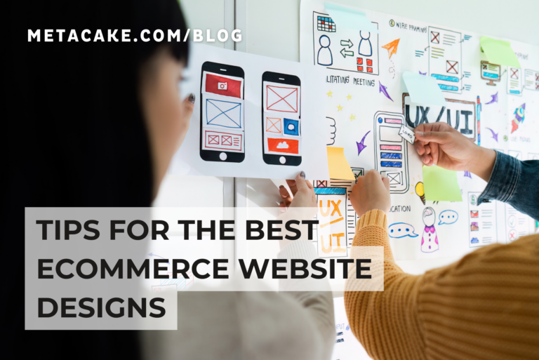
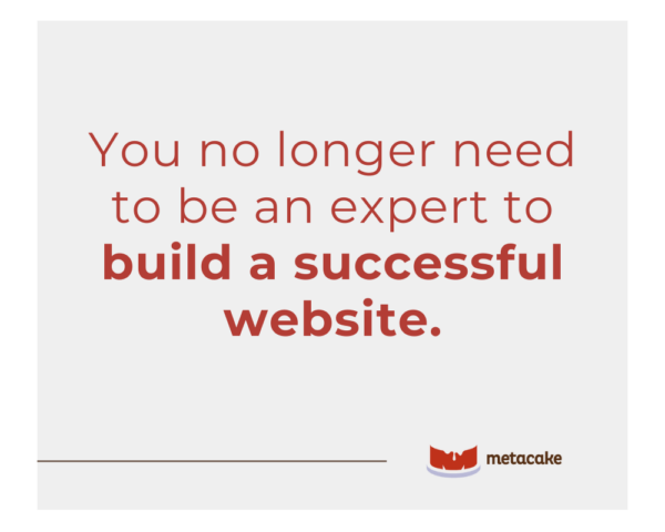
Creating websites used to be exceedingly complex, requiring code and usually someone with a degree. However, with the number of ecommerce platforms available, you no longer need to be an expert to build a successful website.
You do, however, need to know the basics of what good web design is. Or, better yet, what great web design is.
Great design is vitally important for ecommerce sites. In fact, it’s often the single difference between winning and losing ecommerce business.
What are the elements of a great ecommerce website design?
We’re glad you asked! In this article, we’ll share our thoughts on the best ecommerce website designs. We’ll also show you some examples of sites that got it right and where we think they need improvement.
Elements of the Best Ecommerce Website Designs
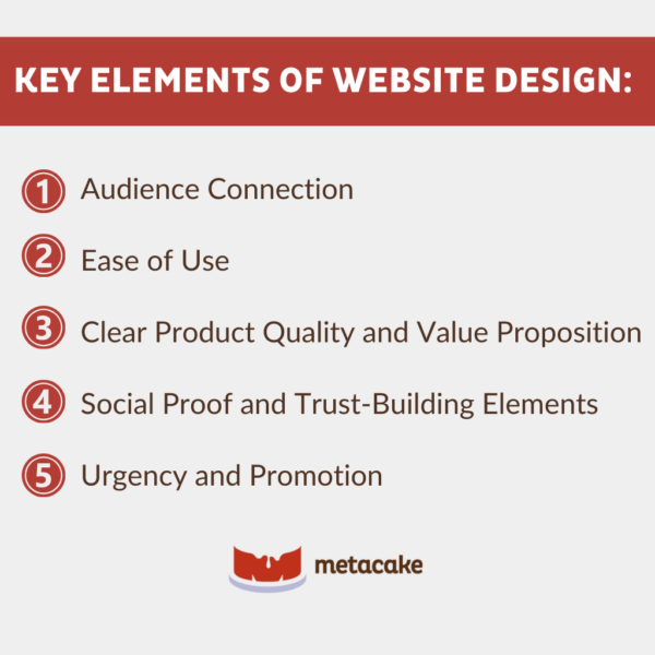
When evaluating websites, we typically look at the following key elements:
1) Audience Connection
The designs must include a clear brand message that creates an emotional connection with the site’s target audience.
The execution of this in design will vary greatly from site to site because not everyone’s audience is the same, and various audiences shop differently. Consider the contrast between how you would construct brand messaging for a millennial audience versus an older demographic.
2) Ease of Use
The site design should provide a unique and easy user experience. The goal is to remove as much friction as possible from the ecommerce shopping experience.
This component is multi-faceted. It applies both to having a high-quality implementation so that the site looks great across all browsers and devices and to reducing the pain of shopping online. This includes optimizing your site to fix slow loading speeds.
There are certain difficulties or barriers to shopping online because you can’t touch, test, or try products, so we look for designs that lower this barrier to entry.
3) Clear Product Quality and Value Proposition
The design implementation needs to clearly demonstrate the product quality and value proposition. It can’t be just another T-shirt you could buy on any other ecommerce site.
This doesn’t mean that the product has to be different, but the representation does. The site design and product representation can and should add value to the product itself and the shopping experience.
4) Social Proof and Trust-Building Elements
Designs should incorporate trust-building elements in order to make visitors feel comfortable shopping on the site.
This includes social proof, so that visitors can hear from their shopping peers and have an idea of things like no-risk purchases with money-back guarantees, free trials, etc.
5) Urgency and Promotion
Great ecommerce designs convey a sense of urgency to encourage visitors to make an immediate purchasing decision, whether that be yes or no. Usually, this takes place in the form of some type of promotion.
Most visitors who walk away from your site without making a purchase decision won’t come back again to check out your product, so it’s best if you can entice them to make a decision through limited-time offers or promotions. This is why flash sales typically work so well.
Design Wins and Room for Improvement
Let’s take a look at six sites we think got it right and where we think they need improvement.
Nisolo:
Nisolo is an ethically produced apparel brand focused on high-quality leather goods like shoes and accessories.
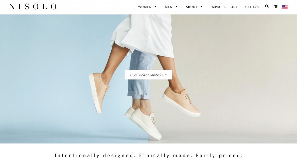
Design Wins:
Audience Connection: What we love about the Nisolo site design is their short brand video. It quickly demonstrates the quality of the shoes and attaches you to their brand. It immediately creates an emotional connection, almost bringing you to the point of tears.
Ease of Use: Their clean design makes shopping a breeze.
Room for Improvement:
Social Proof: The Nisolo site lacks social proof. Their product is very high quality, but it’s quite expensive, so adding social proof could help push customers over the edge in their purchase decisions. We see this as low-hanging fruit.
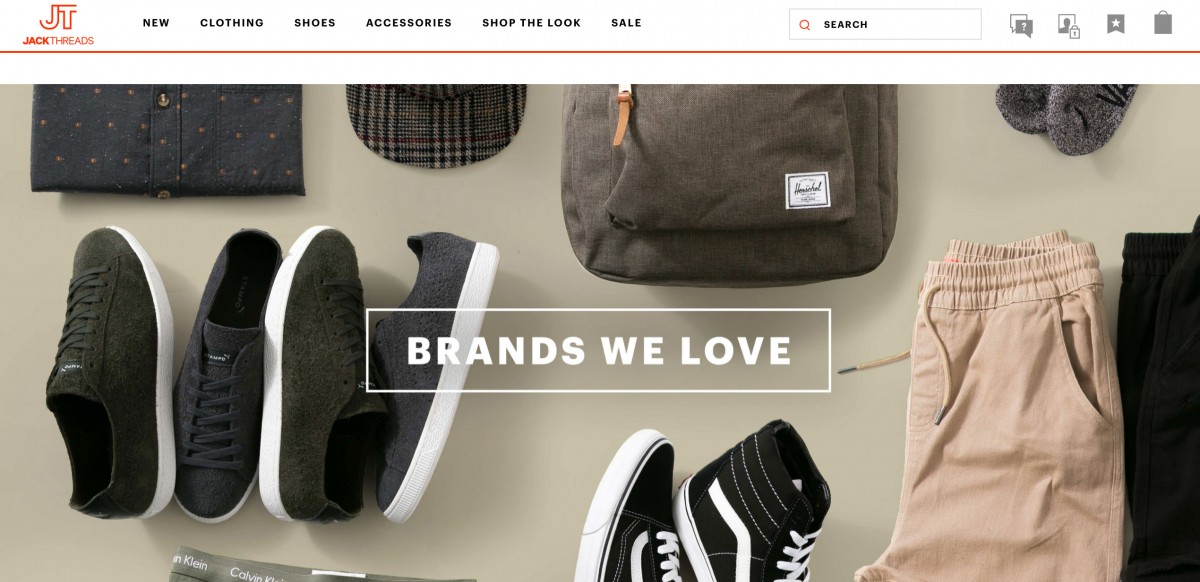
JackThreads:
JackThreads is a more edgy millennial apparel brand for men.
Design Wins:
Audience Connection: JackThreads has incredibly strong brand content, not just on their site but even through direct mail. They provide lookbooks with lifestyle tips. It has high-quality content and doesn’t even include prices. It’s simply brand-building content for their customers to enjoy.
Ease of Use: They have complex filtering that’s well designed and allows users to narrow down their product choices quickly to find exactly what they’re looking for.
Clear Product Quality: JackThreads places all its apparel in the context of an entire outfit. They properly display their products, allowing customers to quickly see how they’ll appear wearing a product and how to combine it with other clothing. This simplifies the shopping process for visitors and helps them make a purchase decision.
Room for Improvement:
Ease of Use: The homepage on the desktop version of the site is pretty overwhelming. With promotions visible left and right and heavy use of images, it’s hard to take it all in at once or know where to look, likely causing some users to bounce right away. Simplifying the homepage with a single leading offer and an overall cleaner design is a possibility for improvement.
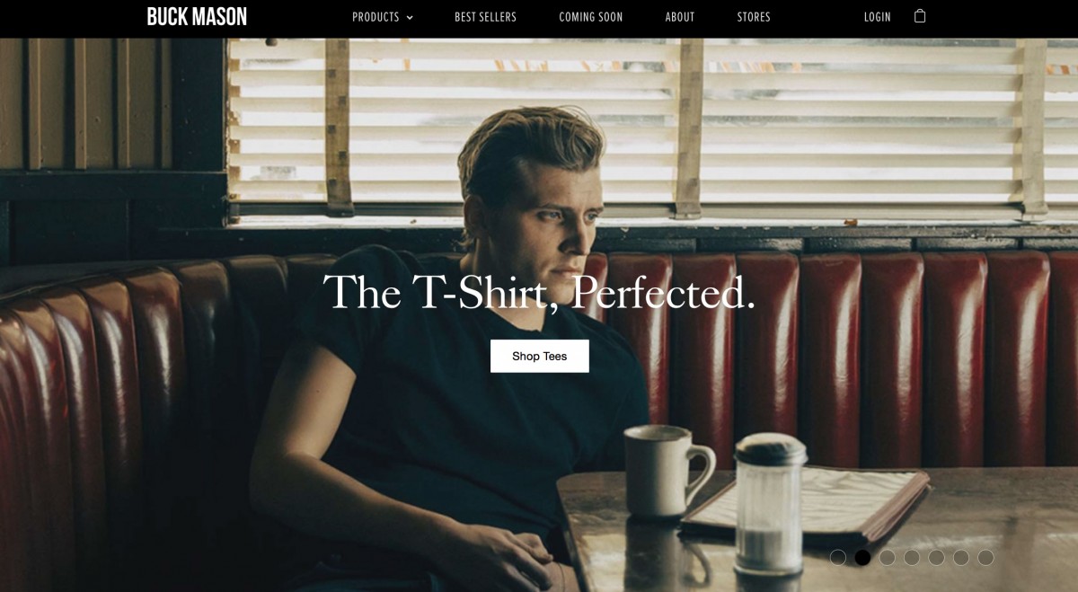
Buck Mason:
Buck Mason is a men’s apparel brand that focuses on doing the basics right.
Design Wins:
Clear Product Quality: They offer high-quality, made-in-America products for an all-American look. By offering just the basics and showing them in context with other items, it makes shopping easy for men. Basically, everything on their site goes with everything else, so you can’t go wrong.
Ease of Use: Buck Mason also allows you to easily buy an entire look, rather than having to go through and select all of the individual products. It puts the outfits together for you, lowering the barrier to entry for men shopping for clothes online.
Room for Improvement:
Urgency: There is no sense of urgency when shopping on this site, leaving users with the sense that the offer will always be there. By adding some offers or promotions for site visitors, as well as a quality guarantee or explanation of easy returns, they would likely capture more first-time visitors.
Value Proposition: Buck Mason doesn’t clearly communicate their value on their site. If you don’t already know the brand and how to shop on their site, it’s not entirely intuitive. They could do a better job explaining their value proposition up front for new visitors to their ecommerce site. For example, on their homepage, they should display popular products and explain how the process works.
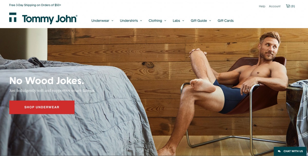
Tommy John:
Tommy John is an underwear and loungewear site that offers a new and revolutionary product.
Design Wins:
Clear Product Quality and Value Proposition: Tommy John tackles the age-old issue of comfort in men’s underwear. The product is expensive, but they clearly communicate the product’s value through product detail spotlight videos on product pages and well-written descriptions of the different fabric options.
Social Proof and Trust-Building Elements: Tommy John does a good job using social proof in the form of reviews on product pages and testimonials on the homepage. In addition, they offer a guarantee that it’s the best pair of underwear you’ll ever wear or it’s free.
Room for Improvement:
Clear Product Quality: While the site sells well, there are complaints that its product quality doesn’t live up to its claims. With the guarantee, customers can get their money back, but they also need to respond to customer claims and improve their product in order to continue selling well and increase their repeat purchase rate.
Urgency: While the site contains some promotions for first-time buyers, the promotions don’t encourage the visitor to make a decision on their product quickly.
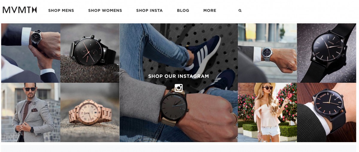
MVMT:
MVMT is a well-known watch brand made famous for building its brand through ridiculously targeted Facebook ads.
Design Wins:
Social Proof and Trust-Building Elements: MVMT not only does a great job using social proof throughout their website, but they take it a step further and allow you to shop through their Instagram, so you can see the watches in context with comments from other users and make the purchase right there. They also include several trust-building elements like free returns and a long warranty on their product pages.
Ease of Use: MVMT has a clean design that clearly displays all the information that you’d need in order to make a decision quickly and easily about their products, including great product imagery with all variations and an easy-to-use sizing guide.
Room for Improvement:
Ease of Use: Similar to JackThreads, the homepage is a bit overwhelming with heavy imagery. The idea is for these large homepage blocks to be used as navigation, but it’s difficult to take it all in at once and decide where to explore first as a user.
The North Face:
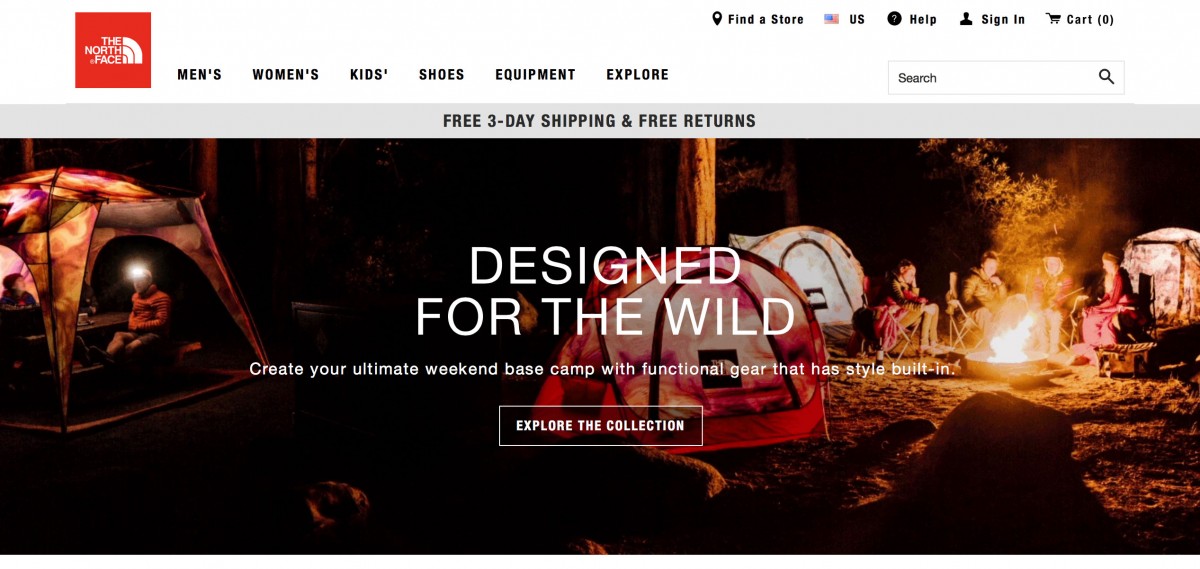
Design Wins:
Ease of Use: We included The North Face in the list due to their awesome crowd-sourced sizing mechanism available on their product detail pages. With this feature, you can enter your own measurements and see what size people of your measurements bought by percentage. This is very useful and lowers the barrier to entry to purchasing online without being able to try on the product.
Room for Improvement:
Social Proof: While The North Face includes social reviews on their product detail pages, they’re buried at the bottom of the page and easily missed. Bringing these both up higher on the product detail page and including some social proof and trust-building elements higher up in the funnel would improve their design.
Final Thoughts on the Best Ecommerce Website Designs
Now that you know you don’t need to be a coding genius to create the best ecommerce website design, are you ready to begin building?
If the task still seems too monumental, we’d love to lend a helping hand. Reach out to our award-winning team today!