Not every ecommerce customer follows the same path on their journey to a sale. It’s not as simple as “in through the homepage, out through checkout.”
Ecommerce stores are complex and challenging. So how do you make your ecommerce customer’s journey as clear as possible?
First, let’s take a step back and compare the journeys of offline and online customers.
Land of 1,000 Doors
In a traditional offline retail setting, there’s one front door. All customers walk through the same entrance to get into the store.
An online store could have thousands of ways to get in. Most customers arrive through the home page — typically more than half. But they could arrive through a landing page, a blog, a product page, or some other place buried deep on the web.
Every page of your website is a door to your store.
The challenge is to provide a consistent experience, regardless of which door they use, and make it easy for your customers to find what they’re looking for, whether they’re lasers or browsers.

Provide a Clear Blueprint
Having a solid information architecture will help your customers find what they’re looking for.
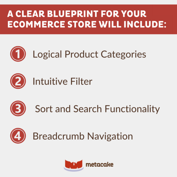
Logical product categories, intuitive filter, sort and search functionality, and breadcrumb navigation — little things like these make it easy for users to figure out where they are and where they need to go.
Visual consistency throughout the site is critical so users get to know who you are and what you do.
Very often, we come into situations where marketing departments aren’t able to create and manage landing pages within their existing website, so they use apps like Leadpages and Unbounce to create pages.
Third-party apps like these are great and can be helpful, but not if it means branding and site design get tossed out the window. No matter which door a customer enters through, you need to be consistent with the feel and design of your website.
Keep It Simple
Ecommerce stores present a lot of opportunities that don’t exist in a brick-and-mortar retail store.
You can build more traffic channels and customize them for specific categories or products. You can use tools like Optimizely to tailor the user experience according to user profiles and locations. You can even use analytics tools to gain insights into your customers — insights you could never get in a physical store.
But with the power of technology comes great responsibility.
Ecommerce stores are complex and challenging. The ecommerce customer’s journey shouldn’t be. Make that journey as simple as possible. Don’t let the wealth of tools available get in the way of focusing on your customer’s experience.

The Journey of the Ecommerce Customer: Final Thoughts
Take a look at your ecommerce store through the eyes of your customer. What is their experience navigating your website? Is it clear what to do next? Are they distracted by an overly complex design?
Make the store you’ve curated online the sort of place an ecommerce customer will want to return to again — a pleasant landing spot on their journey. Taking the time to make them feel at home will win your customers over for good.
Unsure about the first step you need to take? Our experts know the best approaches for ecommerce businesses to smooth out the journey for customers. Contact us today, and let us help you move forward.
