Many people think brands and logos are the same thing.
Spoiler alert: They’re not!
But with decades of experience building brands and designing logos, we’ve noticed that particular misconception just won’t go away.
Part of the confusion may come from the word “brand,” first used in the context of branding animals. Your brand is your mark, letting other people know what’s yours. But that mark isn’t actually your brand — that mark is your logo.
Defining your brand is a necessary first step. But what about when you’re ready to leave your mark in the form of a brand logo? What are the elements of the kind of logo design that get the attention you’re looking for?
What’s a Logo?
Your logo is a visual representation of your brand in a single mark. It’s a common point of engagement across websites, products, brochures, social media, etc.
The goal is to create a visual memory and an emotional feeling about your brand. Your logo provides depth, allowing space to add new emotional layers each time someone has an experience with your brand.
Yes, your logo should pack an emotional punch. But that doesn’t mean all your brand’s concepts and values need to be explicitly designed into the elements of your logo.
In fact, the most successful and memorable logos are great because of their simplicity. They can cleverly convey feelings and elicit emotional responses in a powerful way while maintaining subtlety.
What do you need to do to create a logo like that? How do you weave together all of the best elements to achieve a logo design that sticks with people?

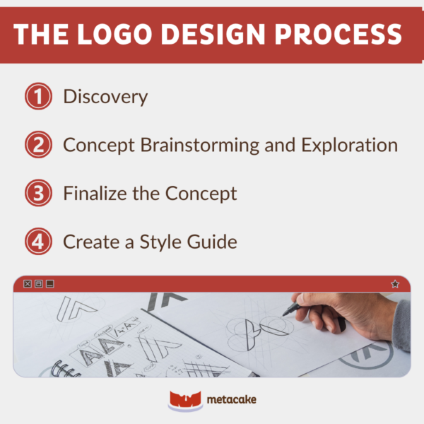
The Logo Design Process
At Metacake, we have a detailed process that we follow for every logo we create. Because of the importance of a logo, we believe that each of these steps is crucial to creating a powerful and memorable mark for your brand.
1. Discovery
The first step doesn’t involve diving headfirst into graphic design software and churning out concepts for review. (Feeling relieved?)
The logo design process begins with discovery — exploring your name, your purpose, and your audience. We like to do this by inviting you to ask yourself some questions.
- Why was your brand’s name chosen? What do you want that name to mean?
- What’s the vision of your company? What are its values and goals?
- What motivates your customers? What are their problems, and how does your company help solve them?
- What do people think and feel when your brand comes to mind?
2. Concept Brainstorming and Exploration
When we perform this step at Metacake, we start by throwing a bunch of ideas and concepts out there and seeing where they lead. Think of classic brainstorming with whiteboards and notebook paper (or high-end glass boards and moleskins for the ad agency folk).
Then, we start to prioritize those ideas and concepts. Which ones are most true to the brand? Which ones elicit the emotional response we’re looking for?
We boil it down to a few concepts and focus on creating initial designs based on those. The key is to avoid trying to produce a finished product right out of the gate.
Initial concepts are done in black and white. This removes the distraction of color and creates a level playing field for the top design concepts. We only add color after we choose the winning concept.
It’s not uncommon to focus exclusively on the logo mark and add the name later in the process. Because we want to remove distractions that can be created with certain fonts, colors, and text sizes, waiting to add the name can be helpful.
3. Finalize the Concept
This is when your logo really begins to come to life. We choose one concept and refine it.
We add color, the name, and a tagline to the logo mark. We test different types of treatments and layouts. These decisions are based on the emotions you want your brand to communicate, and they also take into account the applications where the mark will be used.
This can’t be accomplished by simply choosing a font from the standard Photoshop list. (We may use one of those as inspiration, but we typically create your font from scratch.) Every component of your logo must be unique to your brand.
4. Create a Style Guide
Finally, we create a style guide. A style guide is a simple set of rules to ensure the logo is used in a way that’s consistent with the brand. This also includes your logo in various colors, horizontal and vertical orientations, and a number of file formats so you use the right version for the right application.
The Key Elements of a Great Logo Design: Final Thoughts
It’s important to remember that a great logo will leave an imprint on those who see it. It’ll draw out feelings, engage interest, and maybe even introduce people to you who’ll become lifelong champions of your brand.
Details matter, and your brand’s logo is no exception. Take the time to develop each key element of your logo’s design. Your audience will notice and respond, and you’ll be glad you made it a priority.
Wondering how to determine the elements needed to bring your logo design to the next level? Our team would love to help you sort it out. Contact us today for some expert help in creating a logo that you and your audience will love.

