Have you ever considered those moments when you’ve purchased something that was almost too easy to buy? The value offered, the emotional appeal, the trust, and the user experience came together in a perfect storm.
In the world of ecommerce, this is what we’re going for, and the product detail page is the battleground where all of this takes place in the potential customer’s mind.
In this article, we’re going to break down the best practices for creating the perfect ecommerce product detail page that gives the user exactly what they need at the exact moment they need it and urges them to take action.
Creating the Perfect Product Detail Page
Customers make decisions based on logical information, but they take action based on emotion. With that in mind, it’s important to fulfill both of those in your site experience, particularly on the product detail page.
Aside from checkout, the PDP is arguably the most important page on your site. It’s also one of the best places to increase your site’s conversion rate. Therefore, it’s critical to build it with intention, supplying the right amount of info, creating an emotional connection, and presenting an irresistible offer that compels the user to take action.
How do you construct a PDP that fits all of those requirements? You’ll need both a winning strategy and structure. In this post, we’ll discuss the strategy — the why behind the design — and then we’ll outline the actual structure of elements on the page in order of priority.
Before we get started, there are a few prerequisites we assume you have in place.
- First, you need a mobile-first site, PDPs included. At this point, most of your traffic is likely mobile.
- Second, you should have a fast, scalable ecommerce platform like Shopify Plus, BigCommerce, or another cloud-hosted platform.
- Finally, make sure you have the right analytics tracking in place to measure the effectiveness of your PDP within your store’s purchase funnel.
The Strategy Behind a Winning PDP Design
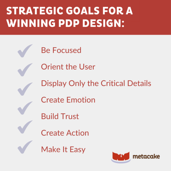
Implementing best practices for product detail pages requires that each component of your PDP works toward a single purpose: helping the user make a quick decision. Before we look at the structure of the page, we need to keep in mind the following key strategic goals.
1. Be Focused
Your product detail page’s structure and design should give the user just enough information and emotional pull to influence a decision. Avoid any and all distractions.
2. Orient the User
Make sure the user knows where they are, why they’re there, and why they should keep reading as quickly as possible.
3. Display Only the Critical Details
There are certain key details the user needs to know in order to make a purchase decision. These should be quickly and easily accessible, but keep them brief.
If you want to include further information on the PDP (like specs, measurements, or care instructions), give the user a way to explore this deeper if they’re interested. This is as simple as tucking those bulleted lists away into a drop-down or other collapsible section.
4. Create Emotion
This isn’t just fluff. It’s actually one of the most important strategic elements. Think about the last time you purchased a product you were super excited about. Chances are, there was a considerable emotional factor influencing your purchase, right?
On the product page, use the title, description, photography, and all other elements on the page to get the visitor excited about this product. One way to do this is by telling the real story behind why you created this product. This’ll help connect to the customer’s personal needs or wants, make it clear why your product will make their life better, and create raving fans of your brand.
5. Build Trust
This is the icing on the cake for a winning PDP strategy. You can have a great offer, a compelling story, and real urgency and still not win the sale.
However, if you have all of these elements and help the user trust your brand, you’ll really have a winning strategy. Build trust with customer reviews and mentions of your brand’s warranty or guarantee.
6. Create Action
Don’t underestimate the thinking that should go into the CTA button. The copy around and within your CTA blocks is critical. It should be genuine and not obnoxious but still compel the user to action.
From a technical standpoint, placement and visibility are also key, which may require some testing. Check out our helpful guide for conversion rate optimization here.
7. Make It Easy
Be careful not to distract with sections like related products, but when appropriate, be sure to let the user know about other products that complement the one they’re viewing. You could also take the opportunity to show off any bundled offers.
Whatever you do, make it easy for the user. A good rule of thumb is to give someone no more than three options. Too many options can overwhelm the user and make it hard to make a decision.
How to Design the Perfect Product Detail Page
Now that we have a good understanding of a winning strategy, let’s get into the actual structure of a great product detail page. These are the physical elements that should be present on a PDP, in priority order:
1. Breadcrumbs
We won’t get too technical here, but the correct use of breadcrumbs is an important piece for navigation and orienting the user, and it also has its benefits with search engines.
2. Product Title
Make the title brief and compelling, following a standard site structure. You don’t need to reiterate variant details like size or color in the title. Keep it simple. This is essentially your product’s headline and needs to fulfill the five-second rule!
3. Basic Product Details
If your product title is your “headline,” treat your product description as if it’s copy for an ad. This isn’t the manual or handbook for your product. It just needs to be descriptive, compelling, and convincing.
4. Product Images and Videos
The product images and any videos you use should be practical as well as tie your product to aspirational lifestyle imagery.
We recommend at least one standard product shot on a consistent background, along with several lifestyle images (photos of humans using your product). These images must be of high quality.
This is ecommerce — you can’t sell without images, and having no image is actually better than a really bad one. Therefore, great photography, videos, and media are critical.
5. Prices and Discounts
Prominently display prices as well as any discounts. If you’re running a sale, mark down the price and display the sale price directly next to it. Whether you have a promo running or not, include payment plans (like Sezzle, Afterpay, etc.) and other critical information that makes it easy for the user to say yes.
6. Review Stars
Near the product title and price, include a simple star rating, and link the stars to the reviews further down the page. This is a small but extremely important element.
7. Call to Action (Primary)
Your first call to action is a “buy” button or “add-to-cart” button. Make it clear, obvious (not obnoxious), and easy to use.
When the button is clicked, the user should either be directed to the cart page or the item should be added to the shopping cart without leaving the page. The option you choose depends on the type of product you sell.
- If people are likely to shop around and purchase more than one product, simply add it to the cart and keep them on the product page so they can continue shopping.
- If you have a type of product that people will only buy one of at a time, get them to the checkout as soon as possible.
8. Guarantee
One of the three components of an irresistible offer is a strong guarantee. The higher the guarantee, the lower the buyer’s resistance. We refer to this as “de-risking” the sale for the customer. The more you can convince the buyer that this is a risk-free purchase, the easier it’ll be to close the sale.
9. Story
Find a way to tell the story behind why you created this product. As we mentioned in the strategy section, this is critical to establishing authenticity and an emotional connection. This doesn’t have to be a tragic or even heroic story if it doesn’t fit with your brand. Don’t fake it.
Dedicate a section to explaining why you identified a market need for this type of product and how it’ll improve your customer’s life. Include high-quality images and videos here.
10. Reviews
You can have the perfect product detail page, but at the end of the day, users will trust what others say about your product more than anything you say yourself.
Reviews and social proof are absolutely critical in the ecommerce experience. If you get this wrong (or just don’t include them), you’re a sinking ship. If you can get this right, it’ll be a huge competitive advantage.
That being said, put the full reviews on the product detail page. If you’re a new brand or this is a new product with no reviews yet, include at least one to three positive testimonials on the page.
11. Call to Action (Secondary)
Be aware of your page length. It’s okay to have long pages, as long as they’re structured to allow your visitor to easily navigate to the top or dig deeper at their leisure.
For that reason, we recommend adding secondary CTAs as needed toward the bottom of the page to make it easy to add the product to the cart without scrolling back up. If your site allows for a floating, ever-present CTA, that would also be helpful.
12. User-Generated Content
If customers are posting about your product on social media, that’s a great layer to add further down the page. Pulling in those photos and captions helps build trust and puts it in context for the user.
13. Related Products or Categories
Again, we don’t want to overwhelm or confuse the customer. However, a critical piece to scaling an ecommerce store is increasing the average order value and customer lifetime value.
A great way to do that is by merchandising complementary products where they make sense on the page in a non-intrusive way. To keep it easy for the customer, we like to make this one of the last elements on the page.
Ready to Build a PDP That Converts Visitors Into Customers?
The product detail page is one of the most critical pages in the path of your ecommerce site, and constructing it with intention is absolutely necessary.
We hope that these best practices help you think about your PDP in a way that will dramatically increase your conversion rate.
If you’d like to know more, reach out to us at Metacake for more info!