Updated: October 20, 2023
If you’ve been in the ecommerce world for any amount of time, you know that promotions and product launches are the lifeblood of any ecommerce business. But in order to make those a success, you’ll need some thoughtful strategy in several key areas. One of the most crucial is your website.
Most ecommerce businesses get so caught up in the marketing of their promotions that they overlook the customer’s site experience. How will the promotion work on the site, logistically? What changes will need to be made to the site? What will the customer journey feel like, from arrival on the site all the way through checkout?
In this article, we’ll outline the 8 parts of your website that you should consider updating any time you run a promotion, sale, or product launch. We’ll explain each part’s role and what actions you can take to make sure they contribute to the sale and help convert more customers. Let’s get into it!
The Ecommerce User Flow
Before we dive into each important element of the ecommerce site, it’s important to have a proper understanding of the ideal user flow from initial entry all the way through checkout. We’ll outline each of the phases of the user flow below as well as provide a diagram to illustrate this journey.
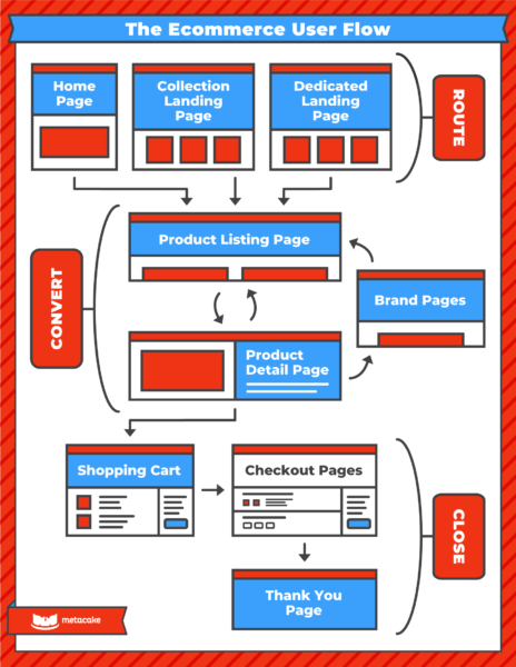
Phase 1: Routing Pages
This part of the user flow includes the first pages users will see: the homepage, the collection pages, or dedicated landing pages. The goal of these pages is to orient the user and help direct them to find what they’re looking for.
Phase 2: Converting Pages
This section of the user flow includes product listing pages, product detail pages, and brand pages. This is where the “shopping” occurs and a buying decision is made. Customers are exploring what you have to offer, jumping back and forth between a list of products and product-specific pages. They may jump to other pages to learn more about your brand and ideally will come back to the product.
Phase 3: Closing Pages
This final piece of the flow includes the shopping cart, the checkout page, and the thank you page. These pages close the sale and process the customer’s payment.
The 8 Most Important Parts of Your Website to Update for Your Next Promotion
Now that we have an understanding of the ideal user flow and how customers move through your site, we’re ready to walk through the 8 parts of your website you should be sure to update for your site’s next event.
1. Homepage
The homepage is typically where a lot of attention is given, and for good reason. It’s the one page on your site that needs to have something for everyone. That can be a challenge, so there is a specific strategy we’ve developed on how to construct your homepage. You can learn more about this on our post The Perfect Ecommerce Homepage that Builds Trust and Sells. But for now, let’s focus on what your homepage specifically needs during a promotion.
Role of the homepage:
1. Orient visitors (in under 5 seconds)
Communicate to users why they are at your site, what your brand does, and why they should stay. In the case of a promotion, you also need to communicate your sale during those 5 seconds.
2. Get them to the right place
The challenge with a homepage is it has to present the user with the right amount of calls to action in the right priority. You’re trying to help different people get to the correct place as quickly as possible.
3. Build trust in your brand
Remember, people take action based on emotion, not information. The homepage is a great place to sell your brand, not just your products. Use elements across your homepage to develop your voice and reasons you exist as users work their way down the page. A key part of brand building is also trust-building, so include customer reviews, your guarantee or warranty to help with that.
Actions for the homepage:
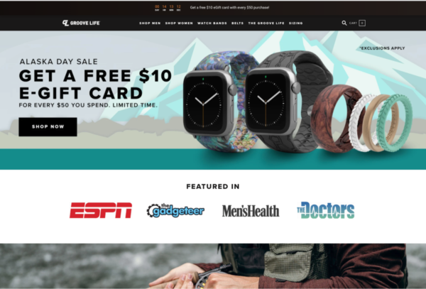
1. Update your hero image (also called the header image or banner image)
- The imagery and messaging on this hero should align with the promotion, even down to the current phase of the event (did it just launch? Is it ending soon? Timing provides urgency).
- Make sure it displays the offer or product launch clearly, with critical information listed.
- Include a visual call-to-action that is clearly clickable and link it to a relevant collection.
- Design both desktop and mobile versions of the hero image. Simply scaling the desktop hero down in size may not be user-friendly if there is a lot of content on the image.
2. Nice to have: Add a featured collection
- This is an optional, nice-to-have when running a sale. Featuring a collection of product listings that are on sale is a great way to get customers’ interest and get them shopping.
Example:
2. Collection Page / Category Listing Page
This page has a few different names— collection page, category page, or product listing page— but its role is simple. It lists your products and allows for quick browsing. If you have a lot of products, you will need some method of filtering to make it easy for people to scroll through. Also, make sure all images are uniform.
In the case of a promotion, a collection page may act as a landing page. Every promotion should have a landing page, and collections are a great opportunity to group all products that are included in the promotion on one page. Even if all products are included in the sale, you can utilize the all products collection. This helps the user stay focused on shopping even if it’s a bit redundant.
Role of the collection page:
The role of the collection page is to get customers to the product pages as quickly and efficiently as possible. As mentioned above, the collection page often serves as a landing page during a promotion.
Actions for the collection page:
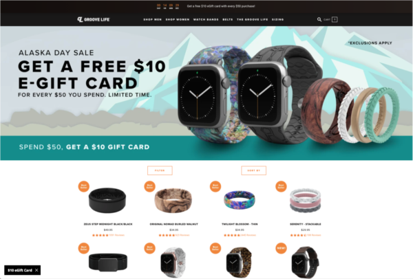
1. Create a collection of products that are included in your sale or relevant to your event.
2. Include a hero image on the collection page to orient the user. It can be similar to the homepage hero, but make it shorter, so as to not push the products too far down the page.
Example:
3. Landing Page
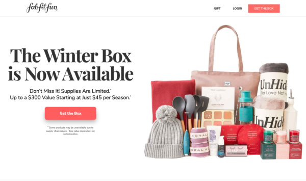
Depending on your product line, the nature of the promotion, and/or marketing you run, you might need a specific landing page as opposed to the collection page. Note a landing page should NOT be the homepage. However, it should still be designed for orienting the user and directing them to the specific product or collection featured in the promotion. Typically a landing page digs a little deeper into the problem that the featured product or collection is here to solve. It focuses on stacking value, and works to eliminate risk.
Role of the landing page:
The role of the landing page is to present your offer in a tailored experience that is focused for a specific audience, without any distractions. There is a clear call-to-action and each element of the page helps stack value for the offer, encouraging the user to click.
Actions for the landing page:
Create a landing page for your offer. There are page builders that help execute this logistically speaking, so spend most of your time developing the messaging for your offer. Be sure to include these essential elements:
- The offer / theme of the promotion
- Product or collection relevant to the promotion
- Plenty of call-to-action buttons throughout the page
- Stacked value, appealing to 3 different sells: emotional, logical, and time-based
- Trust-building elements such as customer reviews and your guarantee
Example:
4. Product Page
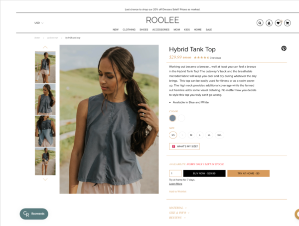
The product page (or product detail page, the PDP) is where the customer’s buying decision takes place. It’s the most critical pages in the decision-making process. The goal of this page is not to force a decision; it’s to help the customer make a quick one. There is a certain structure we recommend to help make this happen, so if you want to make sure you’ve set up your PDP correctly, check out our post The Perfect Product Detail Page to Maximize Purchases.
Role of the product page:
As we just mentioned, the role of the product detail page is to provide just enough detail to make a decision and then make it easy to proceed with a purchase. Be mindful of which details you share and how you prioritize that info on the page. Any crucial info should be kept close to the top of the page, including:
- Price
- Photos/videos
- Brief product descriptions
- CTA button that makes it easy to buy
- Elements to eliminate risk, such as:
- Value stack (communicate the offer)
- Warranty or guarantee
- Customer review stars (with a link to read customer reviews)
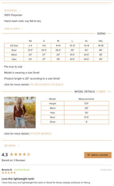
- Size guide / tips (if relevant to your product)
Further down the page, you can include more in-depth info that customers will investigate only if they want or need to:
- Specs
- More detailed description
- Product or brand video
- Customer reviews
- Your brand story
Actions for the product detail page:
During a promotion, be sure to:
- Use great photos
- Make the sale/discount obvious in the pricing area
- Trim all unneeded information and make it easy to understand, decide and buy
- Have clear CTAs (multiple if the page is long)
- De-risk the sale with things like warranty, reviews, and tackling other possible objections.
- Present all of this WELL on mobile
Example:
5. Cart Page
The cart page is the place where customers typically review selections and move into the checkout. The goal here is to keep things simple and easy to move forward. At this point in the process, you do not want to distract the customer with anything. If you do want to use an up-sell pop up or other types of additional offers, do so strategically as to not distract the customer from checking out.
Role of the cart page:
Allow customers to easily review their selections and move on to the checkout as quickly as possible
Reinforce any elements needed in order to provide clarity for the customer to move forward with confidence: trust building, discount codes, shipping, special sale information
Actions for the cart page:
When running a sale, here are a few tips for the cart page:
- Make sure the crucial sale elements are messaged in a sitewide bar or other element across the top of the page.
- Reinforce trust-building elements like social proof and your guarantee
- Do not cause distractions on the page. If you offer an up-sell, make sure it’s only an “easy yes”— something that is a no-brainer. This close to checkout is not the time to ask customers to make a hard decision.
6. Checkout
Checkout can be a dreaded page in the customer journey. Having to find your credit card and entering all those numbers with your thumb is enough to make anyone second guess how much they really want to go through with a purchase. That’s why your goal should be to make it as easy as possible.
These days, the format of the checkout page is pretty set in stone based on your ecommerce platform. However, there are a few things to keep in mind and understand about this critical page.
Role of the checkout page:
The checkout page involves any steps after the cart through the order completion. The goal is to keep it as quick and simple as possible for the customer to complete their purchase— not sell any other products.
Actions for the checkout page:
You likely don’t have a lot of control over customizations for this page, but make sure these things are squared away:
- Make sure everything is clear and easy. Whether shipping and billing are on one page or two doesn’t really matter, as long as you can get payment info as quickly as possible.
- It should be clear where a discount code needs to be entered. On Shopify, the discount field is collapsed on mobile, making it easy to miss. Sometimes we’ll auto-expand that to help customers out.
- Be clear about shipping costs. As a note, we suggest not doing dynamic carrier-calculated rates. Using flat rate shipping based on spending tiers or weight allows you to clearly communicate pricing to the customer upfront.
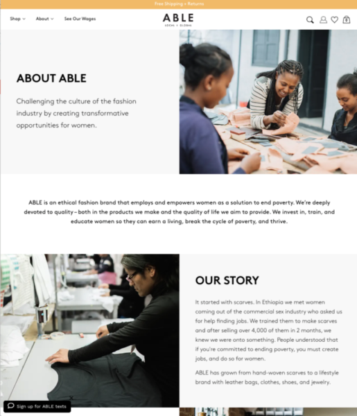
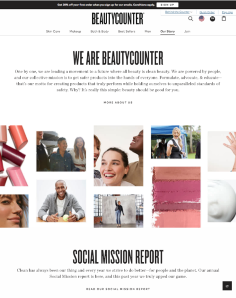
7. Brand Pages (About Page / Story Page)
Brand pages can encompass a number of different types of pages such as an about page, our story page, company mission page, blog pages, and more. While they don’t really need to be updated for a promotion, they have proven to be important to the conversion path. Why? Selling your story matters, it truly helps convert visitors into customers. In fact, we generally see that when a user passes through pages like this, they convert at a higher rate.
Role of brand pages:
Whether it’s a page for your story or just to give more info about your brand, these pages are a way to introduce your brand while customers are thinking about buying your product. Most people today care about the “why” behind your product, who is making it, how it’s made, the level of quality and care that goes into it, etc. Overall, the goal is to reinforce the why behind your product and connect with customers on an emotional level, which increases the opportunity for conversion.
Actions for the brand pages:
- Make sure you at least have an “About Us” page.
- Ideally, you would create several brand pages that educate the customer on your company, your product, your purpose, and what sets you apart from others.
- Create clickable elements across your site (the homepage, the product detail page, collection pages) that give visitors a way to learn more about the brand behind your products.
Example:
8. Sitewide Elements
Lastly, there are two sitewide elements that are important for promotional periods.
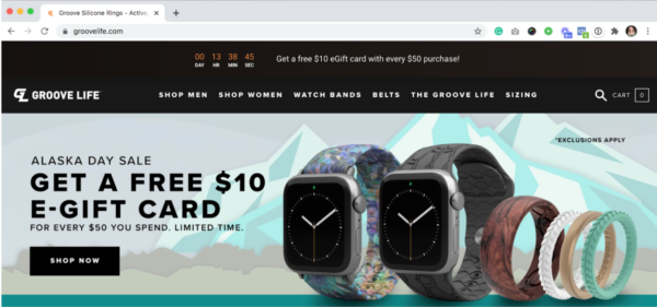
First, is what we call the hello bar. This is a narrow banner that is always present across the top of the site, making it easy for visitors to see key details of the event going on. It may be small, but this is a critical element for making the customer experience easy. By including a concise summary of the offer and the discount code here, the customer will be reminded of the details wherever they go.
Role of the hello bar:
Inform the user of key details of the promotion anywhere on the site.
Actions for the hello bar:
- Add the hello bar to your site. Some platforms include it natively, but there are also apps you can use.
- Place the key details of the promotion in the bar including the discount, coupon code, and duration of the sale.
- Optional: Include a CTA button that links to a sale collection or featured collection.
Example:
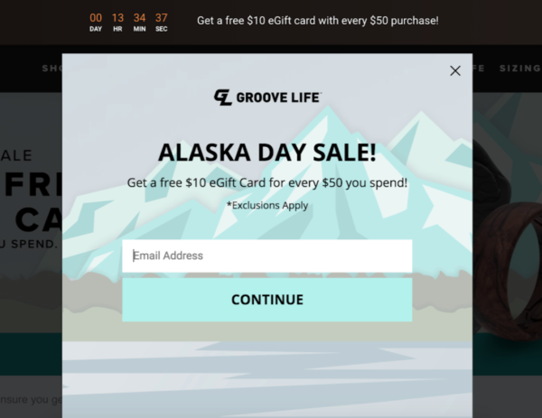
The second sitewide feature is the entry pop-up. While most of us have a love/hate relationship with pop-ups, they are useful and they do help with conversions, especially during promotions. During a promo, you’ll have increased site traffic and even if many of those visitors don’t buy, you can still use an entry pop to acquire an email address and to communicate the event going on.
Role of the entry pop-up:
To inform visitors of the current promotion, to generate excitement, and to capture the visitor’s email address (and phone number if you utilize SMS marketing)
Actions for the entry pop-up:
- Create a pop-up that fits well with your promo’s creative and clearly messages the sale. There are several tools that make this easy, such as Klaviyo, OptiMonk, and OptinMonster.
- Make sure it’s nicely designed, large, explains the promo clearly and concisely, and why it’s a great offer.
- If there is a coupon code involved with the promo, we’d recommend making users enter an email address to get access to the sale. This is a great way to build the list and typically has over a 10% entry rate. If you go this route, provide the coupon code on a second window of the entry pop, as well as via automated email.
Example:
Ready to Crush Your Upcoming Ecommerce Promotions?
Get these 8 crucial elements of your website in order and you will be! Developing a strong offer with compelling messaging is important, as well as marketing your promotion effectively to bring traffic to your site. But in order for that messaging and your ad budget to turn into purchases, it’s critical to adjust each of these site elements to help create the best experience possible for your customer.
