Web travelers are fickle.
They visit your site demanding to be entertained, surprised, or educated, and often never think twice about leaving without buying what you’re selling or sharing what you’re saying.
Of course, the way you respond to this unfortunate truth is up to you.
You can choose to lose faith in web travelers altogether, quit trying to attract them to your site, and come to resent every unique visit Google Analytics reports.
OR, you can choose to believe that these faceless visitors mean no harm but simply need a few key things from you in order to take the actions you’re rooting for.
When you choose the latter and give website visitors the benefit of the doubt, the next step is to identify what key elements they need from you.
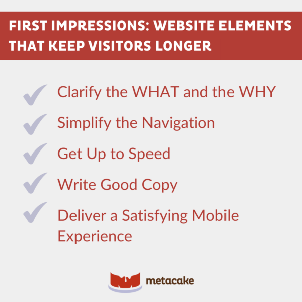
Below, we list the top five elements to optimize to make your website hospitable to newcomers. Together, all of them add up to a first impression that captures website visitors and keeps them moving through your funnel.

First Impressions: Website Elements That Keep Visitors Longer
1. Clarify the WHAT and the WHY
We live in an age of microwaves, smartphones, and on-demand everything. It’s no surprise, then, that denizens of the web have short attention spans and little tolerance for friction.
In web design, we call this the three-second rule. Essentially, if a visitor can’t answer within three seconds what your website is and why they should stay there, you lose them.
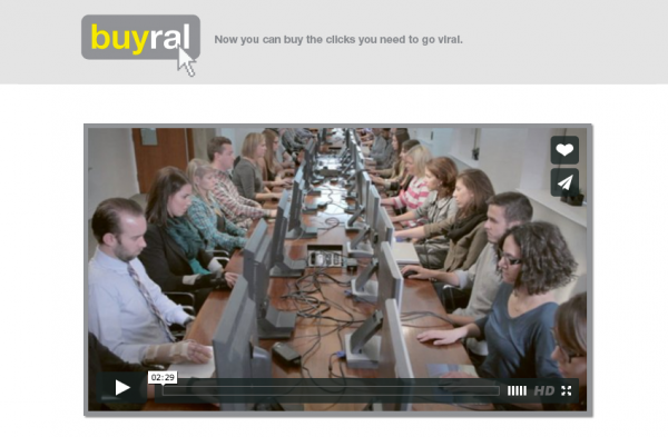
You can answer what in a handful of ways, but none better than having a CLEAR (not a creative) headline.
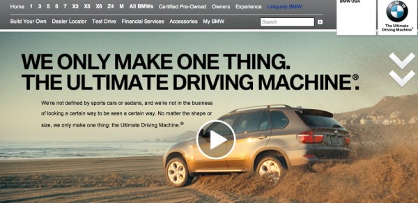
BMW does a fantastic job of answering this question from moment one. Even a man emerging from a lifetime of cave-dwelling would have absolutely no question what BMW does.

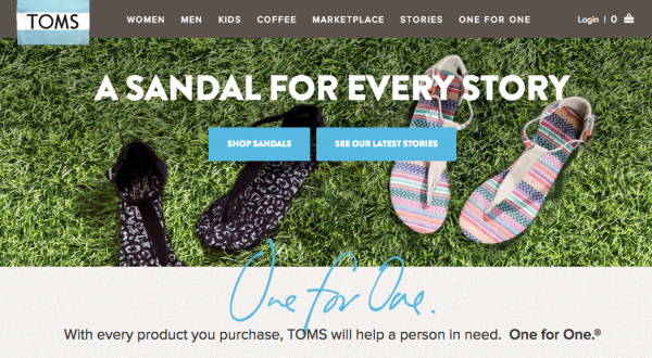
As for why the visitor should care enough to stick around, it’s all about creating an emotional connection and extending an invitation. No one did this better than TOMS and their One for One campaign.

2. Simplify the Navigation
Visitors shouldn’t need a manual to effectively navigate your website. They’ll spend one, maybe two seconds glancing around for an obvious link to where they want to go. And if they don’t find it, they’re gone.
Perhaps the easiest way to put training wheels on your site is to simplify your main navigation menu.
Navigation menus and page titles are not the places to flex your creativity. Be boring. Be predictable. Be clear. Save your creative genius for wowing visitors when they get to the actual page your menu leads them to.
If you don’t believe me, you may want to take notes from one of the kings of innovation: Apple. Their menu changes over time as they add or take away products, but the header language remains abundantly clear. Want an iPad? Click here. Some AirPods? Click here. It couldn’t be simpler.

3. Get Up to Speed
Leaving guests hanging doesn’t make a good first impression at restaurants, in call centers, or on your website. And guess which has the lowest threshold of tolerance for delays?
Test your site speed with a tool like Pingdom to see how quickly it loads compared to other websites they’ve tested. If you land in the bottom 50%, try a few tricks to decrease your loading time:
- Compress images
- Scale images
- Use browser caching
For more ways to increase loading speed, check out these additional tips.
4. Write Good Copy
Picture this: You’re visiting a new local coffee shop, and just the smell of the beans makes you want to try one of everything on the chalkboard menu. But as you read, another feeling overrides your sensory nirvana:
“TRY THE COFFEE WITH WHIPPED CREME. OR ANITHING WITH WHIPPED CREME AND CINNAMUN.”
This shop could offer the best coffee in the world, but you’re not too motivated to spend $7 on a latte with “cinnamun.” If they can’t get third-grade English right when it’s basic to their business, what else are they messing up?
No matter how great a product smells, people are going to be less excited about buying it when they see signs of carelessness or inexpert execution.
This doesn’t mean you suddenly need to master grammar and win a spelling bee. It does mean that every word on your website needs a once-over by someone who has. And it needs to be written with effective copywriting principles in mind.
Write copy that’s enjoyable, readable, invitational, and shows competence. Take a look at this great example from Neil Patel:

Notice how clear and simple the message is?
5. Deliver a Satisfying Mobile Experience
Over half of all website visitors now arrive via mobile device. Chances are, then, more than 50 out of every 100 visitors to your site need a specially tailored mobile experience.
Even with clear website copy and navigation, ineffective mobile design drives visitors away. Tiny unreadable text, giant images, giant navigation bars that take up the entire screen — any nonresponsive element can cause enough friction to send prospects running into competitors’ arms.
Most major companies have upped their mobile game in recent years, but you can still find sufficiently frustrating experiences on certain .gov sites and homespun shops that lack the benefit of automatic responsive design built into platforms like Shopify.
Make a Glowing First Impression With Your Website
When it comes to first impressions and website visitors, put yourself in their shoes. Or, better yet, do a little user testing so you don’t have to.
It’s easy to forget what a brand new visitor might feel when you yourself are saturated with your brand and site. User testing — even with friends or acquaintances — brings in an element of objectivity that shows you how hospitable your website really is for newcomers.
Don’t miss out on opportunities because of a poor first impression on your website. Because when you give a visitor what they want, they give you what you want — whether that’s comments, shares, or purchases.

