Mobile shopping rates grow day after day and year after year. In fact, mobile shopping now represents the majority of traffic to ecommerce stores. (Yes, that means over 50%.)
You can’t afford to ignore mobile ecommerce best practices. Not only will you lose over 50% of your potential customers, but your store will also be penalized by search engines. Talk about lose-lose!
How to Implement Mobile Ecommerce Best Practices on Your Site
Make Sure Your Site Is Responsive
Having a responsive design is one of the most crucial mobile ecommerce best practices. If your site doesn’t adjust to smaller screen sizes, mobile shoppers will get frustrated and bounce.
Unfortunately, “converting” a non-mobile site to be responsive isn’t an option. So, if your site isn’t responsive, either hire an expert to create a mobile site for you or switch to a responsive theme.
Get Up to Speed
Site speed is another key aspect of mobile ecommerce best practices. About 40% of shoppers will abandon a web page that takes more than three seconds to load. If your mobile site doesn’t load quickly, potential customers will move on to another site that does.
Struggling to increase your site speed and follow mobile ecommerce best practices? Try these tips:
Eliminate Fluff
On mobile, get rid of non-essential animations and JavaScript. They slow your site down and detract from the mobile user experience.
Optimize Images
Nothing kills site speeds like oversized images. Many ecommerce platforms optimize your images for you when you upload them to your site, but it’s always good to double-check.
Simplify Your UI
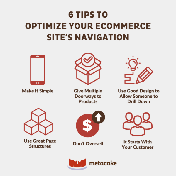
Simple navigation is another critical aspect of mobile ecommerce best practices.
It’s important to have a simple user interface for mobile. With limited screen real estate, you must put the most important features at the top of each page and remove any non-essentials. Include clear calls to action throughout the purchase path.
We also recommend disabling any pop-ups or alerts that might get in the way of the purchase process on mobile.
Streamline Your Checkout
Optimizing your checkout is one of the most impactful mobile ecommerce best practices.
Even at its best, checkout is a point of friction for mobile shoppers. Entering a ton of information (billing and shipping information, along with payment details) on a tiny screen isn’t fun. So, limit the fields you require as much as possible, and make sure your checkout is mobile-friendly.
Also, add Apple Pay and Android Pay as payment options. These payment methods are a massive step forward for mobile shopping. Instead of painfully typing in tons of information, customers can use their thumb readers to make a payment instantly.
Following these mobile ecommerce best practices will surely increase your mobile conversion rate. Try them today, and let us know how it goes.