Good user experience (UX) is essential for the success of any ecommerce business — I think we can all agree with that. But are you aware of the many pitfalls or mistakes that can happen along the way in creating a good user experience?
Think about Facebook and the frequent changes to its interface and privacy settings. Those frequent changes have often left the user frustrated or even confused. Or, YouTube’s autoplay feature — talk about irritating!
Have you fallen victim to using these practices on your ecommerce website? Have you even thought about these pitfalls?
No worries; we’ve got you covered! In this article, we’ll go over five common UX mistakes that are guaranteed to cost you money and potentially cause you to lose your brand fans.

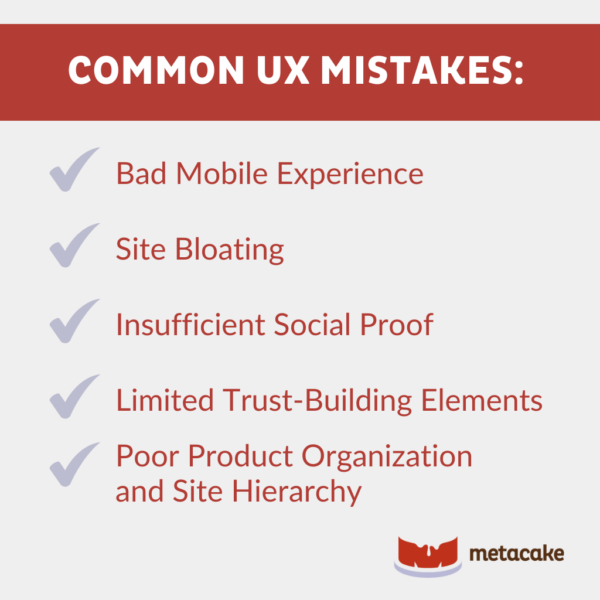
1. Bad Mobile Experience
Mobile commerce in the U.S. exceeded 491 billion dollars in 2023, with no signs of slowing down. Not being mobile is a big mistake, and it’ll cost you. At the very least, you need to have a site that’s responsive.
But just “being mobile” isn’t enough. You need to think about the experience design specifically for mobile, as you would on your desktop site:
- Ensure your website is mobile-optimized.
- Hide elements that are distracting on mobile.
- Streamline your checkout process.
- Create your own mobile app.
- Build an omnichannel strategy.
The aim is to make your visitor’s mobile experience as pleasant as possible, guiding them through the customer journey with ease.
2. Site Bloating
What is that exactly? Well, we could’ve said “slow site speed.” But in fact, that’s just a symptom of a bigger problem — namely “site bloating.”
Review your site to ensure you haven’t overdesigned by adding too many design elements and unnecessary JS/CSS animations or scripts. This isn’t the place for your developer to show off cool hover effects or parallax.
Clean and simple is the name of the game.
Think through it this way: How many clicks away is your customer from accomplishing your intended goal (likely a purchase)?
No, seriously. Count them! This is very important to map out. The shorter the purchase process, the higher your sales will be.
3. Insufficient Social Proof
Or worse, zero social proof.
Social proof sells like nothing else, so if you don’t have this on your site, you’re seriously shooting yourself in the foot. People buy your product because other people tell them to, not because you tell them to.
Gaining social proof isn’t easy, but there’s only one way to start, and that’s to ask for it.
Shopify has some great apps that make requesting verified reviews a breeze. Check out Yotpo or Stamped.io (the latter is significantly more affordable and a great way to get started).
4. Limited Trust-Building Elements
On top of reviews, there are several other trust-building elements you should include on your site. For example, you should include information on warranties, guarantees, returns, and security.
These may all seem like little things, and they are. But together, they can greatly increase the credibility of your site and the confidence visitors have in you when making their first purchase.
Don’t bury this information in the footer.
If the information is relevant, call it out at the right time. For example, if you offer satisfaction guaranteed or easy returns, call this out on your product detail pages so your site visitors know they have nothing to worry about.
5. Poor Product Organization and Site Hierarchy
Back to this question: How many clicks away is your customer from accomplishing your intended goal (likely a purchase)?
The answer is probably too many, especially if you have a complex product line.
Rethink your product categorization and the paths you present to users to help them locate what they’re looking for as quickly and conveniently as possible.
This likely means that some products live in several different categories. It also means you’ll need advanced filtering and intelligent search to help your customers along the way.
Common UX Mistakes: Final Thoughts
After reading through the five common UX mistakes, do any of them seem familiar? Have you made these mistakes yourself?
If you have, you’re not alone. This is precisely why Metacake exists: to help ecommerce business owners (like you) succeed!
Neglecting UX can result in poor user satisfaction, higher bounce rates, and ultimately, a significant loss in potential revenue.
So, if you want to increase conversion rates, have better user engagement, higher revenue, and enhanced customer satisfaction, then steer clear of these mistakes. As experts in this field, we can guide you on the right path. Reach out today to see what we can do for you!

