One of the most challenging parts of buying and selling products online is that customers can’t experience the product in person before they buy. The closest thing we have to letting the customer hold the product is the ecommerce photos we display on the product detail page.
Interesting technologies such as augmented reality and virtual try-ons are becoming more popular. But for most brands, ecommerce photos and videos are still the product page’s bread and butter.
In this article, we’ll discuss the importance of ecommerce photography and how to construct the perfect product image gallery section for your ecommerce store’s product page.
This may seem simple, but it’s so important considering this is the only place a potential customer can visualize and interact with your product.
The Purpose of Ecommerce Photos
The goal of ecommerce product images and/or galleries is to help customers get a clear view of the product and feel compelled to buy it.
As we discuss often, people make decisions based on emotion and then justify them with logic. So make sure your product images appeal to both!
This is why we recommend including both product-focused photos (on a plain background) and lifestyle images.
Represent your product beautifully, but also provide a look at the detail and show multiple angles.
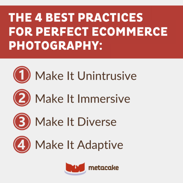
4 Best Practices for Perfect Ecommerce Photography
Let’s dive into four tips for making the most of the product image gallery on your product pages.
1. Make It Unintrusive
You might have 20 images of a product that you like, but you don’t need those 20 images stacked and taking up the whole page.
Put yourself in the customer’s shoes. Most of the time, when we’re shopping and flipping through product photos, we’re on the hunt for a particular angle or a view we’re curious about.
If customers have to sort through a ton of photos or different color variants they aren’t interested in, they’ll get frustrated.
We recommend around five images — 10 images maximum. Have one featured image with a few smaller thumbnails. And most importantly, make sure everything stacks nicely, especially on mobile.
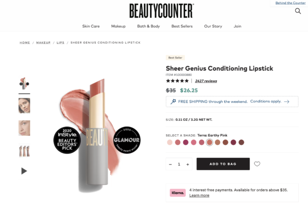
BeautyCounter does a great job of providing a helpful yet non-intrusive image gallery. The lipstick product in the example below includes:
- An image of the product on white
- Two lifestyle images with models
- A helpful comparison of what the color swatches look like on different skin tones
- A product video
2. Make It Immersive
When it comes to ecommerce photography, providing an “immersive” experience can mean multiple things.
For starters, ensure that your photographs are of the highest quality and that customers can zoom in on the products. This is especially true if details are important to your product. It’s also beneficial to have images that can be enlarged for a closer look.
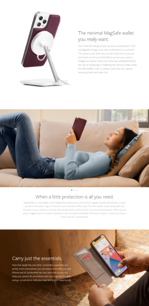
To make it more immersive, consider options beyond the product image gallery at the top of the page. Consider incorporating lifestyle photos into other areas of the page to provide a more curated experience rather than just a product page.
This effectively appeals to the customer’s emotions and helps them imagine the product in real life.
Twelve South, an Apple accessory company, does an excellent job with this, as demonstrated in the image below.
3. Make It Diverse
This one is pretty straightforward — simply provide a variety of image types in your product image gallery.
As mentioned previously, use a combination of product-focused images on a white or plain background, as well as lifestyle images that show the product in use.
For product-focused photos, show multiple angles and views. For lifestyle images, show different models or scenarios where the product is being used.
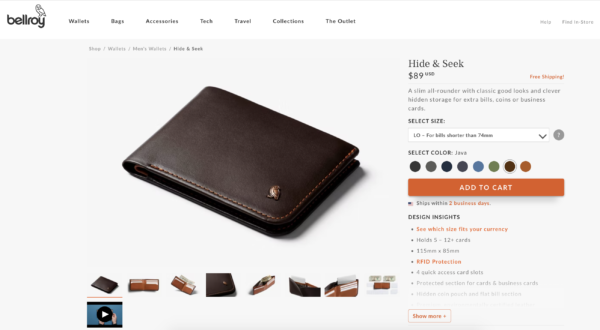
In the example below, Bellroy provides a variety of angles for the wallet they’re selling, which is very helpful for a customer trying to visualize how they could use the product.
They also added variety by including a product video.
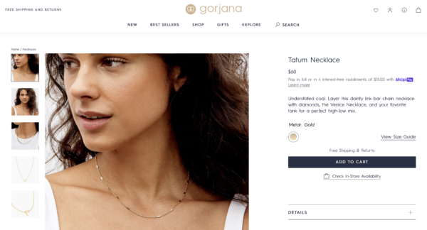
In Gorjana’s case, they provided a variety of images for this necklace by including multiple views of the product on white, as well as different ways to style the necklace on a model.
4. Make It Adaptive
This is a simple concept, but it can be hard to execute it well. Your ecommerce photos need to adapt to whatever screen size the visitor is using and still look clean and organized.
Whether photos are viewed on mobile, desktop, or tablet, make sure the image gallery displays well.
There are different ways to accomplish this; for example, the way thumbnails are stacked or displayed may need to differ for desktop vs. mobile.
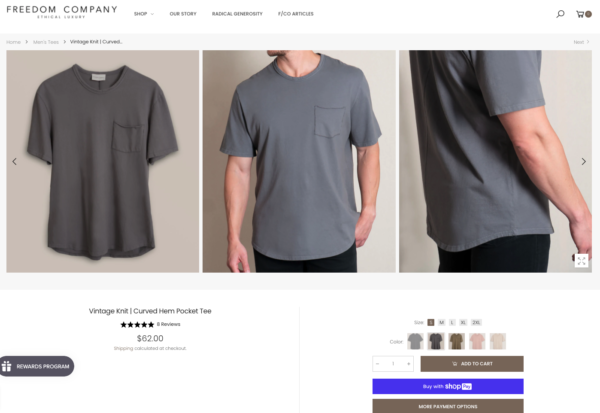
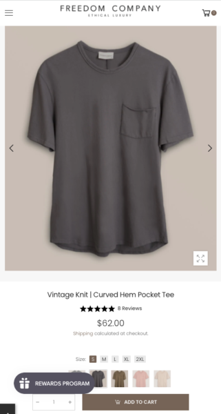
In the example below, Freedom Co. has gotten creative and displayed a series of three images horizontally on the desktop view. But for the mobile view, three images across the screen would be very hard to see, so customers shopping on their phones will see a mobile-friendly version.
How to Measure the Success of Your Ecommerce Photos
Wondering if your ecommerce photography is effective for converting your visitors into customers? While we can’t measure this directly, there are some indicators to watch:
1. Are they being used?
If visitors land on the product detail page and are not clicking through the image gallery, it might not be translating well for your customers.
Its current setup might be cumbersome, might not have the right variety of images, might not be of good quality, or be entirely another issue.
There are tools that allow you to track what users interact with on your page, and heat maps could be helpful here as well.
2. What is your add-to-cart rate?
If you improve your product image gallery and those changes are helping market your product well, the rate of people clicking “add to cart” should be going up.
3. Talk to customer service.
If people are asking a lot of clarification questions about the details of your products, then your product images could probably be doing a better job for your customers.
The product images, product description, and FAQ page should all be working together to reduce customer service inquiries.
4. How does your conversion rate look?
There are a variety of factors that contribute to increasing your conversion rate.
If you make significant improvements to your product image gallery and other critical areas of your store, that should have a positive effect on your conversion rate.
Is It Time to Optimize Your Product Image Gallery?
Making these adjustments for a better user experience may seem like a simple change, but it’s so important.
The product detail page is the only section of your site where customers can interact with your product. It’s the closest they’ll get to holding your product or seeing it up close before buying it, so it’s imperative to ensure your ecommerce photos are user-friendly, detail-oriented, and of high quality.
Ultimately, the quality of these images and how they are presented are a direct reflection of the quality of your products and your brand. Do this well, and you’ll be that much closer to converting as many visitors into customers as possible!
If you need help implementing these practices into your ecommerce photography, feel free to reach out to our team. We’re always here for you.
