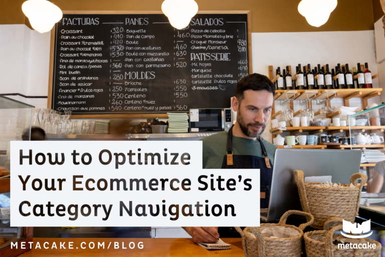
Have you ever considered that your site navigation can make or break your ecommerce experience? Whether you have 3 products, 30, or 300, a well-structured navigation is critical.
Creating your navigation should be the result of good architecture to your product line and your site. It starts with asking the question, “How do we group things together so that people find what they need as quickly and easily as possible?”
It serves as a map, helping people get where they want to be efficiently. If the map is bad, it wastes time and causes frustration. It takes customers running down the wrong paths and ultimately lowers the conversion rate. It might also cause customers to miss additional products that they may want to know about and purchase.
Conversely, a well-optimized site architecture represented by a well-organized navigation can increase your conversion rate, and even increase average order value. These are two golden multipliers for your business, because even a small change in these metrics can mean major gains for your profits.
In this post, we’ll walk through our most important tips for optimizing the perfect navigation for your ecommerce site.
Navigation Tip #1: Start with Your Customer
As we do for any element of an ecommerce store, we need to start with the customer in mind. Identify your customer avatars, as well as the types of ecommerce shoppers. Get to know their mindsets, how they shop, and what they come to your site hoping to find. Once you understand your customer and how they think, it will be much easier to design a site structure and navigation that is user-friendly for them.
Navigation Tip #2: Use Great Site Architecture
Navigation isn’t just the top menu of a site. That top menu is a visual representation of all the elements of your site and how they are connected. So if you haven’t already, be sure to go back a step and create a cohesive customer journey. This journey should walk people through your brand and product line in a way that feels natural and logically leads them to a product page to purchase.
One thing to note is that in this customer journey, you will have pages that fall outside of the navigation, and that’s okay. Your site probably has places to link to additional brand content or customer service related pages across the top of the homepage, or in your footer.
Additionally, when creating your customer journey and designing your navigation, be sure to accommodate different types of ecommerce customers. You’ll have both browsers and lasers and it’s your job to help both have the best experience.
Navigation Tip #3: Make It Simple
Our first tip for the design of the actual navigation is to keep it simple. A good architecture and site navigation does not have to be complex. It also does not have to show every product or every category you have. It just needs to help visitors and customers get to the correct next step.
Why does this work? We often tell brands we work with that confused customers don’t buy. If they’re looking at the navigation, they’re seeking a road map— an overview of what’s offered and where they can go to find what they’re shopping for. Complicating or cluttering the navigation will only slow down this process, causing overwhelm, frustration, and early exits.
Navigation Tip #4: Give Multiple Doorways to Products
Products can sit in multiple categories – that’s allowed! The goal isn’t that the info is tightly organized for an accountant-type personality to review. The goal is that products fall into places where users will look for them. This may mean you have multiple ways to get to the same products because of the different ways people might think about them. For example, a product might sit in the men’s collection, an outdoors collection, and the sale collection. And that is okay!
This actually helps the effectiveness of your navigation because the goal of this section is to get customers where they need to go. If you’re giving them multiple ways to get to a product they have in mind, that’s extra helpful.
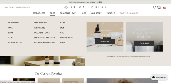
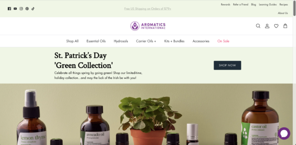
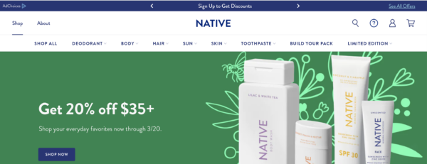
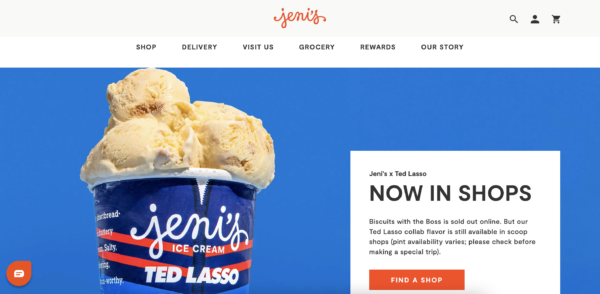
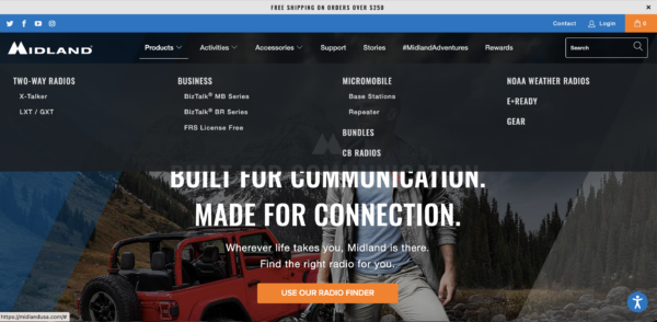
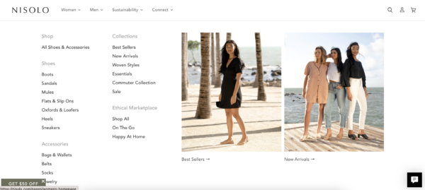
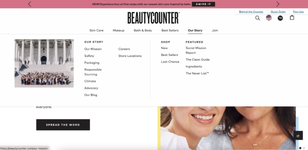
Navigation Tip #5: Use Good Design to Allow for Easy Subcategory Browsing
We’ve all used mega menus when shopping on sites with an extensive product line. Some brands do them really well, while others have very poor design. If your brand has a complex, nested product line, you will need a mega menu to allow exposure to each category and sub category. But remember two things: use great design to make it easy to follow, and make it mobile-friendly. This should hopefully go without saying, but if you don’t have a complicated product line, don’t use a mega nav! Just highlight the main categories or most browsed collections in the nav, and let your collection (or category) pages do the next step of directing customers to the right product.
Navigation Tip #6: Don’t Oversell
We talk a lot about the value of building a brand and turning customers into true brand fans. The idea here is to create more loyal, repeat customers by helping them buy into your brand, not just your product.
With that in mind, don’t let your navigation focus solely on selling. Make sure you bring elements of your brand and brand-related pages into the navigation so customers can find them easily. This could include links to pages for About Us, testimonials, customer service, warranty or guarantee, and more.
Ready to Build a Winning Site Navigation?
There is much to be gained from a good site structure and well-designed store navigation to represent it— and even more to lose from a bad one! It is well worth your time to get out a whiteboard, map out your brand’s customer journey and page structure, and then re-evaluate how that is represented in your site’s navigation. When you do so (with your unique customer avatars in mind), you’ll be able to serve your customers better with a clear roadmap that leads to more purchases in your store.