When it comes to building an ecommerce store, the FAQ page is not exactly the star of the show. It’s typically an afterthought during a store development project, and its importance is not often talked about.
However, the FAQ page can be critical to the customer journey and to your site’s conversion rate. Why? Because unanswered questions and unresolved objections in the minds of customers are likely the top factors hurting your conversion rate.
So, what role does the FAQ page play in the customer’s site experience, and how can it be constructed to improve your conversion rate? In this post, we’ll explain just how an effective FAQ page can improve your conversions and outline how to design a perfect FAQ page.
What Should Be the Goal of an Ecommerce FAQ Page?
f the FAQ page on an ecommerce store is more than just listing some common questions — it’s to solve problems before they arise.
There will always be a group of site visitors who have potential objections to purchasing or a reservation about your offer. An intentionally designed FAQ page can be extremely useful at disarming those objections and encouraging the visitor to purchase.

What Should Be Included on the Ecommerce FAQ Page?
When mapping out content for the FAQ page, you need to get into the minds of your customers. Don’t take anything you already know about your product for granted; instead, assume visitors know nothing about your product.
This is a great time to use data from a variety of sources. Ask your sales or customer service team for a list of questions they get asked regularly. You can also pull questions from comments on social media posts and ads.
You might also look at Amazon for products that are similar to yours and pull ideas from Amazon’s FAQ section or questions asked in the reviews. Or, check out a tool like Answer the Public for questions the market is asking about products like yours.
What Types of Questions Belong on Your FAQ Page?
A great ecommerce FAQ page will address a couple of types of questions:
The first are common questions, which would be common misunderstandings or questions about your product. If you have a complex product or you’re just new to the market, there may be a lot of these. The goal is to make sure you don’t lose a potential customer simply because they can’t find the answer to a question about how your product works or what they need to get started (i.e., how to find their size).
The second type of question can be categorized as sales objections. Most FAQ pages will only include common questions, but a really great page will go a step further to pre-empt any common objections to purchasing your product. Every customer can have their own objections in the sales process, but most of the time, they come down to the same few topics:
- Price: Why is it priced the way it is? Is it worth the price?
- Quality: How can you assure customers of your products’ quality since they can’t see it in person before they buy?
- Comparison to the competition: What makes you different than other sites or Amazon?
- Features and benefits: What really makes this product valuable?
- Warranty or guarantee: Is there a way to eliminate any sense of risk? Is there a warranty, guarantee, or great exchange policy?
A great FAQ page will be able to handle these objections before the customer even thinks about them. And that is where a well-designed FAQ page can really help accelerate conversions!
How to Measure the Success of an Ecommerce FAQ Page
We’ve previously discussed the importance of measuring the performance of non-product pages, and the FAQ page is no different. The primary metrics to pay attention to for this type of page are the time on page and the exit rate. If you notice that customers are exiting quickly, that likely means customers are arriving with a question and jumping ship when they can’t find the answer.
You could also measure how visitors are engaging with your page by looking at the number of questions submitted. We’ll dive into this more below.

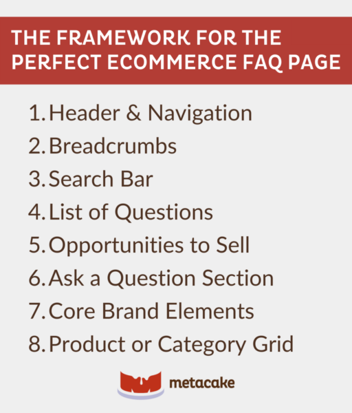
The Framework for the Perfect Ecommerce FAQ Page
Let’s dive into the page structure and design we recommend for a FAQ page. A good FAQ design is not only helpful to the customer but also boosts your conversion rate.
1. Header & Navigation
This first step may seem obvious, but it’s still important. Your site’s header and main navigation should stick across all pages so that it’s easy for users to find what they’re looking for, no matter where they land.
An example of a very simple, scannable FAQ page with the header and main navigation remaining across the top.
2. Breadcrumbs
No matter what page they land on, breadcrumbs are helpful for reminding users where they are in relation to the entire store. These will orient the customer and allow them to go back a step if needed.
Pipette provides a simple breadcrumb element at the top of the page.
3. Search Bar
Include a search bar toward the top of the page. This allows the customer to punch in keywords to easily find what they’re looking for. This is especially helpful if you have a lot of FAQs on the page.
Wanderer Bracelets has a search bar at the top of their FAQ page that will even provide suggestions as you begin typing in keywords for your question.
4. List of Questions
Now it’s time for the main event: the actual FAQs. This is typically presented as a simple list of questions and answers, but there are formatting options that can make it easier for the customer.
First, keep it scannable. Format the FAQs in a way that makes it easy for customers to get to the question they’re looking for. Some brands opt for using dropdowns where answers are collapsable, which makes the page’s content look less overwhelming.
For the answers to the questions, make them direct and easy to read. Including too much information will turn into a novel your customer doesn’t have time to read.
If you have more to say, it’s great to add relevant links to other pages where the customer can learn more. It can also be effective to include images and videos if a visual helps answer the question better.
Additionally, this page must look great on mobile. This goes for every page on your ecommerce store but is especially important for the FAQ page since it’s content-heavy.
Primally Pure’s initial FAQ page is very simple and scannable.
When the customer clicks on a category from the main FAQ page, they are taken to a new page with a list of relevant questions (which also collapse for easy scanning).
5. Opportunities to Sell
Most brands toss up a basic set of questions and call their FAQ page done, but that is a missed opportunity. Go the extra mile and find ways to sell your product even as visitors are reading through the FAQs. Throughout the page, you can merchandise product listings and highlight features, benefits, and differentiators from your competition.
From Primally Pure’s main FAQ page, the category “Skincare Regimen” links off to its own page with questions and answers, while also selling their products in a helpful way.
6. Ask a Question Section
Including a section where customers can ask their own questions is a great way to alleviate potential frustration and provide additional questions to add to your page. Consider including a form on the page where customers can submit questions they didn’t find answers to, or include a link to your customer service page.
Freedom Co. provides a form at the end of their FAQ list for customers to easily get in touch with customer service if they still have questions.
7. Core Brand Elements
Throughout the page, or toward the bottom of the page, include core brand elements that reinforce the philosophies you have described in answering these questions. This could be a grid or graphics that outline features and benefits of the products, a mission statement, or a summary of your brand story.
You could also link to your “about” page or blog posts that explain how your products are made and why you make them. All of these elements expand on the questions you’ve already answered and help sell your brand.
8. Product or Category Grid
Always include a way for customers to exit the page and hop back into the sales flow again. Toward the bottom of the page, include product listings or blocks of product categories to give the customer some inspiration about where to go explore next.
For example, a product grid of Best Sellers or Staff Picks would be a great element to include at the end of the FAQ page to route the customers back to the shopping experience.
Ready to Create an FAQ Page that Increases Your Site’s Conversion Rate?
FAQ pages play an important role in the customer journey and should not be overlooked. When designed strategically, the FAQ page can do an excellent job of disarming objections to purchasing, removing any sense of risk, and clearing up any confusion while also selling the customer on your brand. All of this can direct customers back into the purchase funnel and increase their confidence about a purchase, therefore increasing your conversion rate.
While you’re at it, make sure to check out our posts in this series. Together, they’ll help you build the perfect ecommerce store:
The Perfect Product Detail Page to Maximize Purchases
The Perfect Ecommerce Homepage (That Builds Trust and Sells)
The Anatomy of a Perfect Customer Service Page
And if you’re considering redesigning your website to serve your growing ecommerce business, check out our resources on conversion rate optimization:
Oh the Ways You’ll Grow (A Conversion Rate Optimization Guide)
Strategies for Ecommerce Revenue Optimization
[Video] Intro to CRO
[Video] Why CRO is the Lynchpin in Your Marketing Strategy
