It goes without saying that conversions are the fuel that powers the ecommerce engine. If you can’t sell enough of your product, your business will be unprofitable and will eventually fail.
So how do you determine if your ecommerce business is generating enough conversions? There are a few indicators that you might consider.
- One is your conversion rate. Is it less than 4%?
- Another indicator is the average order value. Is it insufficient to cover your clients’ average cost per acquisition?
- How about your paid marketing? Are you generating traffic but not seeing conversions?
What you may not be aware of is that your ecommerce site needs to guide your customers through nine key steps in order to complete a sale. If you miss even one of them, your website’s performance will suffer.
In this article, we’ll go over the steps your ecommerce site must take to optimize conversions, along with tips for improving (or fixing) your ecommerce channel for improved sales.
The Importance of an Optimized Ecommerce Website
Your website houses your brand’s ecommerce experience. It’s where the sale happens. Yet so many websites are designed and built without any real strategy in mind.
The homepage can easily become a collection of elements the marketing or leadership team wants displayed, not necessarily what the customers need to see.
Category and product pages are organized based on what the team thinks looks good, not what’s been proven to be the most useful to the customer.
Overall, no one really thinks about how to cater to different customer types and how to maximize the sale, rather than simply selling.

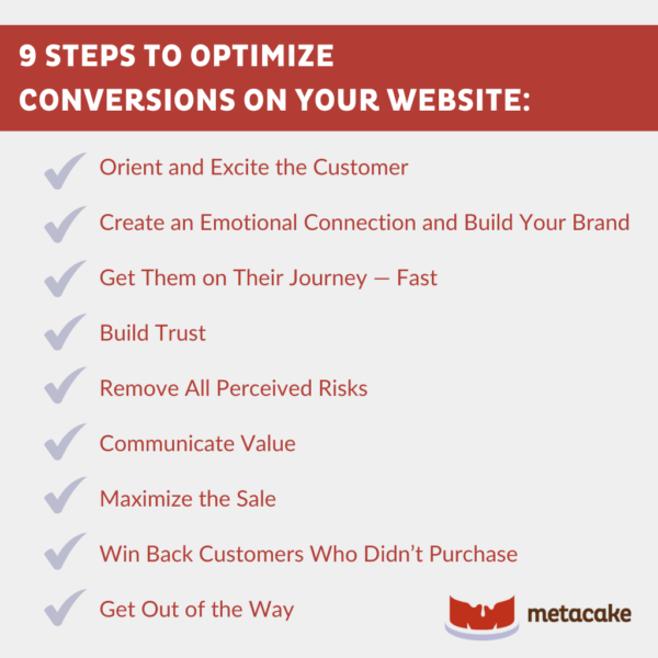
9 Steps to Optimize Conversions on Your Website
For over 10 years, Metacake has helped ecommerce businesses of all sizes grow through site design, marketing, and business strategy. We’ve discovered what works, and we’ll share with you nine critical steps to optimize conversions on your ecommerce website.
These methods work for any ecommerce platform — Shopify Plus, Magento, Woocommerce, etc. These elements are about the user experience, so they can be used anywhere. However, the execution is likely easier on some platforms than it is on others.
1. Orient and Excite the Customer
When a customer visits your website, you have about five seconds to engage with them before they potentially lose interest and bounce.
A stunning hero image should appear first on a homepage or landing page. Use an image that explains why they are here, ties to any marketing messaging that may have brought them here, and communicates why they should stay.
2. Create an Emotional Connection and Build Your Brand
Emotions, rather than information, are frequently the major motivators for making a buying decision. Consider expensive impulse purchases, such as a car or a laptop. If you bought one of those immediately, you most certainly felt an emotional draw toward the thought of owning this object and then justified your decision with rationality.
There are three “sells” required for any sale:
- The emotional sell
- The logical sell
- The time-based sell
To create that emotional pull for your customers, put your brand’s story front and center. This isn’t necessarily about who founded the company in what year (that’s usually boring).
Your story is about why you do what you do and what’s in it for your customer. What kind of life does your product help them live? This is all part of building your brand in the customer’s mind.
Once you’ve made that emotional brand connection, follow it up with logic by stacking the features and benefits of your product.
Even if you don’t make an emotional connection with the buyer and educate them about your business, you may still make some sales. However, it’s doubtful that you’ll have a customer who’ll return to make repeated purchases.
Doing everything you can to increase that lifetime value is crucial to developing a strong brand that’ll remain.
3. Get Them on Their Journey — Fast
The next step is to direct customers to the category or product page as quickly as possible before they get distracted and exit.
There are two types of shoppers that your site must accommodate: browsers and lasers. Your site design must accommodate both.
Make sure your homepage is carefully crafted with all your category options appropriately laid out. You’ll also need well-organized navigation that sells your product, directs traffic where it needs to go, and tells your story.
4. Build Trust
Another important step is building trust throughout the customer journey. This can be done through elements such as customer reviews and testimonials and a great warranty or guarantee.
Be sure to incorporate these throughout the customer’s path. For example:
- Incorporate customer quotes on the homepage.
- Add review stars to the category page’s product listings.
- Include customer reviews on the product pages.
- Prominently display your warranty or guarantee on the homepage and product pages.
Keep in mind that your brand story can also help build trust, as can standard site elements such as a secure checkout.
5. Remove All Perceived Risks
When the customer arrives at the product page, it’s time to present an offer they can’t refuse. Part of that is removing any perceived risks they see with making the purchase.
- Demonstrate the quality of your product.
- Clearly state your shipping and return policies.
- Highlight your warranty or guarantee.
- Provide excellent customer service and a simple way to contact a human.
Note: Having an appropriate margin is key to providing all of this for your customer. Having a quality product with great shipping options, free returns, a comforting guarantee, and helpful customer service is expensive for you as the business owner. That’s why we stress the necessity of factoring these expenditures into your product pricing, so you can afford to offer all of this as part of your brand experience.
6. Communicate Value
Another important step in selling is to communicate value on the product page. Many ecommerce stores just stick a product image, title, and price on the product page and hope customers will click add to cart.
The fact is, no matter what you sell, they can probably find a cheaper version of your product on Amazon. That’s why you’ll need to carefully craft what we call your irresistible offer on your product page.
This involves illustrating a value stack. You essentially show your customers:
- What they get.
- How valuable the product is.
- How much value it adds to their lives.
7. Maximize the Sale
Once the customer has purchased, it’s time to maximize the sale. There are a few ways you can do this:
- Post-purchase upsells: After the customer clicks “purchase” at checkout, direct them to an interstitial page with a limited-time offer for a product that’s complementary to what they just bought. If they add it, they’ll be charged and directed to the “thank you” page. If you’re on Shopify, you can use an app such as Zipify One Click Upsell or Bold Cashier for this.
- Cross-sells: There are a few places you could attempt a cross-sell on your site, but you’ll run the risk of distracting the customer from getting straight to checkout. For that reason, we typically set up automated email flows based on certain purchase behaviors to follow up with complementary products.
8. Win Back Customers Who Didn’t Purchase
Even if your website has a great conversion rate (say, 4%), you’re still losing 96% of customers who visit your site. Don’t let them get away!
This is especially important for customers who add products to their cart and don’t complete checkout. Be sure to have an automated abandoned cart flow to recover those customers who didn’t make it through checkout.
Additionally, be sure to capture email addresses as soon as they arrive on the site in case they don’t make it to the cart. Use a pop-up to display an offer or welcome discount in exchange for an email address.
Once you capture their email address there, have an automated pre-purchase email sequence ready to follow up with them that educates them about your brand, reminds them of their welcome discount, and markets your products.
9. Get Out of the Way
Last but not least is a reminder not to distract your customers. The art of designing a website that converts is accomplishing all the things we’ve outlined above without getting in your customers’ way.
- Your homepage can’t be too cluttered.
- Pop-ups shouldn’t be too annoying.
- Product pages need to display only the most important information above the fold.
- Your upsells and cross-sells need not distract from the purchase.
If your goal is to optimize your conversions, it’s all about striking a balance.

Ready to Build an Ecommerce Site that Converts?
Designing an ecommerce store isn’t just about creating something visually appealing. It’s about creating a website that’s carefully designed to encourage visitors to convert. Of course we want it to look great, but the priority is its capability to execute these nine steps in order to secure the sale.
This is precisely what we do at Metacake. We’ve designed and built hundreds of high-converting websites for the best businesses out there because we understand how to grow a brand from the ground up. We’ve accomplished this for brands like Groove Life, Gibson Guitars, and more.
If your brand is making six to eight figures per year but your site isn’t producing the desired results, we welcome the opportunity to help. Our team members are experts in conversion optimization for ecommerce websites. Give us a shout!
If you’re not quite there yet, we recommend The Perfect Ecommerce Website. This 70+ page guide describes the most significant pages of your website, the critical elements of each page, and the sequence in which they should be shown to complete the nine steps above. We’ve also supplied wireframes for each page to make it easier to get started with an optimal page design.
