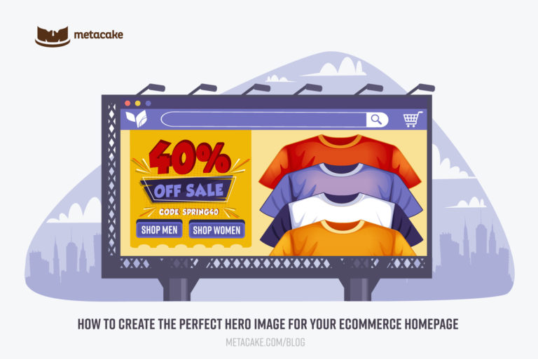
The hero image is the first thing visitors see when arriving at your ecommerce site’s homepage. While it may seem fairly simple, it is highly valuable to dig into what makes a hero image effective and then optimize as much as possible.
Research shows that you have about five seconds or less to win someone over when they land on your site. That means your hero image (also called the homepage banner) has the power to draw someone in or cause them to leave. And when you’ve spent so much time and effort on email marketing, Google advertising, Facebook ads, YouTube videos, and more just to get someone to your website, you can’t afford to have someone bounce quickly.
With that being the case, it’s crucial to learn how to construct a hero image effectively and to apply the right strategies. In this post, we’ll outline 7 hero image best practices and then walk through 6 things to consider when designing it for your site.
7 Qualities of an Effective Hero Image for an Ecommerce Website
1. Clear
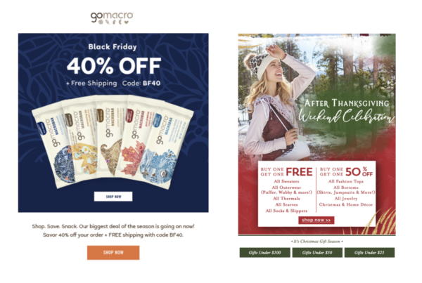
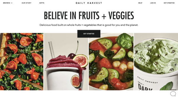
This image needs to be simple and clean as well as communicate clearly. Make sure it’s not overwhelming, cluttered, or confusing. Clarity is especially important for the hero’s messaging, particularly during sales. Oftentimes the best types of promotions are simple and straightforward, rather than tiered discounts. Check out the examples below for the difference clarity in a hero image can make.
2. Catchy
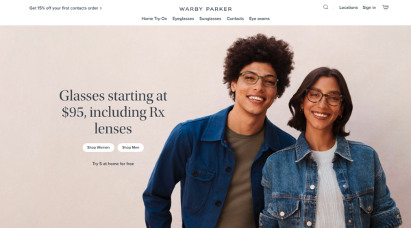
One of the hero image’s main jobs is to keep your site visitor on the page. To do that, the image and its copy need to be unique, interesting and tailored for your audience. Keep this in mind as you choose your image, color choices, font, messaging, etc.
3. Call-to-Action
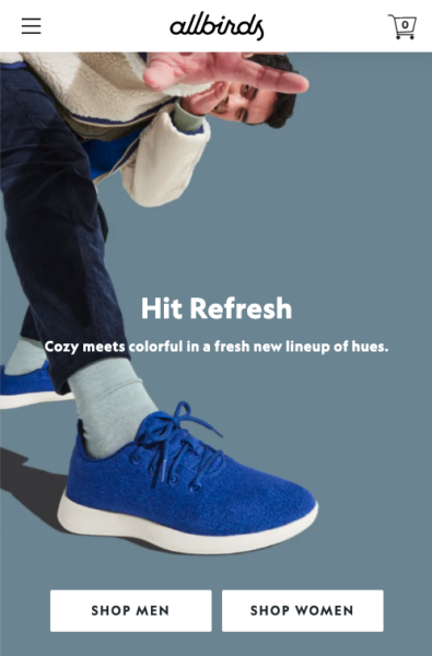
The hero image must provide some sort of action for the visitor to take. This CTA should be clickable and link to a category page or product page to start shopping. You could design a button over the image, or in some situations, underline text to make it clear that the text is clickable.
4. Adaptive
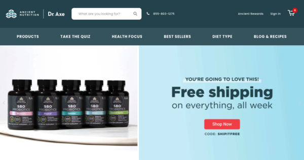
The hero image must be able to adjust to every screen size. Always test to make sure that nothing is getting cut off or distorted on mobile. It’s often helpful to create a separate hero image specifically for mobile, since a desktop hero image scaled down may not be legible. Take a look at the example below from Dr. Axe’s shop, Ancient Nutrition. Rather than just scaling down the desktop hero, the mobile hero stacks so the important sale info is still very visible.

5. Easy to Change
The hero image should be easy to swap out when needed. Sometimes hero images need to change quickly (especially during sales and promotions) and you don’t want to have to rely on your developer’s availability for this quick fix.
6. Single Slide
Every test we have done has shown that a single image works better than multiple images. Most customers don’t care about a second, third, or fourth image. It can also be frustrating for the viewer when they are trying to look at the details of an image and it keeps transitioning. Unless your brand has a definite need to show multiple products or messages in the hero image area, it’s best to stick to a single image.
7. Contextual
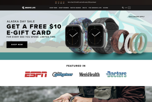
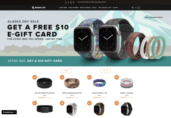
It’s also important to coordinate the hero image’s content with your marketing efforts. Oftentimes brands make their homepage the landing page for their marketing (ads and emails), and if that’s the case, it needs to be a seamless experience. If your ads are communicating a sale and they’re sending traffic to the homepage, the hero needs to reflect that. If the majority of your ads are for brand awareness and driving new traffic, make sure your hero image effectively introduces visitors to your brand.
Groove Life is a great example below. When they ran this sale, they included the sale hero on the homepage and collection page so no matter where traffic landed, they would see the sale details right away.
6 Tactics to Consider When Creating a Hero Image
Now that we’ve covered the basic hero image best practices, let’s get into a few more practical tips to keep in mind.
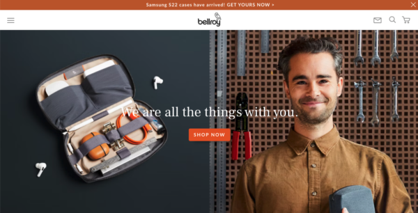
1. Be strategic about the image’s focus
The focus of your image can communicate a lot to your customers. Do you want to use this space to show off your product and who you are as a company? Or do you want to take this opportunity to use a lifestyle image that helps the visitor imagine what this product will look and feel like in real life? You’ll also want to be intentional about the emotion the image gives off. Should it be peaceful, inspirational, playful, grounding, exciting, or something else? Every brand is different, so the best place to start is knowing your customer avatars well.
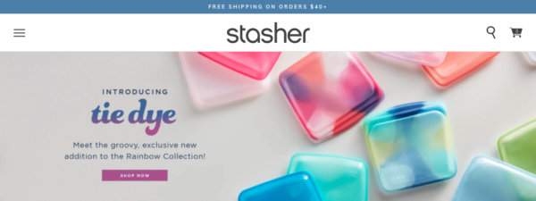
2. Be intentional with color
Color can be the difference between catchy vs. boring as well as inviting vs. off-putting. Of course, you’ll want to use colors that blend nicely with your brand and the rest of your website. But you’ll also want to choose colors with your customer avatars in mind. What will catch their eye and help communicate the emotion you’re going for?
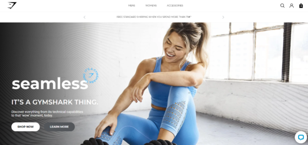
3. Make a bold statement
Space on the hero image is limited so be strategic with the copy on your image. It needs to be clear, bold, and intriguing enough to capture someone’s attention and make them want to stay. This messaging could be brand-oriented, seasonal, or promo-related.

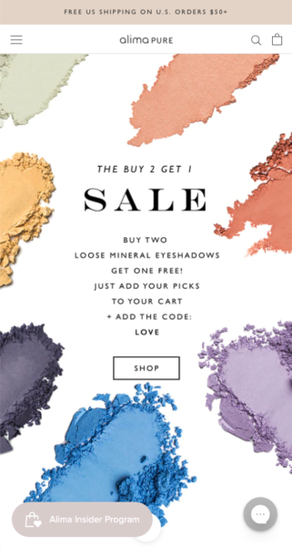
4. Include relevant details
If there is a sale going on, make sure the hero image not only reflects that but also includes relevant details. In the subtext, include important info such as coupon codes, when the sale ends, etc. Confused customers won’t buy (and many won’t even shop). So even if there is not a discount code, add some subtext near the CTA button that says “Discount reflected at checkout” or “No code needed!”
5. Always have a CTA
We mentioned this above, but it’s so important that we’ll repeat it! Always include a CTA button on your hero image. Make it obvious and very clear. And don’t forget to link it somewhere on the site. This could be a best sellers or featured collection, a sale collection, or even “Shop All”.
6. Create a desktop and mobile version
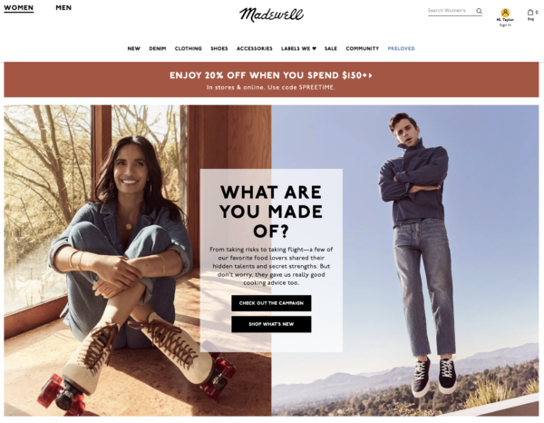
Above, we discussed the importance of the hero image being adaptive. Oftentimes this requires creating a desktop and mobile version of the image. Whatever you do, be sure to test what the image will look like on multiple screen sizes to make sure nothing gets cut off and that the text doesn’t shrink so small that it’s not legible. See below for another great example of a desktop vs mobile version, this time from Madewell’s site.

How to Measure the Success of Your Homepage Hero Image
While it may not be possible to get an accurate read on the success of your hero image specifically, there are a few metrics that are indicators of how it’s contributing to your homepage. Most importantly, take a look at the bounce rate for your homepage. If it is high, there is a good chance your hero image is not doing a good job capturing visitors’ attention and directing them where they need to go. You could also look at the click-through rate going through to the collection page that is linked to your hero image. This is indicative of how well your image, messaging, and CTA button are working together to get the customer to click. Finally, keep an eye on the scroll percentage for your homepage as a measure of how far down the page visitors go.
Ready to Make Your Hero Image the True Hero of Your Homepage?
When creating your hero image for the homepage (or even your collection pages), don’t just leave it to the whims of your designer. Just like any other element on your site, the hero image needs to be strategic. Follow these hero image best practices, be intentional about it and test different images and message variations for your audience. It can make a difference in your sales, especially during promotional periods!
