A case study involving luxury glassware & a significant boost in conversion rate.
A Lesson in Conversion Optimization
Ever wondered how to instantly boost your online revenue? The answer can be extracted from our recent partnership with a long standing luxury glassware company, called Lenox.
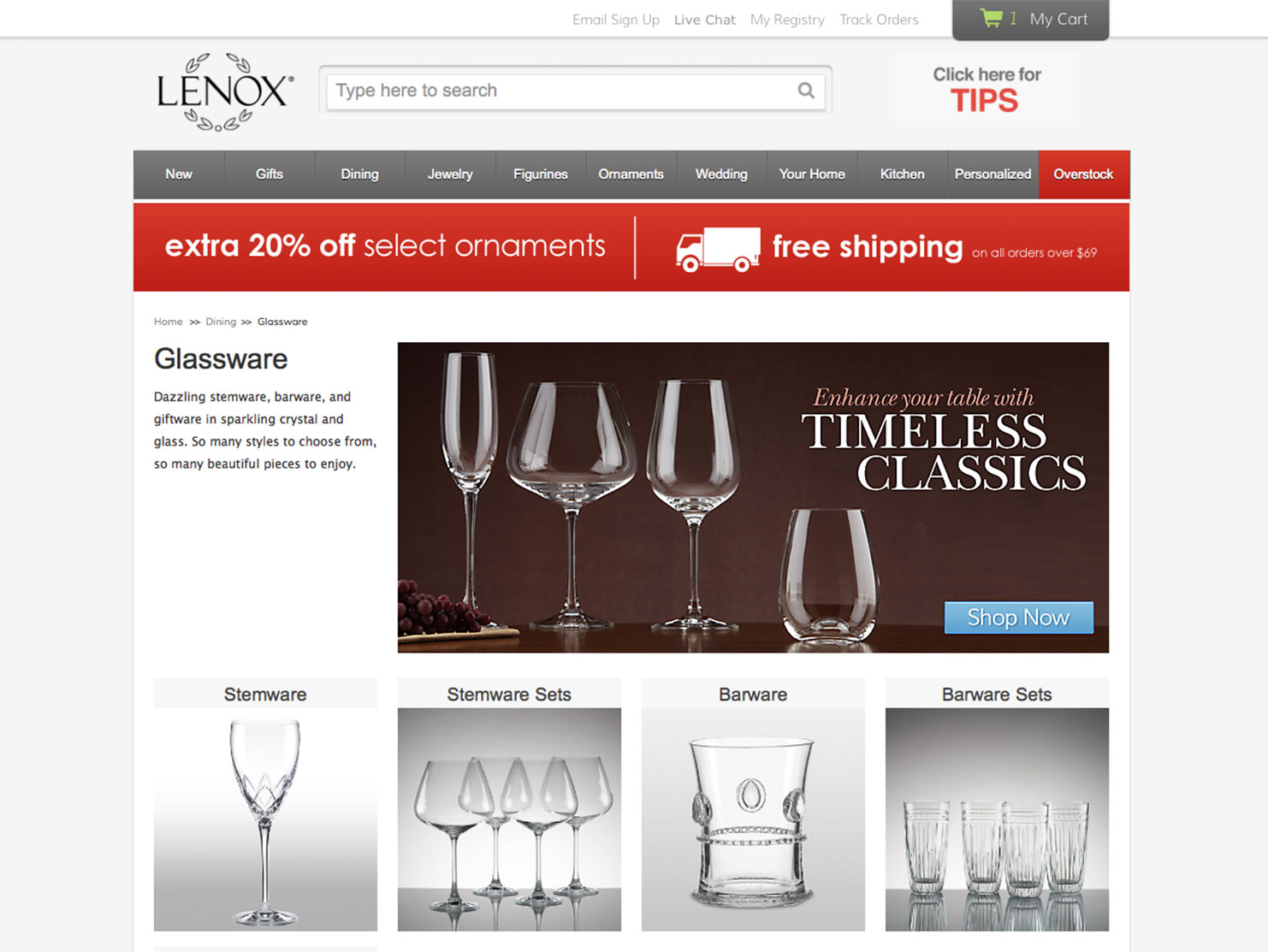
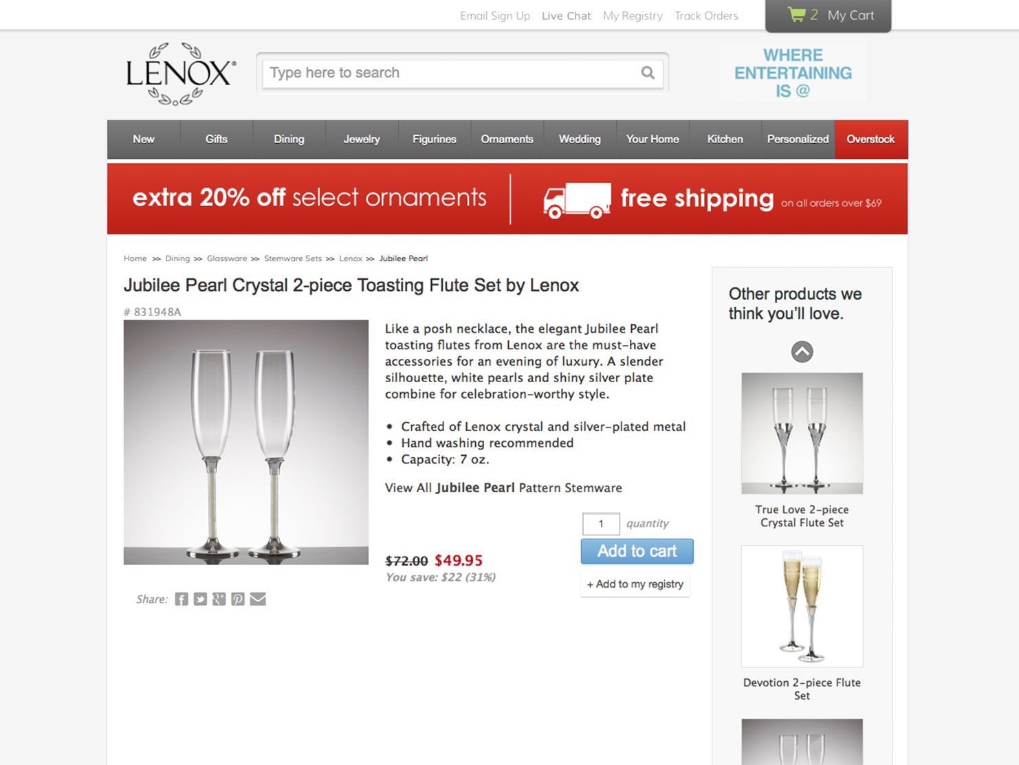
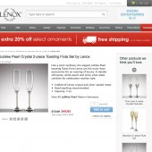
Lenox Corp came to us with a common problem. They had built a highly profitable online business, but it was using antiquated technology and had a poor user experience. Suspecting that they could boost their profit margins with a redesign, they brought us a challenge involving several layers of complexity.
ONE. Reengineer the user experience of a profitable website.
TWO. Redesign the user interface to appeal to two dramatically different audiences.
THREE. Navigate and optimize a technology platform with portions dating back to the 1980’s.
FOUR. Test and iterate the redesign on a highly trafficked site.
FIVE. Prove the success of the redesign via increased revenue.
SIX. Do all of it in time to go live for the busiest season of the year.
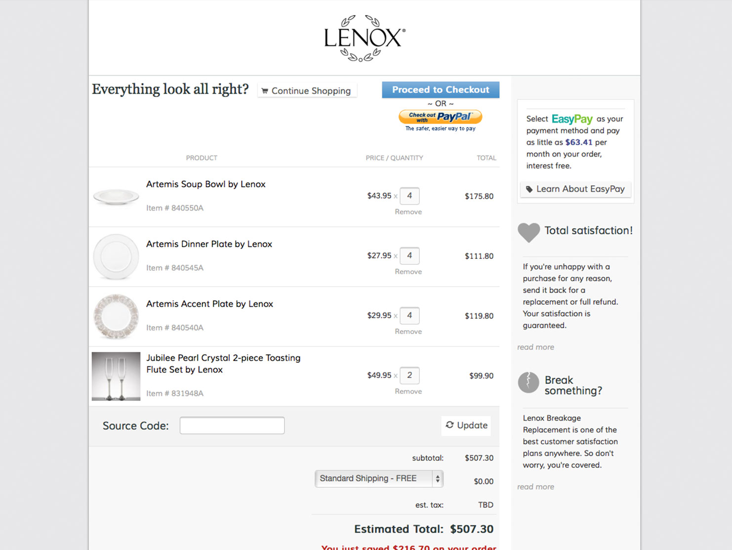
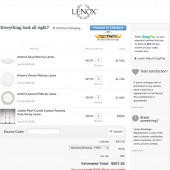
We launched the reengineered shopping experience for Lenox’s customers and observed a 24% boost in checkout conversions.
We launched the reengineered shopping experience for Lenox’s customers and observed a 24% boost in checkout conversions.
