In an ecommerce store, your checkout page is the last step in closing any sale. It’s the crucial final piece of your sales funnel, so it needs to operate in top form.
Because ecommerce platforms provide so much of this setup by default, it’s easy to forget about optimizing your checkout page design. While you don’t need to reinvent the wheel, it’s important to remember that small changes can make a big difference in your conversion rate (and your long-term revenue).
We previously talked about crafting the perfect shopping cart page — another crucial piece of your sales funnel. Below, we’ll outline the ecommerce checkout page design that ensures your store converts at the highest rate possible.
Identify the Goal of Great Checkout Page Design
The (obvious) purpose of your checkout page is, of course, to finish off the sale. But if we drill deeper into that purpose, we find some helpful nuance. In order to close the most sales, the page must make checkout as quick and painless as possible.
This is where intentional checkout page design comes in. To avoid losing customers who’ve made it this far, the page needs to keep them focused and minimize distractions. It needs to reduce friction and function intuitively.
If your product and shopping cart pages are designed well, customers shouldn’t click through to the checkout page just to see what shipping will cost or how their discount code will factor in. Only high-intent customers — those who’ve already decided to buy — should arrive on your checkout page.
Why Customers Exit the Checkout Flow
If the customer sees shipping rates, product prices, and promo codes earlier in their journey, such as on the shopping cart page, why would they abandon ship at checkout? Here are a few common reasons:
- Technical problems: You never want your checkout page to break, but that doesn’t mean you shouldn’t plan for such a scenario. Make sure customers can see an obvious and easy way to contact customer support in the event of technical issues.
- User experience problems: Even without breaking, your checkout page can pose obstacles to a smooth checkout. Since any element of friction can trigger customers to change their minds, target quick load times, mobile-friendly design, clear shipping options, a simple discount code process, and intuitive payment entry.
- Surprises: When customers discover surprises during checkout, they may exit without purchasing. Maybe shipping costs more or takes longer than expected. Or, maybe their discount code doesn’t work on the products they selected. Anticipating and addressing these issues before the checkout page removes unpleasant surprises from the final step of the process.
- Personal issues: Customers are only human, so despite a fantastic checkout page design, they may still get distracted or realize they don’t have their payment information handy. You can salvage these situations by following up with an abandoned cart email sequence.
Design the Perfect Checkout Page: What to Include
First, we’ll outline the basic structure of a checkout page, and then we’ll explore a few additional areas of opportunity.
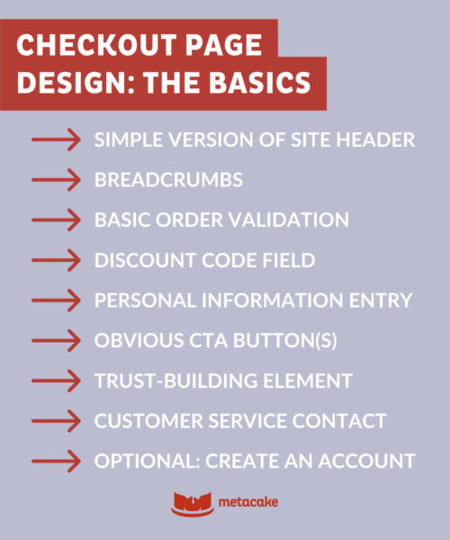
Checkout Page Design: Basic Structure
- Simple version of site header: Leave out your navigation menu to minimize distractions.
- Breadcrumbs: Allow the customer to return to the shopping cart page if they need to change items.
- Basic order validation: Include price, discounts, shipping, and tax.
- Discount code field: Make adding a discount code easy and obvious. Aside from shipping, discount code issues are probably the most common reason customers exit checkout.
- Personal information entry: This traditionally includes two to three steps for entering shipping and credit card information. Make this as easy and simple as possible, especially on mobile.
- Obvious CTA button(s): Under the personal information section, be sure the CTA button directing them to the next step stands out and uses clear wording.
- Trust-building element: Include a simple callout or logo that reinforces your checkout process’s security.
- Customer service contact: Use a button or link that opens a chat window, phone number, or email so users can get in touch with customer service easily.
- Optional: Create an account: Unless your business requires it, don’t force someone to create an account just to check out. This creates friction and loses customers who don’t want yet another store account. If you need to incorporate account creation, make the process as unobtrusive as possible. For example, allow customers to check a box to automatically create an account as they check out.
Checkout Page Design: Additional Options
In addition to the essential elements above, you can incorporate other potentially helpful components into your checkout page design. However, you don’t want to create distractions, potential bugs, or complications by throwing in too many extras. So, use these with caution and always test them before pushing them live.
More Payment Options
These days, you might consider several different payment options in addition to the standard credit or debit card. These include:
- Options for Apple Pay, Google Pay, or Shop Pay. Platforms like QuickPay and Shopify allow you to enable more modern payment methods that customers may prefer to use.
- Alternative Payments like PayPal or Amazon Pay. These payment options can sometimes cause technical issues, so consider them cautiously and be sure to test them. One important factor is whether your customer base often uses them.
- Post-Pay With Afterpay, Sezzle, etc. Post-pay options can increase conversion rates for stores with higher-dollar products. Of course, check that the investment on your end makes financial sense and, again, be sure to test.
Order Bumps or Upsells
Order bumps and upsells can be great for increasing the average order value, but they can also break your checkout process if you’re not careful. They can also distract buyers, potentially hurting your conversion rate. So, if you’re considering adding these to the checkout, proceed cautiously.
For most merchants, it’s safer to test order bumps and upsells in the shopping cart and leave checkout as the final step.
Subscription Payments
Subscriptions help increase customer lifetime value. If your product lends itself well to subscriptions, be sure you have a streamlined, simple-to-navigate user experience.
Subscription purchases typically require a slightly different process from one-off purchases. You’ll need to carefully consider how to customize your checkout page design for a smooth, functional process.
Post-Purchase Upsells
You might decide to try upsell offers after the customer hits the checkout button but before the “thank you” page appears. These can be effective, but they risk introducing technical complications, causing customer service issues, and hurting your brand reputation, especially when done poorly. We recommend thorough testing of post-purchase upsells before implementation.
Great ‘Thank You’ Page
Though technically not part of the checkout page design, your “thank you” page provides an opportunity to leave a lasting impression on the customer. Make sure it’s visually appealing, reads accurately, and offers a next step to help customers get excited about their purchase or use it successfully. Done well, a great “thank you” page can help create lifelong brand fans.
Abandoned Cart Emails
As mentioned above, automated abandoned cart emails provide a safety net for at-risk revenue from customers who’ve exited checkout despite your best efforts. They’re simple to set up and test, and you can make them unique to your brand.
How to Measure Checkout Page Design Performance
One easy way to measure the performance of your current checkout page design is to compare completed orders to incomplete orders. You can also look at your store’s conversion rate for each segment of the customer journey. What percent of customers drop off at each step? What factors could be responsible?
This is an important part of conversion rate optimization, and one you should watch consistently.
Ready to Optimize Your Ecommerce Store’s Checkout Page Design?
Despite its importance, checkout page design is often forgotten in favor of more exciting optimizations — product page design, paid ads, SMS marketing, etc.
Apps and tools can help you implement many of the optional elements mentioned here, but ultimately, the most important factor is a stable, fast checkout. (In our opinion, nobody does this better than Shopify Plus.)
If your store’s conversion rate needs help, start by making sure your checkout page design includes all the essentials above. Then begin adding improvements — with testing! — and keep an eye on your conversion rates.