Everyone knows that the shopping cart and checkout pages are critical in the conversion process. This is where the sale is closed and also happens to be a common point for customers to jump ship, so it’s critical to optimize these pages as much as possible.
Many brands skip the shopping cart page and just use a mini cart instead. A mini cart feature is great and should be used, but there is still value in a separate shopping cart page and strategy in its design as well.
Prior to Shopify gaining popularity among ecommerce brands and the standardization of the shopping cart and checkout pages, we would be hired by massive ecommerce companies simply to assess the checkout process. Why? Checkout impacts conversion rate, which impacts revenue. Even small changes on this page can be very impactful because it leads to small changes in conversion rate, which can lead to massive returns.
While there is no need to reinvent the wheel, most businesses have room to optimize the shopping cart page design for better conversions. In this post, we will consolidate all our experience optimizing these pages for other brands to detail the structure of the perfect shopping cart page design for your website.
What is the Purpose of the Shopping Cart Page?
Before we get into the structure of the page, let’s establish the purpose of the shopping cart page in the ecommerce store.
This is a critical step in the journey because this is the point where the user really considers the investment they are about to make. Until now, there was no real commitment. It’s common for customers to add products to the cart to hold on to them while they think about it. But once they reach the cart page, it’s time to debate whether they’re willing to hand over their money.
The function of the shopping cart page design is simple. We want to allow customers to:
1. Review their selections
2. Decide if they want to move forward (quickly)
3. Add on more products, edit the quantity of items in the cart, or remove items
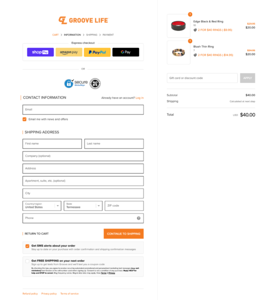
With that, let’s also remember that the shopping cart page is not the same as the checkout page. They have different goals, and the shopping cart page is able to be customized while the checkout page is not.
Our Framework for the Perfect Shopping Cart Page Design
Let’s walk through the framework for the perfect shopping cart page design from the top of the page to the end. Elements 1 through 5 should all be placed ABOVE the fold. The remaining elements should be situated below the fold to keep them accessible but not distracting.
1. Hello bar
This small bar across the top of the site is present on all pages to re-communicate sales, discount codes, shipping tiers, and more. It’s important to keep this present on the shopping cart page so the customer does not have to leave the page to find that information.
2. Simple header
The header across the top of the page can utilize the full menu or a condensed menu. Either way, the goal is to help the customer focus on the cart while also providing an easy way to get back to the store. At this point, the customer is still in the decision-making stage and potentially adding or removing products, so make it simple for them to navigate.
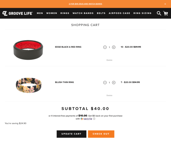
3. Product list
Provide a condensed list of the products customers added to their cart. Make it easy to view the products, update the quantity, or remove products.
4. Core decision-making information
In addition to the product list, include the elements listed below. These are important for decision-making at the shopping cart stage because we don’t want customers to have to go through the checkout process just to see this information:
- Price breakdown, including discounts: The visualization often helps make the decision.
- Shipping awareness: We don’t want customers heading all the way to check out just so they can find out what shipping will cost. This doesn’t mean you need to include a calculator; just a message with your shipping rate will work.
- Discount awareness: They don’t need to enter a code here, but provide a place for them to add it if they want to see the discounted price.
5. CTA bocks/buttons
Make CTA blocks or buttons easy to spot, including a link to continue to checkout and a link to continue shopping.
Optional: Some brands include an upsell or order bump near the standard CTAs as well. If you test this, be careful to not distract from or clutter more important elements.
Now, moving on to elements that fall below the fold.
6. Risk reversal
Risk reversal refers to any elements that can be added to help reinforce trust, which is critical for getting the customer to checkout. A few things you could use to reverse risk on the cart page include:
- Warranty or guarantee
- A customer review (or a few reviews)
- Info to establish brand validity (affirm that you are a secure, upstanding business)
7. Upsells
There is debate on whether to include upsells on the cart page, so if you choose to include them, do so with caution and testing! Every business is different, but for some, there are upsells that can work well when presented on the cart page. These could include:
- Add-on products or accessories that complement the items in the cart
- Bundles that provide great savings
- Special offers
- Order bumps
If you do test this, remember the key is to not distract or sway the customer from their purchase decision. The right scenario to use an upsell would be if they could score a really great deal by bundling products or if there is an accessory available that will add value to their purchase (and their life).
8. Customer support
Toward the end of the page, include a Live Chat feature or other option for them to easily contact your customer service team. It’s very helpful to provide a way for the customer to communicate if they are experiencing issues or if something is holding them back from going to checkout.
What NOT to include
As we’ve mentioned throughout this post, it’s very important to minimize distractions on the shopping cart page. That means this is not the place to ask customers to take a survey. It also means this is not the page to launch a newsletter or promotional pop-up.
How to Measure the Performance of Your Shopping Cart Page
Whether you’re curious to know how your shopping cart page is performing now or you want to take note of the data to measure improvement after you implement these changes, we definitely recommend looking at this in Shopify and Google Analytics.
The best metric to track is the click-through rate from the cart page to checkout. If you use upsells on this page, you can also look at add-to-carts for those upsells.
Ready to Optimize Your Shopping Cart Experience?
While the shopping cart page design is simple and straightforward, it’s still important to get right. If your brand currently skips this page and only uses a mini cart that sends customers right to checkout, we would encourage you to consider adding a cart page. Unless your store is extremely simple and only has one product, utilizing the cart page provides a huge opportunity to increase conversion rate and potentially average order value as well.