Now more than ever, shoppers are moving away from retail stores in favor of online shopping. This means your ecommerce store is facing tremendous opportunities for growth… but it also means that optimizing your site design has never been more important.
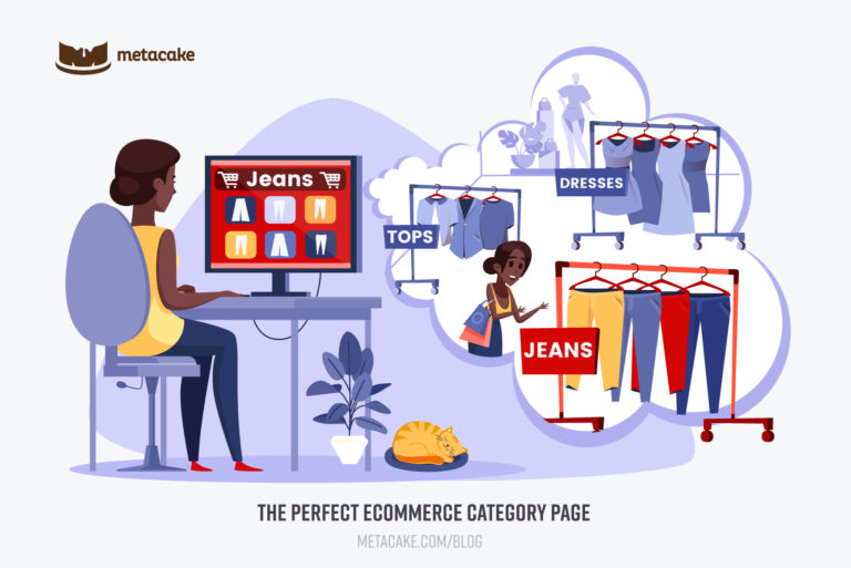
While homepages and product detail pages receive a lot of attention, don’t overlook the importance of your category pages (a.k.a. “product listing pages,” or, if you’re on Shopify, “collection pages.”) These pages do a lot of the heavy lifting in converting site visits to sales!
Think of category pages as personal shoppers for your brand. At their best, they route customers to the best products for them quickly, and they reinforce your brand’s story and build trust in your products along the way. At their worst, they’re clunky and cause leaks in your conversion funnel.
If you want your site to move as many customers as possible to a product page and on to checkout, it’s time to optimize your category pages. Not to sound overdramatic, but it can make or break your sales. Start by asking yourself…
- Are your category pages designed to best showcase your products?
- Are they easy to navigate? (I.e.: Are visitors able to find what they’re looking for and make a purchase decision quickly?)
- Do they work well for both “lasers” and “browsers”? (Ideally, your category pages will work well for both types of buyers—those who know exactly what they are looking for, and those who aren’t sure what they’re looking for and want to explore everything your site has to offer.)
In this article, we’ll explore the purpose of category pages, how to measure their success, and how to design a perfect category page that increases conversions.
The Purpose of a Category Page
Outside of having a place to list all of your products and categorize them, category pages have a deeper purpose. As you build yours, keep the following goals in mind:
1. Create Logical Organization
Breaking your product listings into categorized pages helps divide your product line into browsable sections that are easy for the user to navigate. Site visitors will bounce if they get lost in the abundance of products and don’t know how to find what they need.
2. “Sub-Brand” Your Products
Category pages provide an opportunity to “sub-brand.” If you offer a variety of products and each collection appeals to a different type of customer, personalize each category page to appeal to those unique visitors. Give the page personality, find places to insert the story behind the products, and frame the collection in a way that makes the purchaser feel at home.
3. Allow for Easy Browsing
Category pages also make it easy to “walk around” your store. As we already mentioned, some site visitors (the “browsers”) want to browse slowly and see all of the images and product descriptions. Others (the “lasers”) know what they’re looking for and want to get to checkout with as few clicks as possible. Your category pages can cater to both types of customers if you set it up well (which we’ll get into shortly).
4. Provide Key Information
Scannability is key with category pages, and there are several things that improve or hamper this. When a customer arrives at a category page, they likely just want an overview of what you have to offer. Don’t clutter your category pages with product details—that is what the “learn more” button under each product is for.
5. Allow for Easy Purchasing
A well-built category page provides an easy way for customers to purchase quickly if they know what they want just by glancing through the product listings. We’ll show you how to do this in the framework outlined below.
How to Measure Category Page Performance
How do you know if your category pages are performing well?
Ultimately, if visitors are clicking through your category pages, and they’re not getting caught on them for too long, these are good signs that they are serving their purpose.
However, if site visitors aren’t clicking on individual products, or they’re spending too much (or too little) time on these pages, these are signs that they are underperforming.
Your click-through rate, exit rate, and bounce rate reveal a lot about the health of these pages. For example, if the click-through rate is low or the exit rate is high, this may be a sign that visitors are jumping ship because they’re overwhelmed or frustrated.
If your category pages are underperforming, you should also consider whether your marketing could be at fault. Many ecommerce businesses use category pages as landing pages for their ads—and that’s just fine, as long as you’re sending traffic to pages that are specifically relevant to the ad. Make sure that the ad’s copy and images are consistent with the landing page, otherwise you may see a high bounce rate.
The Framework for a Perfect Ecommerce Category Page
Now that we’re clear about the purpose of a category page and how to measure its success, let’s walk through the features that should be included on these pages. We’ll assume that your site header and navigation are already present. From there, ensure that the following elements are in place:
1. Breadcrumbs
When site visitors arrive at a category page, it’s crucial that they know where they are in relation to your entire store, and breadcrumbs help with that. This is especially true if you’re sending paid traffic to category pages and new users need to orient themselves or go back a step if needed. This also improves the ability for a visitor to find what they’re looking for if the category page they land on isn’t quite right.
2. Page Hero
Include an image that stretches across the top of the category page. Don’t make it too tall, or it will push the product listings too far down the page. A simple brand image that includes the collection title will reinforce your brand and bring emotion to the page, bringing the products that you’re selling to life.
As we mentioned above, if you are sending traffic to category pages from ads, use a similar image in your ad creative. This consistency is called “maintaining the scent,” and it supports conversions by helping visitors get oriented to your site quickly.
3. Collection Description
Before your product list begins, we recommend including a short description for the page. Simply describe what the collection is for or share the story behind it. It should only be a few lines so that your product grid isn’t pushed too far down the page. You could also opt for a video here, or place a video further down the page to break up the product grid. Like the hero image, a collection description that is consistent with your ads will help orient the visitor to your site by “maintaining the scent.”
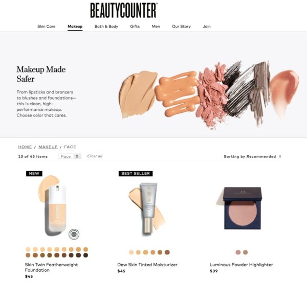
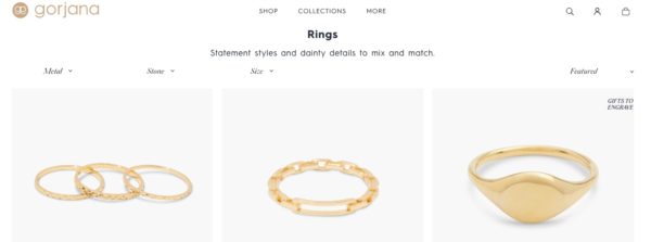
4. Sorting and Filtering
This is critical to the success of your category page, especially if the page includes a lot of products. Your job is to make it as easy as possible for customers to find what matters to them quickly and seamlessly. The more complex your product line, the more important this is. For example, if you sell shoes, sorting and filtering by gender, size, colors, styles, price, and more make that possible.
As you are building this feature, strive for a minimal but effective design. Ideally, you want your filter to be ever present, but as compact and unobtrusive as possible. We’ve provided a great example of a brand that accomplishes this below.
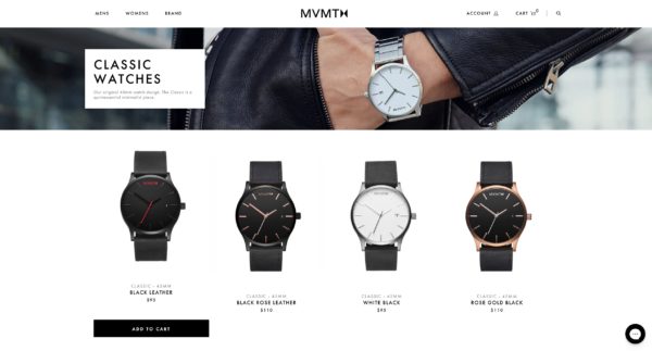
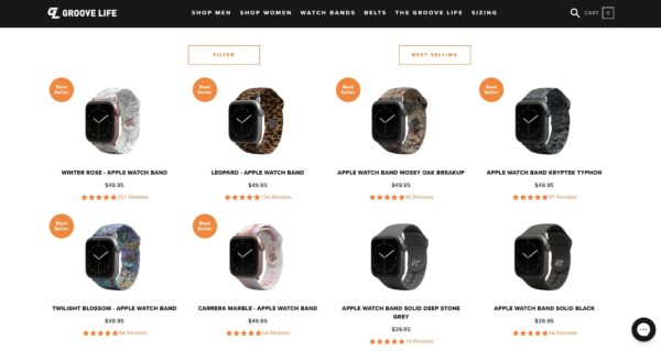
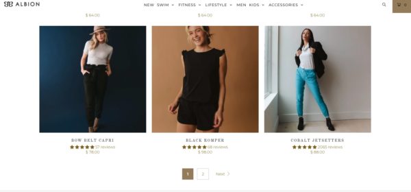
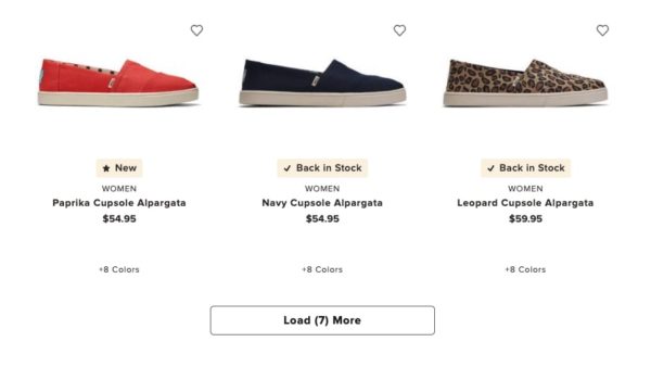
5. Product List
Your product list will be formatted as a grid of images (no more than four across on desktop and two across on mobile). Each product should feature an image, title, price, reviews stars, and a CTA button. Many sites also opt to include options like color, if that’s applicable. Here are a few things to keep in mind for each of these elements:
Product Images
Your product images should represent your product well, but they need to be easily scannable so as not to overwhelm site visitors. To accomplish this, consistency is key. Each image should have the same size and style. You’ll also want to frame the product shot so that the product is easy to see, even when the image is small on mobile. We typically recommend that the image background is the same color as the page background so the images blend seamlessly with the page. You can also feature multiple images for each product, as long as it is not clunky for the user to scroll through them.
Product Title
Be sure to include the full title for each product—don’t cut the title off or use ellipses. The titles will likely have varying lengths, but keep the number of lines consistent for each title so that the height of each row is the same. For example, if you have titles that require two lines, even titles short enough for one line should have enough height for two lines.
Product Price
Of course, you’ll want to list the price of the product below the title. When you run promotions, it’s important to show the discount here so the customer can visualize their savings.
Review Stars
Did you know that social proof is one of the biggest influences on a customer’s decision to purchase? Including review stars in your product list is a great way to offer social proof and increase click-through rates. By demonstrating the popularity of your product, review stars encourage site visitors to make their purchase decision more quickly and confidently.
Color Options
This is optional. Sometimes it’s beneficial for customers to see all of the color options on a product without clicking through to the product detail page. If that makes sense for your products, color swatches are the best way to go about this.
CTA
By default, we recommend using the “View Product” button as your CTA that leads to the product detail page. Pushing the user to the product detail page is better for tracking and gives you more room to sell the product. You can also use an “Add to Cart” CTA on your category pages instead of (or in addition to) “View Product.” We only recommend this if your product is a quick purchase, meaning your customer doesn’t need to read more to make a decision in general.
As a note, whichever CTA you choose can be ever-present or appear upon hover. Either option can work well, as long as they function well on mobile.
We get a lot of questions about whether having a “quick view” modal is helpful, and that really depends on your product. If your product tends to be a compulsive purchase, a quick view function could work. However, if it requires more investigation than a glance, the quick view might not be worth your effort.
6. Load More Products
Once your product grid reaches the bottom of the page, you’ll have to decide how to handle loading additional products. Some stores use numbered pages, others use a “load more” button, and others use “lazy load.”
We highly recommend using pagination. We believe that this option provides the best user experience because numbered pages act as a progress bar. With pages, it’s easy for the customer to know where they are in their search, as well as how large the collection is.
Whatever you do, shy away from “lazy load.” This becomes a never-ending page that is frustrating for the user to navigate.
Additionally, as a rule of thumb, we don’t recommend having more than 100 products in a single collection. Unless your filtering capabilities are really top-notch, it will become too overwhelming to browse effectively.
7. Bonus: Additional Creative Elements
If you really want your category page to stand out, break up your product grid with branded lifestyle images, elements of your story, or videos. These are key in reducing risk. This can be complex to build and you may be limited based on your store platform. But if you are able to put in the time to build something like this, it provides a much more unique, branded experience for your site visitors.
Ready to Create Category Pages that Drive Sales?
Category pages play a critical role in the customer journey. If your category pages aren’t converting, understanding their purpose and design elements is the first step.
With this guide, we’re confident you can build category pages that will give your customers the best shopping experience possible and boost your conversion rate.
While you’re at it, make sure to check out our other posts in this series. Together, they’ll help you build the perfect ecommerce store:
The Perfect Product Detail Page to Maximize Purchases
The Perfect Ecommerce Homepage (That Builds Trust and Sells)
And if you’re considering redesigning your website to serve your growing ecommerce business, check out our resources on Conversion Rate Optimization:
Oh the Ways You’ll Grow (A Conversion Rate Optimization Guide)
Intro to Conversion Rate Optimization
[Video] Intro to CRO
[Video] Why CRO is the Lynchpin in Your Marketing Strategy