ELEMENTS OF HIGH-CONVERTING ECOMMERCE LANDING PAGES (PART 5 OF 6)
Stylish and to the point, a high-converting ecommerce landing page evokes a mix of emotion — curiosity, logic, and intrigue. With the right ingredients, this cocktail creates the “it” factor that’s irresistible to your customers. The trick is to learn what they like.
Customers see these pages and reach for their credit cards or input their contact information before they even realize what they’re doing. Whatever these pages are selling, people want in on it.
How can you guarantee your ecommerce landing page will have the “it” factor? The answer is conversion rate optimization.
Conversions happen when carefully designed and tested elements come together to persuade your audience that they can’t go another day without your product. You can increase the likelihood of them doing this by testing each aspect of the page and then tweaking and improving based on hard customer intel.
Ecommerce landing pages will fall short without that data-driven direction. But with it, they can’t fail! So, build split testing into your landing pages to make the most out of your marketing campaigns.
Want to take your ecommerce landing page from eh to it? Let’s find out how.
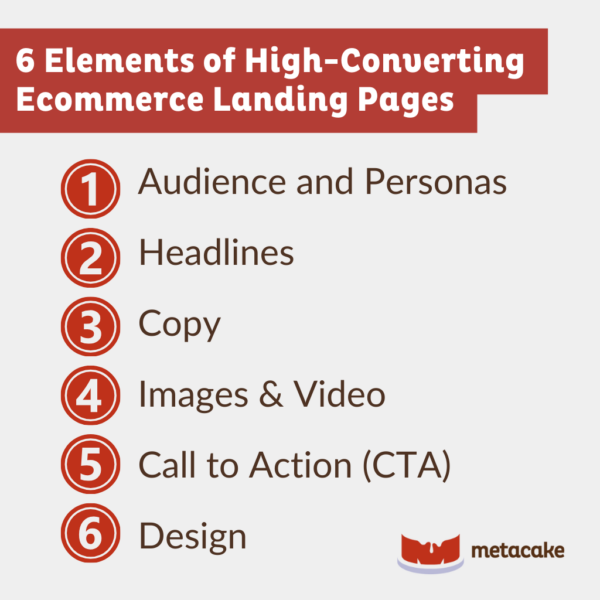
A Deep Dive Into 6 Elements of High-Converting Ecommerce Landing Pages
Audience and Personas
Thanks to our clickbait-crazed culture, you might think a sensational headline is your landing page’s most important element. But headlines play second fiddle to another essential component: audience understanding.
Without this, you can’t even begin to write an effective headline.
Landing pages perform best when you know your target customers and what interests, motivates, and scares them. Develop detailed buyer personas that include demographic data, customer values, and potential sales objections to learn who your prospects are.
Craft your landing page’s tone and design around these personas for maximum effect. If you identify several distinct personas, create multiple landing pages highlighting your value propositions for each customer segment and direct traffic accordingly.
Headlines
Don’t misunderstand us when we say headlines are second to audience understanding on the landing page hierarchy. Headlines are still extremely important to your landing page. They’re the first line of defense in preventing your audience from clicking away.
You only get 15 seconds to impress your visitors.
That’s it. 15 seconds!
So use your main headline to spark their interest, then follow that with a persuasive subheadline that keeps them on the page.
Intuit Quickbase’s landing page headline is a great example that gets to the point and compels people to try the product.
Headline: “The better way to organize, share & track marketing efforts”
Subheadline: “Be a hero. Improve productivity in minutes!”
Check out more great landing page headline examples on Unbounce’s post, 3 Essential Ingredients of Landing Page Headlines That Convert.
Copy
Copy encompasses all the written content that appears on the page. Write concise, conversational text that spells out what visitors stand to gain from your offer, and include customer testimonials to support your claims. You want to include enough information to give your potential customer all the tools they need to make a decision but not overwhelm them with details.
Draw on your buyer personas to address any potential conversion barriers, and write with your brand’s personality in mind. You want to create a consistent experience from the moment customers land on the page all the way through the checkout process.
Images and Video
These elements can be quite powerful when used appropriately. High-quality photos or a quick explanation video allow you to go more in-depth on your product’s benefits. Video is especially useful for breaking down complex elements.
But only use images and video if they enhance the landing page. Don’t make the mistake of thinking any video is better than no video. Including them just for the sake of it is a surefire way to annoy and repel customers.
Don’t believe us? Check out WordStream’s take on video landing pages.
Call to Action (CTA)
Here’s where you ask people to sign up for your newsletter, schedule a call, or buy your product. Test different types of action-oriented CTA copy to see which gets the best response.
Some sites choose a straightforward “Buy Now” while others remind customers of exactly what they’re getting with phrases such as “Download Your Free E-Book” or “Get Your Quote.” The CTA copy that resonates with your audience depends on who they are and what you’re selling. So, go back to your buyer personas and test, test, test.
Design
Design unites the above elements through color scheme, placement, and intuitive content flow. Add or remove elements and change subtle features until you find the most seamless, highest-converting user experience.
The design should be clean and uncluttered. But most of all, it needs to be centered around the conversion goal.
Even the best-looking landing page will sit and collect internet dust if you don’t test on a regular basis. What you think is a brilliant design feature may turn customers off, or your snarky-but-funny copy comes across as plain obnoxious.
Elements of High-Converting Ecommerce Landing Pages: Final Thoughts
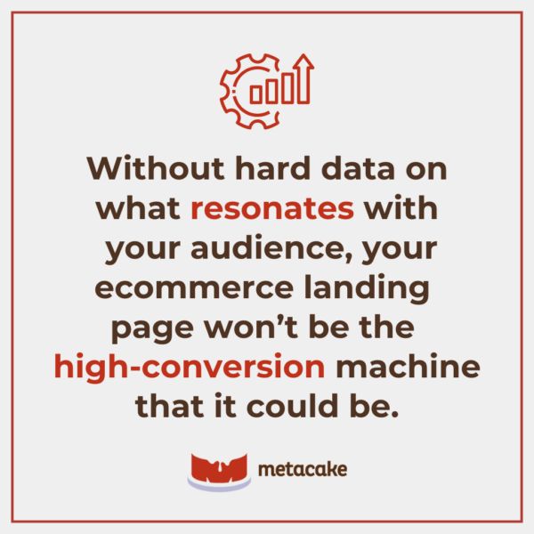
Without hard data on what resonates with your audience, your ecommerce landing page won’t be the high-conversion machine that it could be. You’re already spending time and money to drive traffic to your website – so start using these elements and make the most of it!
Need help implementing these six elements? Reach out! We love helping ecommerce businesses grow and thrive.