
Metacake assisted the Gibson leadership team in developing a detailed plan for investing in and growing their nascent DTC ecommerce channel. This led to Metacake developing their short and long-term strategy for building out the ecommerce channel. Metacake then functioned in a consulting role to support the implementation of the plan through the launch of the new Gibson and Epiphone ecommerce stores.
Learn More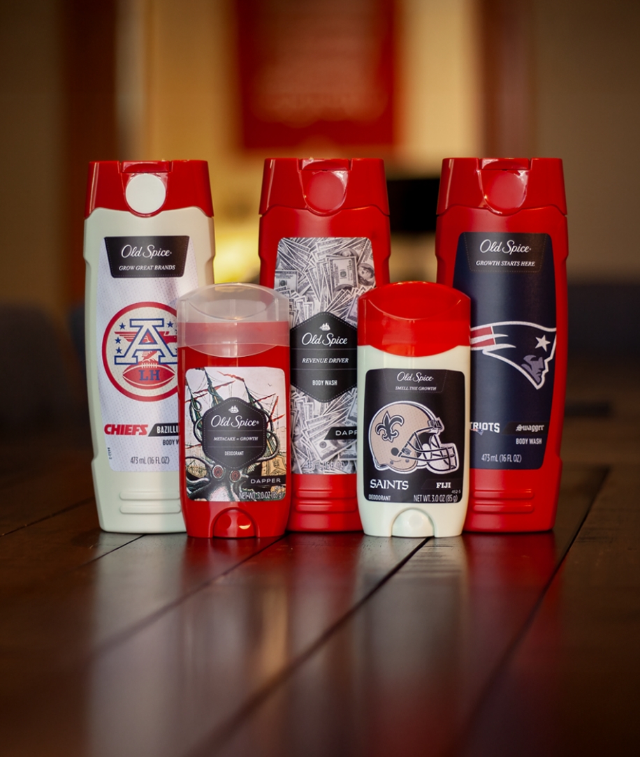

Looking to innovate even further in DTC ecommerce space, P&G wanted to create a personalization store for Old Spice. Metacake set up this personalization store leveraging the BigCommerce platform. Starting off with labels for 6 NFL teams, along with some custom Old Spice labels, visitors can customize their own body wash and deodorant, selecting the style, scent, and title.
Learn More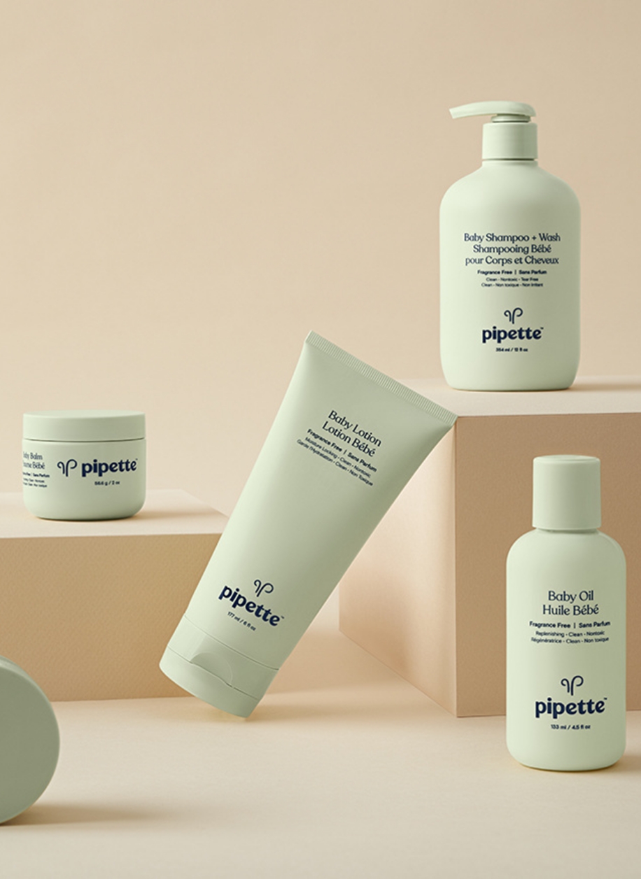

Pipette is a newly launched brand for clean baby care. This is a fully custom Shopify store. Metacake handled the development from the ground up of several of their Shopify store pages, intermixing content and products seamlessly.
Learn More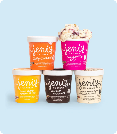

Jeni’s migrated their online store to Shopify Plus. During the process, they had some challenges integrating Shopify with their backend fulfillment system. The Metacake team was able to diagnose the issues and develop a solution. The Metacake team did some custom API work in Shopify and ShipStation in order to get their data flowing smoothly. The solution improved the customer experience and saved the Jeni’s team a ton of time.
Learn More

In order to fully integrate content and commerce, we used a unique method of embedding Shopify Plus buy buttons within content on the content site. Now when you add something to cart on Tony Robbins, you are linked directly to the Shopify cart along with all the tracking data necessary to attribute marketing campaigns.
Learn More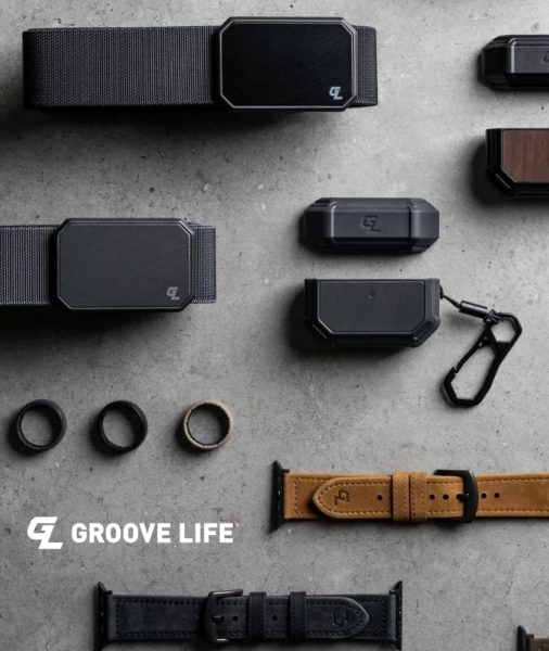

Metacake’s passion is for helping grow brands that matter, believing that customer-focused brands with authentic missions help build a better world. Groove’s mission and values were strongly aligned with our own and we saw massive potential for the brand. As a result, we were eager to come alongside Peter to help drive strategic growth for the company by unlocking several areas of opportunity.
Learn More“The Metacake team was so responsive. The work they did was exactly what we were looking for! I appreciated their proactiveness and working directly with ShipStation to figure this one out. I can’t tell you how helpful it was to not be stuck in the middle between several different parties.
We loved working with the Metacake team!”
– JENI’S SPLENDID ICE CREAMS
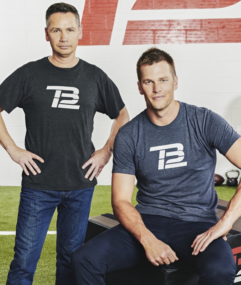

TB12 Meals features a collaboration between TB12 Sports, the health and wellness brand co-founded by Tom Brady and Alex Guerroro, and subscription and delivery meal service, The Good Kitchen. We developed this ecommerce store on Shopify Plus. The store features subscriptions, powered by ReCharge, and many custom features and design elements.
Learn More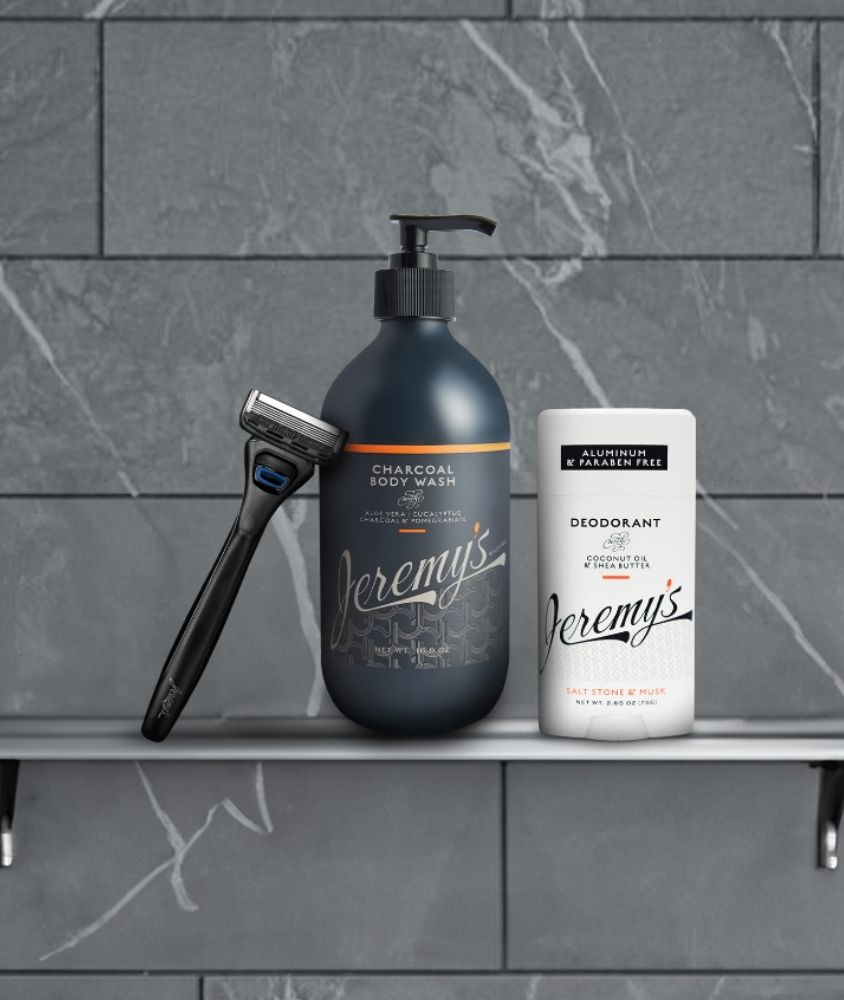

Metacake’s engagement with Jeremy’s focused on laying the groundwork for foundational growth and creating a strong, cohesive brand identity. Our work began by defining the brand’s core values and customer avatars—both for Jeremy’s loyal audience and new, non-DW customers.
Learn More

Country Nation was an ecommerce selling experience that sold product through video content pushed out through episodes. This collaboration was in partnership with Walmart and Brad Paisley. Metacake handled the branding and ecommerce platform design.
Learn More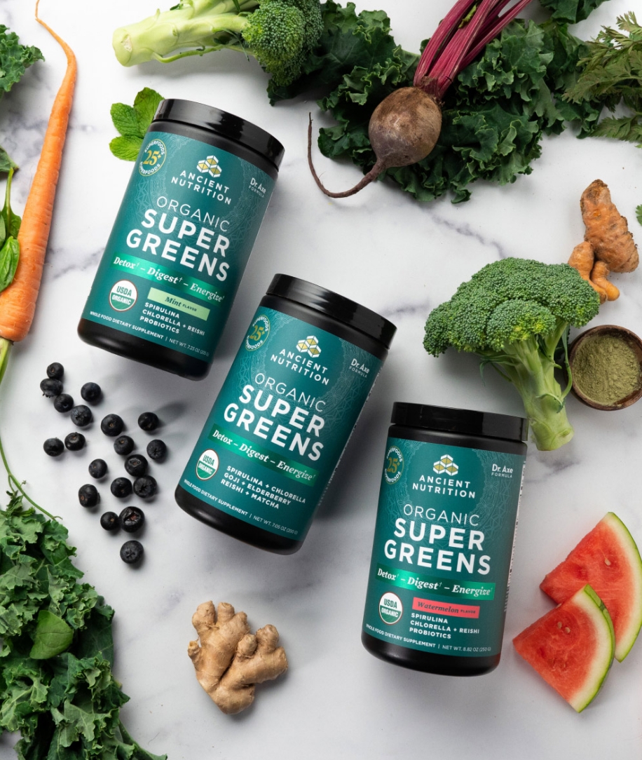

“Metacake did great work for us. They were responsive, fast and conversion focused. I’d definitely recommend working with them.” Michael Danner, Vice President Digital Marketing at Dr. Axe
Learn More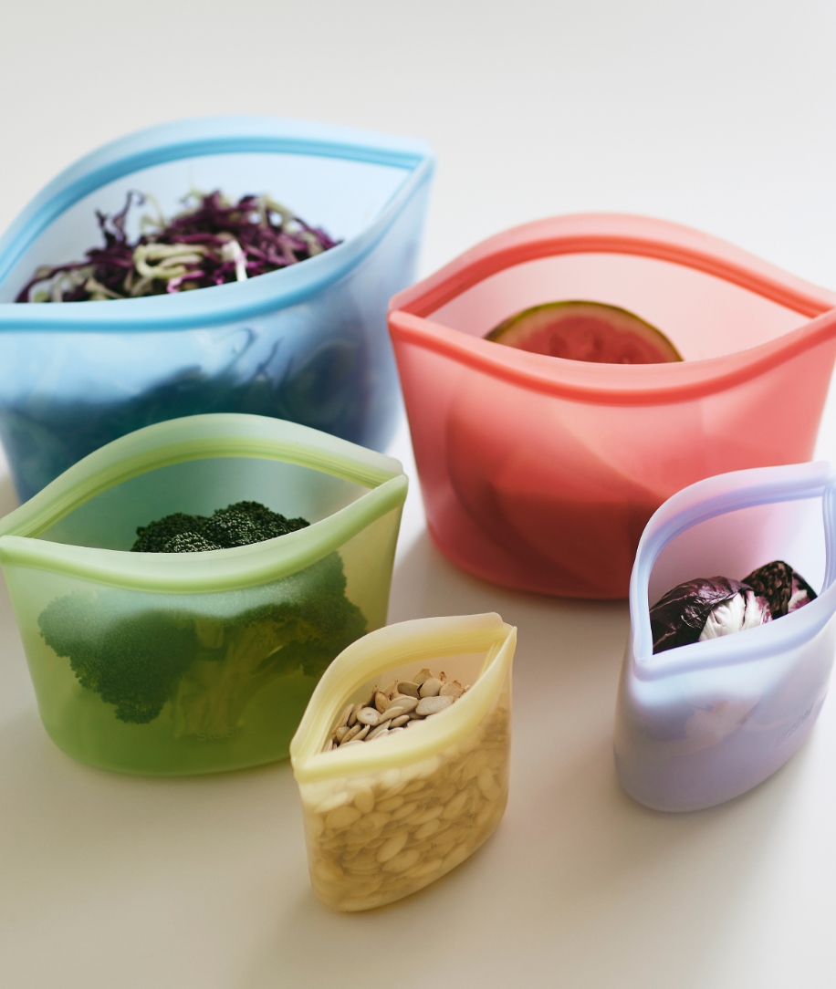

Metacake worked with the Stasher Bags Team to implement a complete solution for their wholesale B2B business. Due to their unique needs, this involved designing and developing a headless custom web app powered by Shopify for sales order entry as well as setting up and customizing Shopify Plus’ Wholesale channel for smaller accounts.
Learn More

Dockers came to us seeking a more scalable online store. With the goal of having the best online shopping experience for their customers, as well as the agility to meet their customers’ evolving needs, Metacake redesigned, developed and launched Docker Shoes’ new online store using the Shopify Plus platform.
Learn More
Metacake's expertise in solving complex Shopify implementation issues and creating effective solutions for merchants made them the ideal partner for Ollies. Metacake worked closely with Ollies' creative team to bring their values to life through custom icons, imagery, and a distinctive, playful design that captured the essence of the Ollies brand on the Shopify platform.
Learn More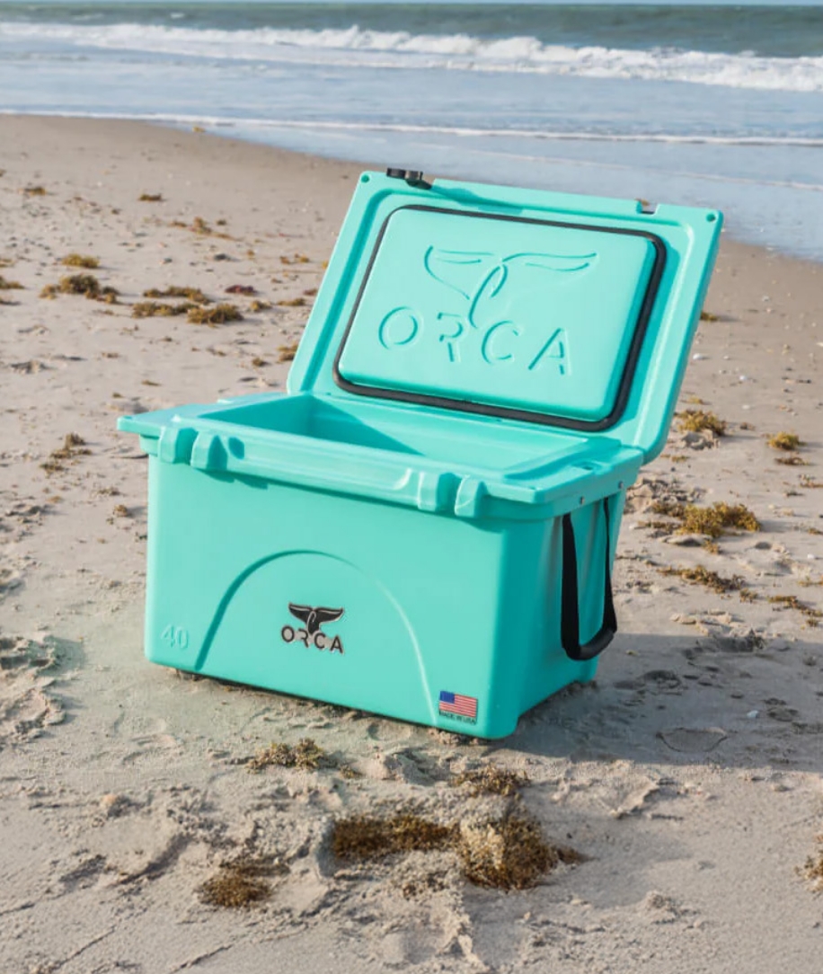

ORCA has grown to become one of the leading outdoor brands in the US. The Metacake team helped ORCA design and build an DTC ecommerce store that reflected their refreshed branding and innovative products on the Shopify Plus platform. Our team was able to implement several customizations to meet the need to elevate the brand and customer journey.
Learn More
Metacake teamed up with Revolution Pictures and Cars.com to bring the Women of Ford microsite to life, delivering a tailored demo that blended female-centric content with actionable tools. We shaped the concept to resonate with women shoppers, designing and developing a sleek prototype that showcased video content, articles, and a dynamic car finder quiz integrated with Cars.com’s data for real purchase potential equipping Ford with a production-ready concept that showcased creativity and shopper-focused design.
Learn More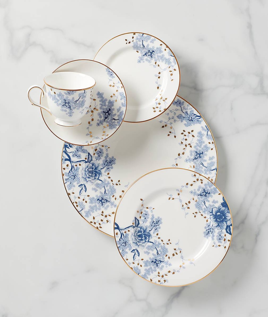

Lenox Corp came to us with a common problem. They had built a highly profitable online business, but it was using antiquated technology and had a poor user experience. Suspecting that they could boost their profit margins with a redesign, they brought us a challenge involving several layers of complexity.
Learn More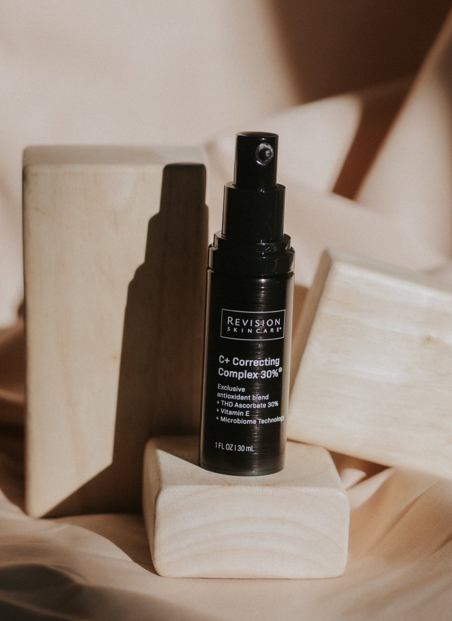

Metacake helped Revision Skincare launch their ecommerce business on the Shopify Plus platform with several customizations to both the store functionality and the checkout. One example of this was integrating with their backend system to pull in data on all of their skincare professional partners to the ecommerce site, allowing customers to find and select a skincare professional near them.
Learn More

Metacake partnered with HealthStream to bring their world-class educational content to a direct-to-consumer ecommerce platform. We created a custom Shopify Plus store experience specifically designed to make HealthStream’s educational products easy for customers to find and purchase.
Learn More

Metacake partnered with Mariners Learning System on expansive engagement covering full rebranding, marketing strategy that included email and paid acquisition channels, content strategy, and a full website redesign and migration to Shopify Plus.
Learn More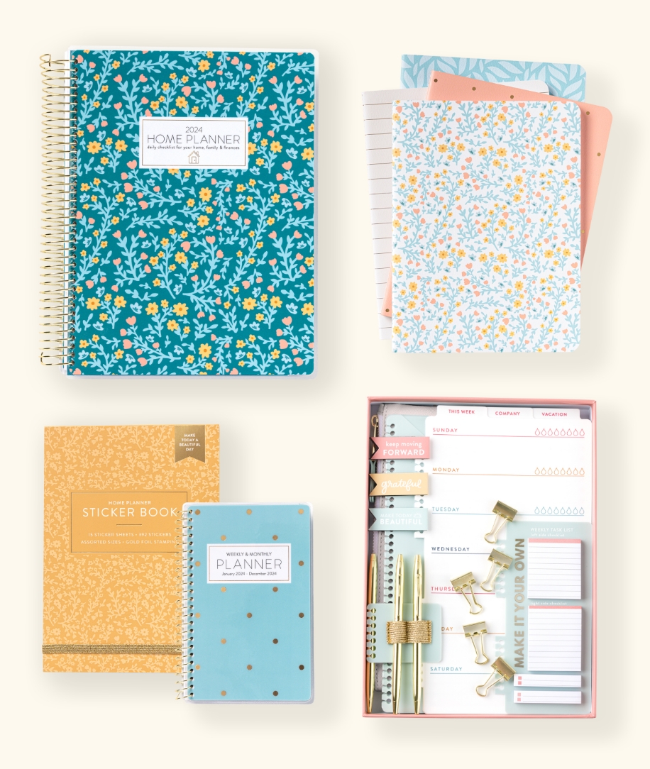

The Passionate Penny Pincher initially came to Metacake for coaching to reach growth goals and identify areas for opportunity and expansion. This project developed into brand positioning and alignment, redesigning and rebuilding their Shopify store, and helping manage marketing initiatives, primarily in the email channel.
Learn More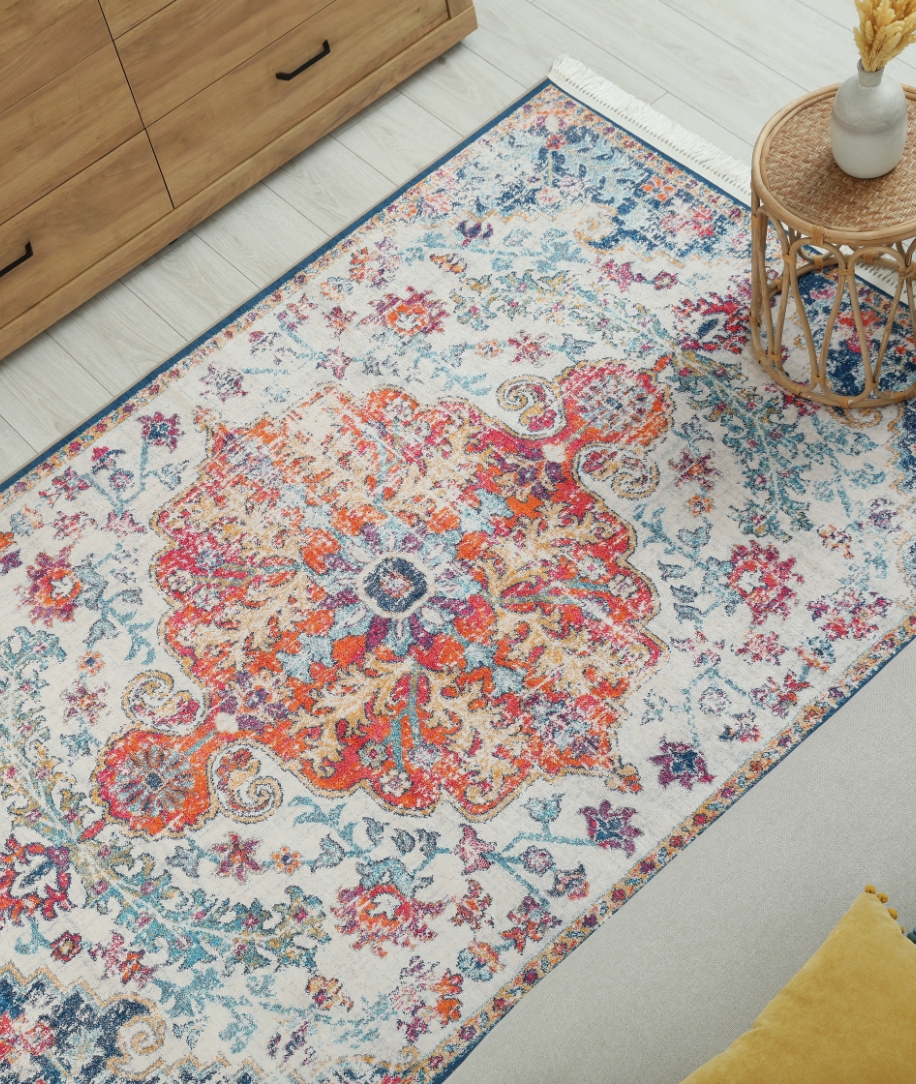

Shopify Plus recommended Metacake to assist Nance Floors with their store migration and B2B system modernization. Nance Floors wanted a platform where they could manage all products, set custom pricing for different customer groups, and control access.
Learn More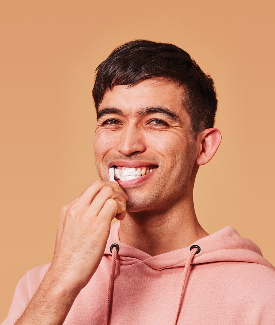

As a new brand, Tend wanted to launch an ecommerce store as a proof of concept for their oral spa brand. We built this store to match their existing style guidelines and incorporate it seamlessly into their primary site. In addition to their store, we set them up on Klaviyo to manage their email marketing. This included the design of 3 automated email sequences for abandoned cart, pre-purchase, and post-purchase to bring customers back to the site and drive sales.
Learn More

The Metacake team partnered with the Midland Radio team to migrate the Midland Radio site to the Shopify Plus platform. This decision to take advantage of Shopify’s secure and scalable infrastructure will make the site easier to manage for the Midland radio team moving forward. These benefits along with a significantly improved customer experience will enable the expansion and growth of the business online.
Learn More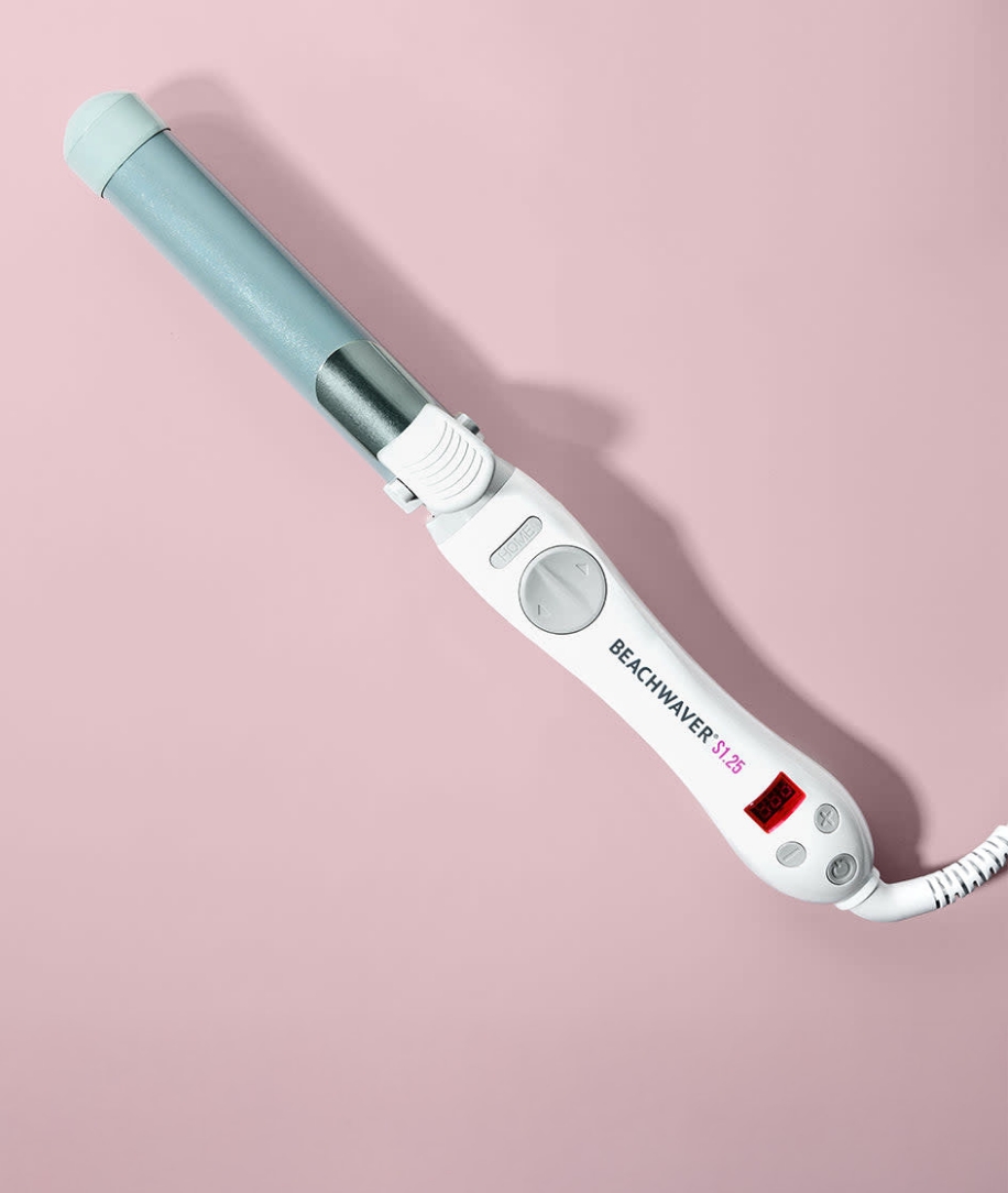

Beachwaver engaged in an email consulting project with Metacake, wherein we conducted a comprehensive review of their store and email marketing channel data. Through this in-depth assessment, we identified a number of challenges and opportunities in their customer journey, and some ways that they could improve their overall shopping experience.
Learn More

Metacake partnered with The Christmas Light Emporium to rebuild their ecommerce store on Shopify’s Online Store 2.0 theme. Our main goals were to improve the overall customer experience and enable further expansion and growth of the business online.
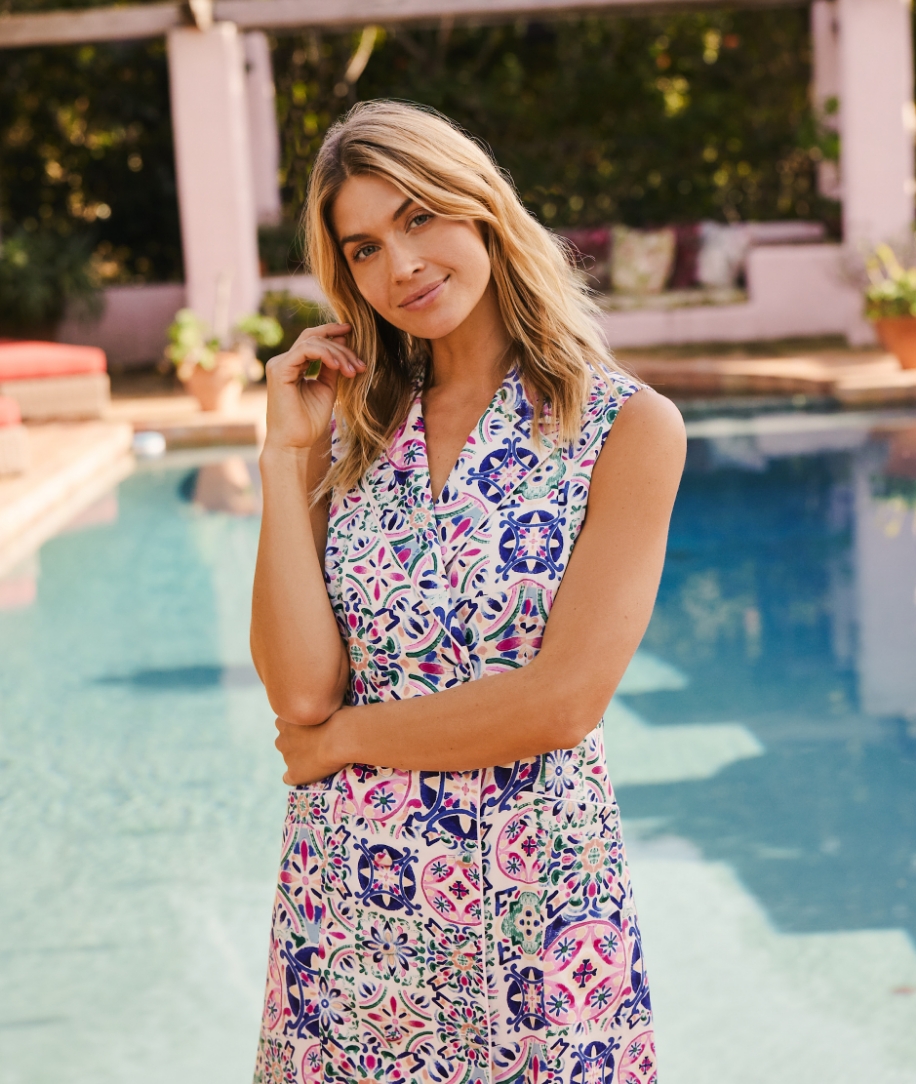

Metacake partnered with Hermoza on an engagement focused on realigning their brand messaging to connect with their ideal target customer. We then overhauled their email marketing strategy and execution to significantly increase subscriber engagement, purchase conversion rates, and customer lifetime value.
Learn More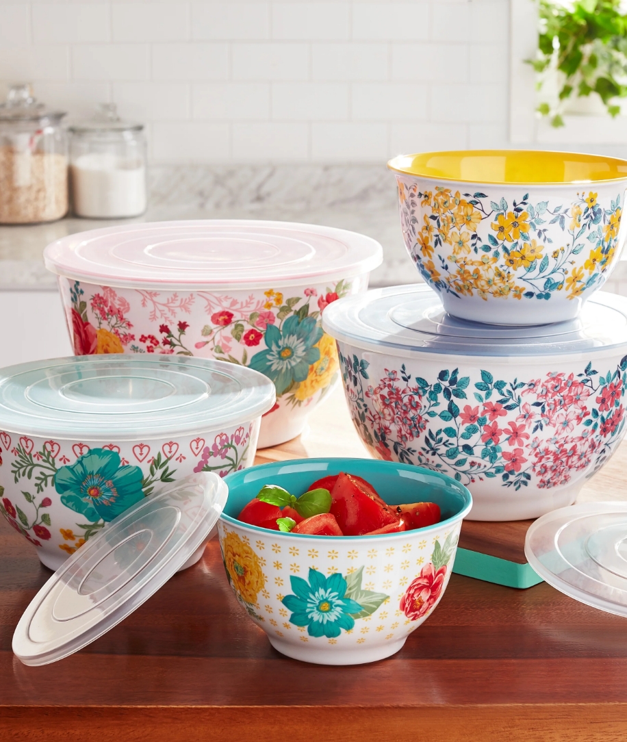

“At The Pioneer Woman Mercantile design is very important to us. When it came to refreshing our Shopify store we were looking for an experienced partner that understood our vision and reflected our retail store’s beauty in the online experience. Additionally, Metacake has delivered strategic value by helping us improve our store experience which included navigation updates, improved user-flow, out-of-stock notifications and many more. We are excited to partner with Metacake and create an incredible experience for the friends that visit our online store everyday.” Taylor Potter, Director of Ecommerce, The Pioneer Woman
Learn More

For Elvis Presley’s Graceland, we migrated their official store to Shopify Plus, including a full redesign, custom development, and integration with their existing ERP system. We also provided email marketing services, store optimization, and ecommerce strategy.
Learn More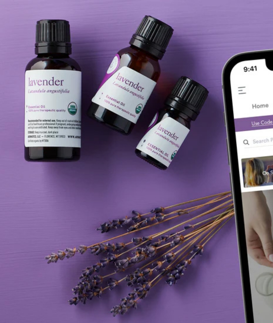

Metacake worked with both Aromatics and Aromahead to develop and optimize their email marketing channels for increased customer engagement, loyalty, and sales. Metacake has developed new automated email flows, provided valuable feedback on email campaigns, helped with strategic customer segmentation, and informed their monthly promotional strategy.
Learn More

Metacake co-founded Naturalite alongside Jabez el Israel, taking a movement for all natural weight loss and clean, healthy living and launching it into a full-scale brand. Leveraging our proven expertise in ecommerce growth, we built a cohesive brand identity, launched an optimized Shopify store, and executed strategic product development, operations, and multi-channel marketing. The result: 7 figures in revenue in year one, 2X organic growth, record-breaking Q4 sales, and a thriving community proving the power of our growth levers in action.
Learn More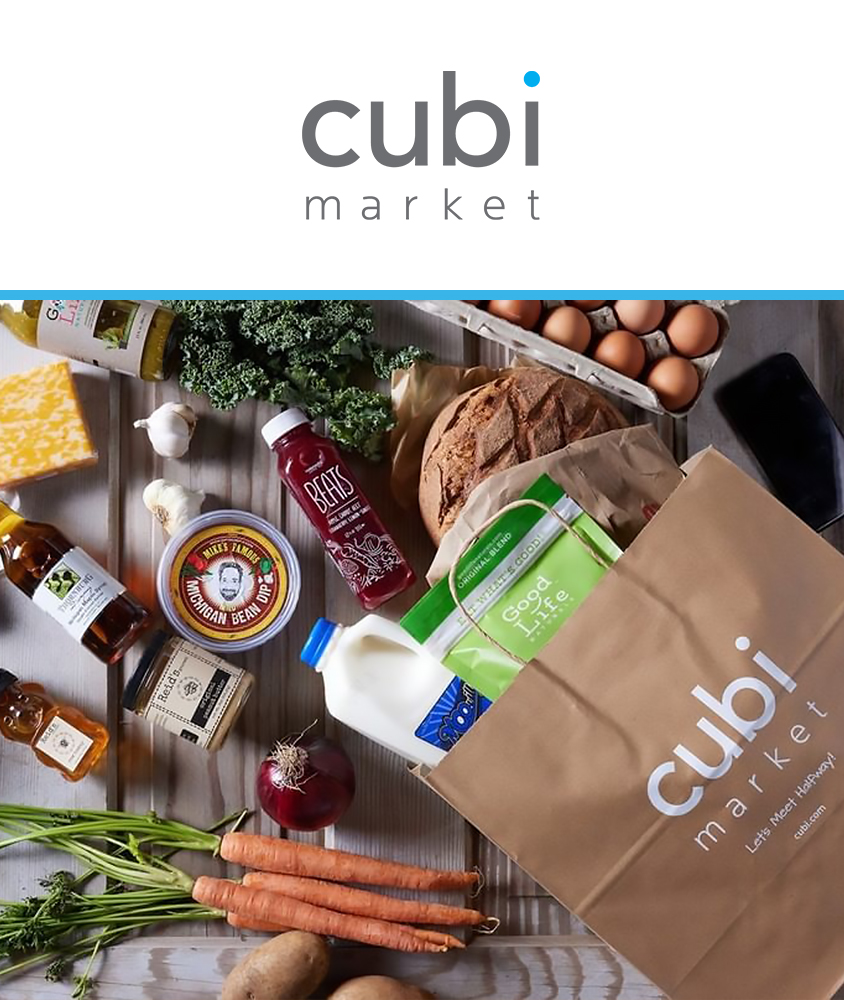

We partnered with the Cubi team to modify the designs of key store templates with the goal of improving the customer experience and increasing conversion and engagement. After reviewing the store’s data and making the necessary design updates, customers now have a much easier checkout experience.
Learn More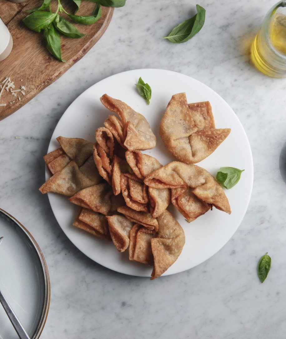

rootberry came to Metacake as an innovative food startup offering local delivery while also launching into the retail grocery channel. Metacake partnered with the rootberry team to build the best ecommerce strategy for launching their online store and delivery business.
Learn More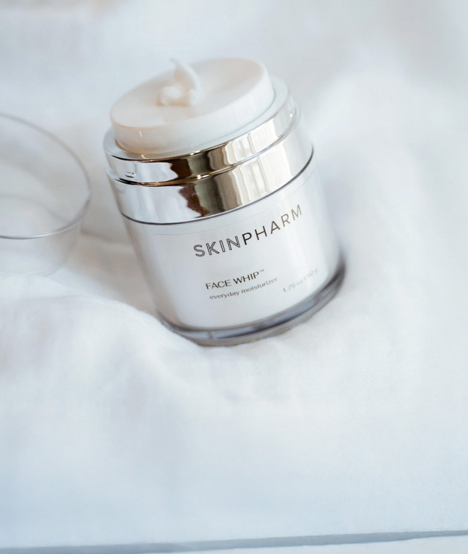

Metacake partnered with Skin Pharm to migrate their site and online store from WordPress/WooCommerce to the Shopify Plus platform creating a better customer shopping experience and put in place a platform to support the growth of the business.
Learn More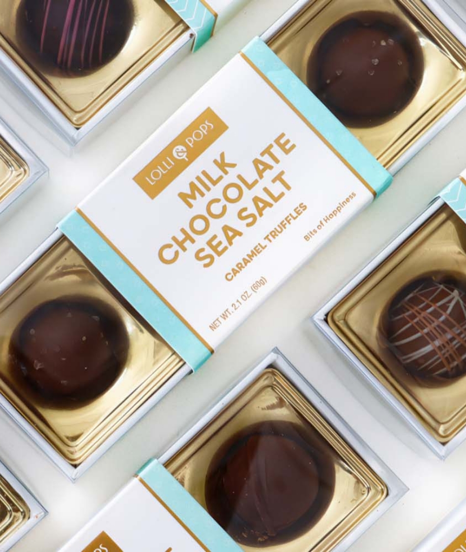

Lolli & Pops came to Metacake with a beautiful, complex and highly custom existing Shopify store, but were having slight troubles with their analytics and tracking customer activity. Metacake functioned as their trusted Shopify Plus partners.
Learn More

Cascadia Vehicle Tents came to Metacake with the objective of migrating their existing website from Magento to Shopify Plus and to fully redesign their store in the process.
Learn More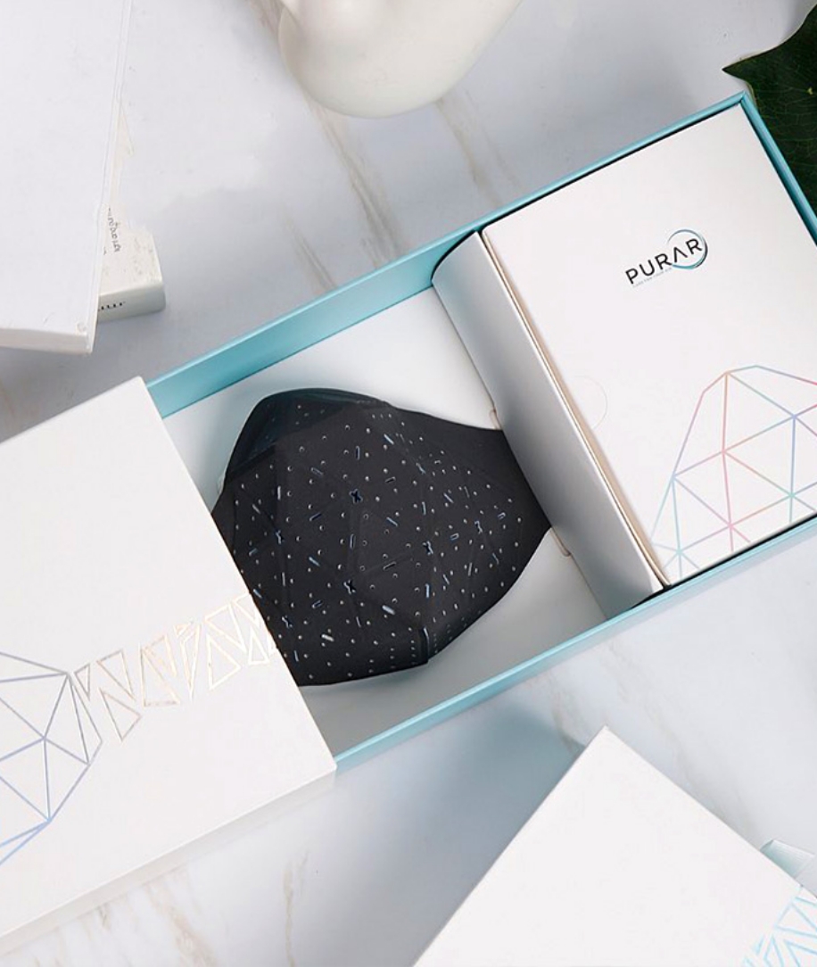

Metacake assisted the Purar team in developing a clear growth plan to reach specific goals through strategic coaching, campaign feedback, and data analysis.
Learn More

A Faster Horse is a documentary on the 50-year history of the Ford Mustang, including archival footage and interviews with designers, fans and collectors. It released in April of 2015. Metacake handled the ecommerce portion of the ticketing to the live event experiences in partnership with Vimeo at theaters across the country.
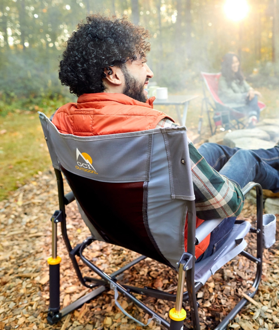

Metacake migrated the GCI Outdoor ecommerce store from Magento to Shopify Plus. During this process, we redesigned their store, and transferred all their data, products, and customer orders, while also refreshing their brand style, improving the customer journey and adding more engaging visual elements.
Learn More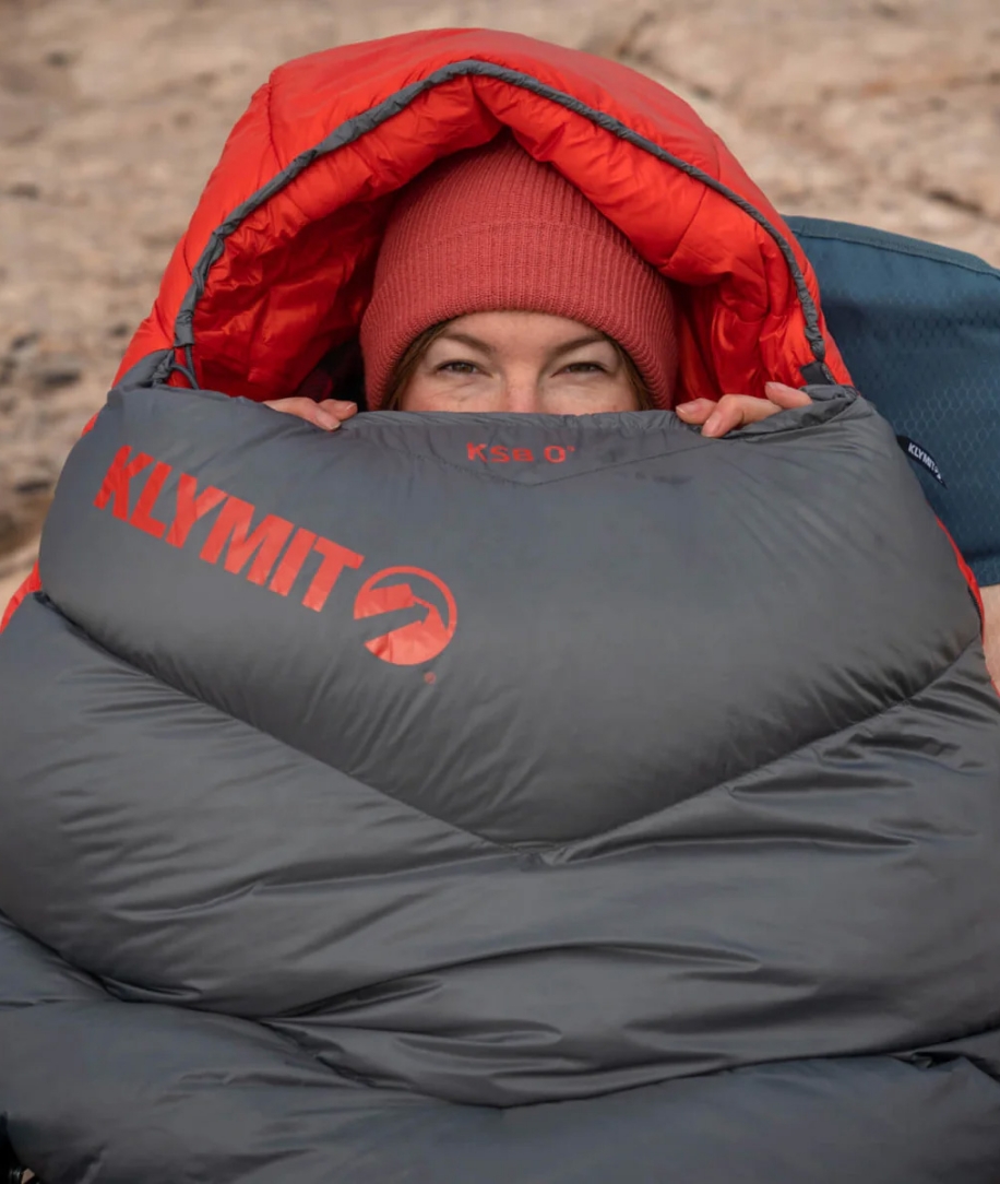

Klymit was already utilizing Shopify as their ecommerce platform, so the primary objective of this project was to revamp their online store with a new theme, a fresh design, and some new functionality. Our team assisted by upgrading them to an updated 2.0 theme and enhancing the overall customer journey.
Learn More

Metacake helped Violette Field Threads select an existing store theme on Shopify and made modifications to align the store’s consistency with their brand. We assisted with the setup of their store including products and handled the launch of the new store. We conducted a standard install of the store analytics to ensure we are able to measure the impact of traffic and any marketing activities moving forward to continue to help Violette Field Threads grow their business. Lastly, Metacake setup and configure a group of key 3rd apps that will help with sales growth.
Learn More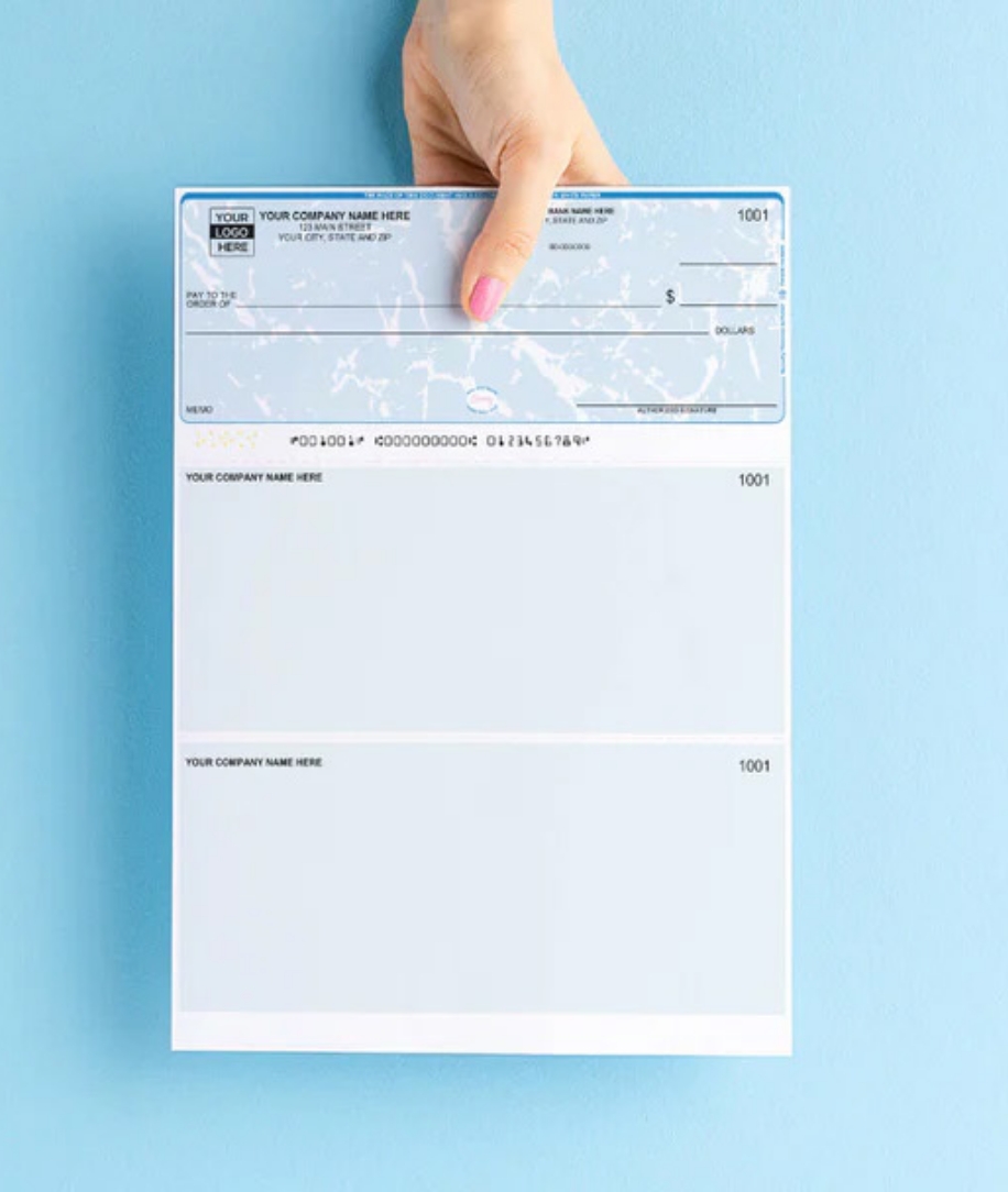

Metacake designed and launched Check Depot’s Shopify Plus store to enable the expansion and growth of its business. Store customizations were required for the personalization of check orders, product quantities, and reordering capabilities. When the new store was successfully up and running Metacake continued with ongoing store support and marketing services. Metacake provided management and optimization of Check Depot’s Google search ad campaigns and setup of the Klaviyo email marketing platform.
Learn More

Metacake collaborated with Southern Copper to launch their DTC ecommerce store on Shopify Plus. The platform provided Southern Copper with the opportunity to establish a DTC channel, catering to the growing number of end-customers shopping online. The new site was designed to allow customers to easily find and order a selection of Southern Copper’s products directly, facilitating the company’s online business expansion and growth.
Learn More

Metacake assisted Sense with store design, custom development, customer experience flow, store optimizations, B2B store development, and ecommerce strategy.
Learn More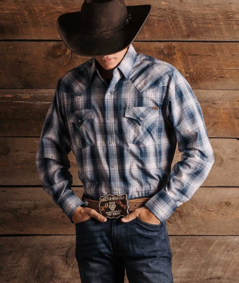

Ely Cattleman is a longstanding Westernwear brand sold in traditional retail. The primary goal of this project was to launch the Ely Cattleman brand on a modern and flexible ecommerce platform to give the business a baseline to develop and grow their DTC business. We built this store on the Shopify Plus platform as well as set up their B2B wholesale channel.
Learn More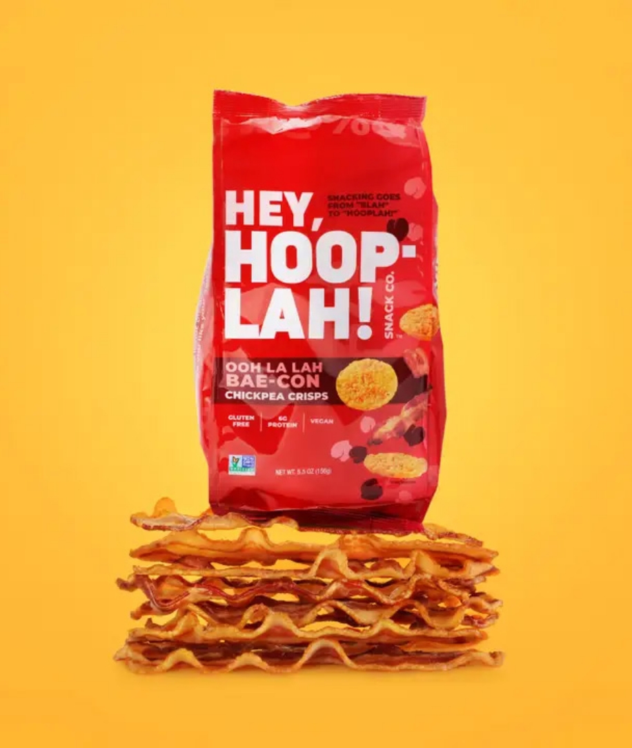

Metacake collaborated with HEY HOOPLAH to bring their new product to the market. We worked closely with the merchant’s team to design and launch their DTC ecommerce store and establish a strong brand identity. Our team built their online store from scratch, ensuring that every aspect of the customer journey was set up for success.


The team at Metacake collaborated with and directed the Weighting Comforts team to select an existing Shopify store theme and made limited modifications so the current store theme stayed consistent with Weighting Comforts brand. Metacake also assisted with the setup of Weighting Comforts ecommerce store including products as well as the launch of the new store.
Learn More

Metacake partnered with Gray Line Tennessee to elevate their Nashville presence, launching the Open Top Hop On Hop Off Nashville City Tour and revitalizing their brand. We refreshed their identity to reflect Music City’s vibrancy, redesigning and relaunching their website on a modern platform for a seamless, engaging user experience.
Learn More

Cookshack offers high-quality commercial and residential BBQ equipment. We migrated Cookshack onto the Shopify platform, focusing on designing a site primed to make shopping easy for commercial and residential customers alike.
Learn More

Freedom Company engaged in ecommerce strategy and growth coaching with Metacake. Our advising focused primarily on the optimization of their website and enhancement of their email growth initiatives. In addition, we also provided guidance on investment acquisition and business growth strategy.
Learn More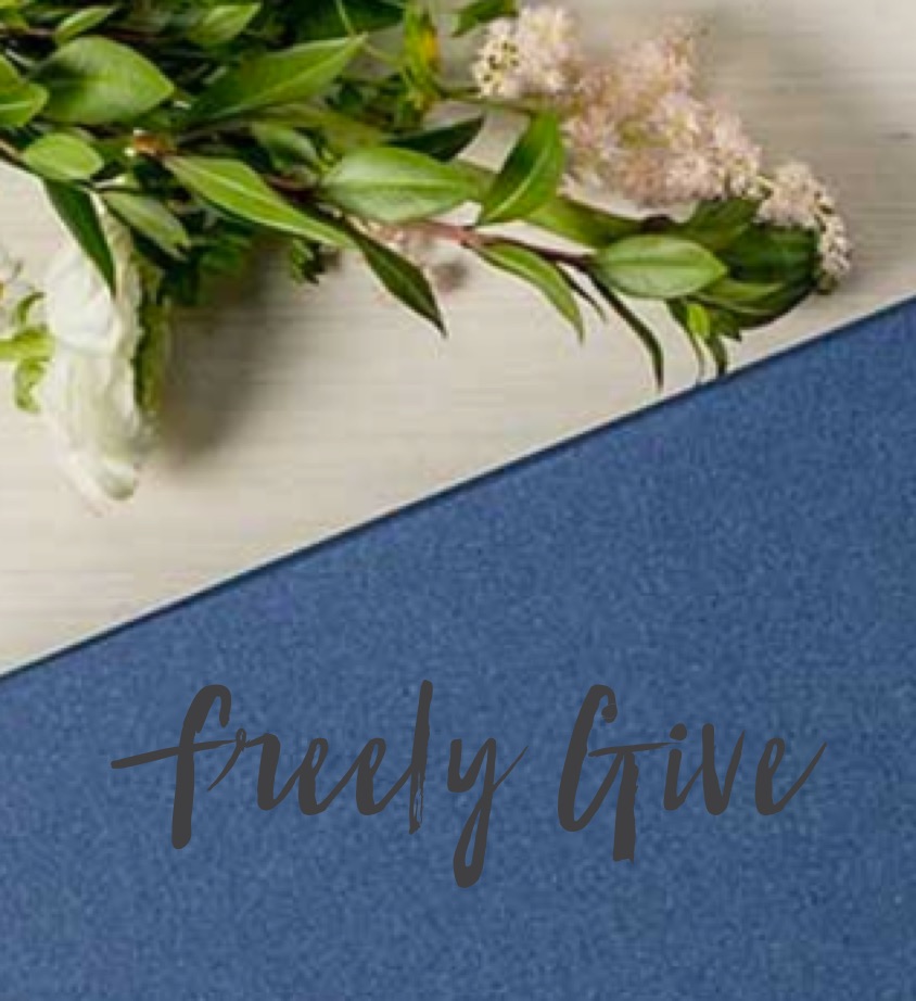

Freely Give curates beautiful and unique gift boxes that bring hope, encouragement and joy to families, friends, and loved ones. Metacake designed, developed, and launched a custom Shopify store for Freely Give, leaving them with a beautiful site enhancing customer experience and functionality.
Learn More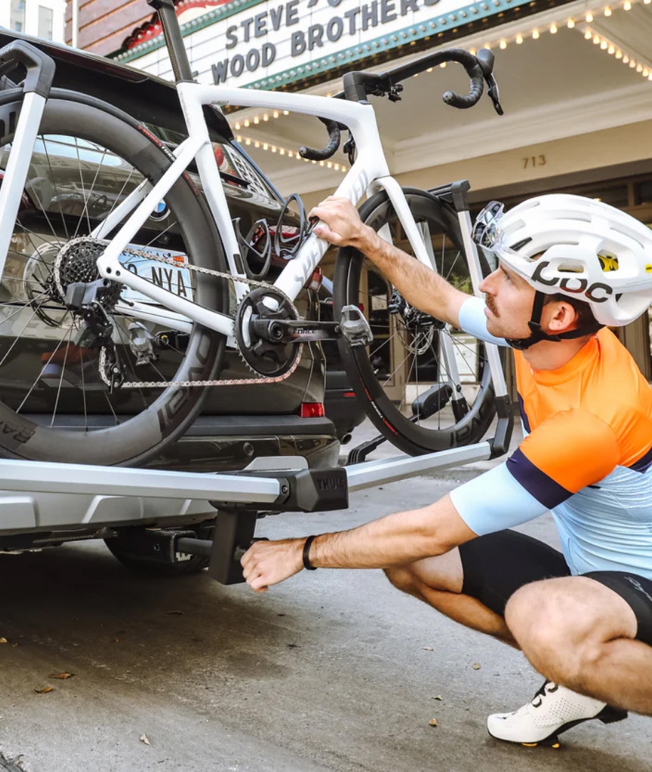

Metacake helped Stealth Hitches select an existing Shopify store theme and make modifications in order to keep the store consistent with Stealth Hitches’s brand. We also assisted with the setup of the online store including products, as well as handling the launch of the new store. Lastly, Metacake setup and configured third party apps that will help with sales growth and assisting the launch of the store into the marketplace.
Learn More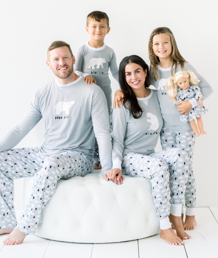

Metacake provided A&J Distributing, LLC / SleepyHeads.com with selected marketing services on a monthly basis including introducing new lines of pajamas to current and targeted new customers, create relevant and timely campaigns to keep the Sleepyheads sight top of mind throughout the year, sell the remainder of their inventory, and create and manage Facebook and Google ad campaigns.
Learn More

Metacake worked with Peggy Green, a Southern lifestyle brand, specializing in traditional children’s clothes, classic women’s pieces, custom keepsakes, and luxe accessories, to select an existing Shopify store theme and make limited modifications to make the store consistent with Peggy Green’s brand. We assisted with the setup of Peggy Green’s online store including products and will setup and configure a group of key third party apps. We will also handle the launch of their new store.
Learn More
Brilliantly Brave Parenting is a podcast, blog and resource site designed to empower parents of all stages and ages who are balancing meeting the demands of life while living responsibly as a family of Faith. Metacake set up a new WordPress site for and styled it remain consistent with the brand. We also imported all of the existing posts from their previous blog to the new website.
Learn More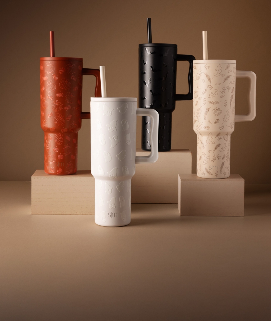

Simple Modern is a drinkware brand featuring premium vacuum insulated, powder coated tumblers and bottles that will keep your drink cold for up to 24 hours and hot for up to 8 hours. Simple Modern seeks to develop exceptional products and lasting relationships. Metacake relaunched their existing Shopify store on a new theme with brand and content customizations, a new university drinkware page as well as a greek drinkware page.
Learn More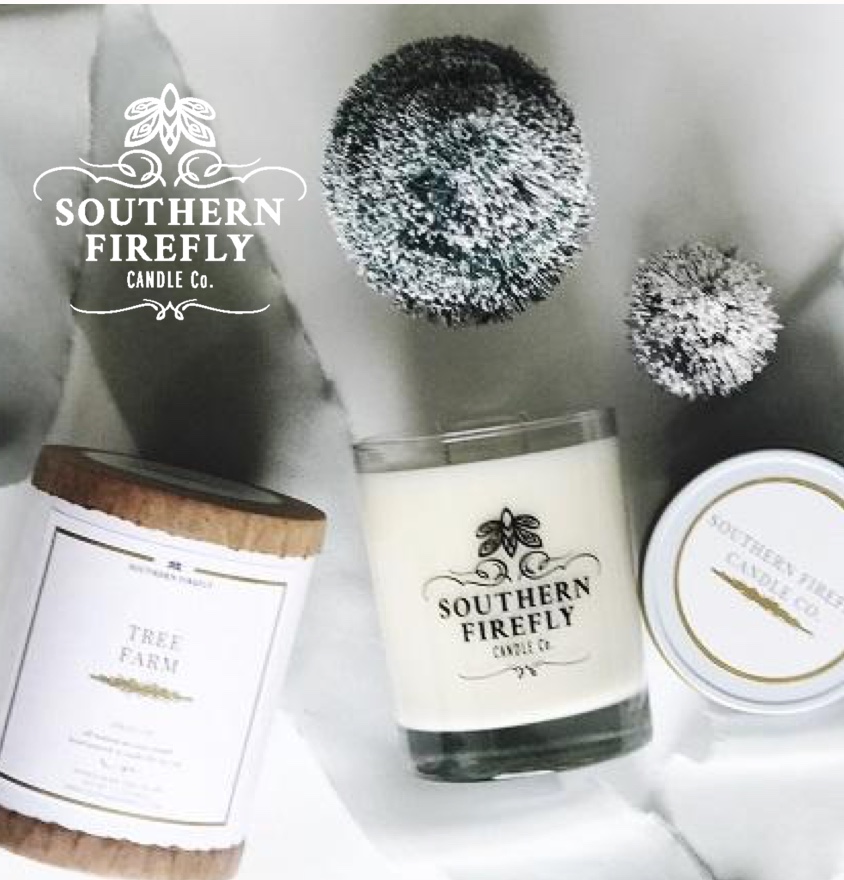
Southern Firefly Candle Co. is a luxury fragrance brand that creates the finest handmade products with an eco-friendly mindset. Metacake created a Shopify site for Southern Firefly, which included development and choosing a theme design.
Learn More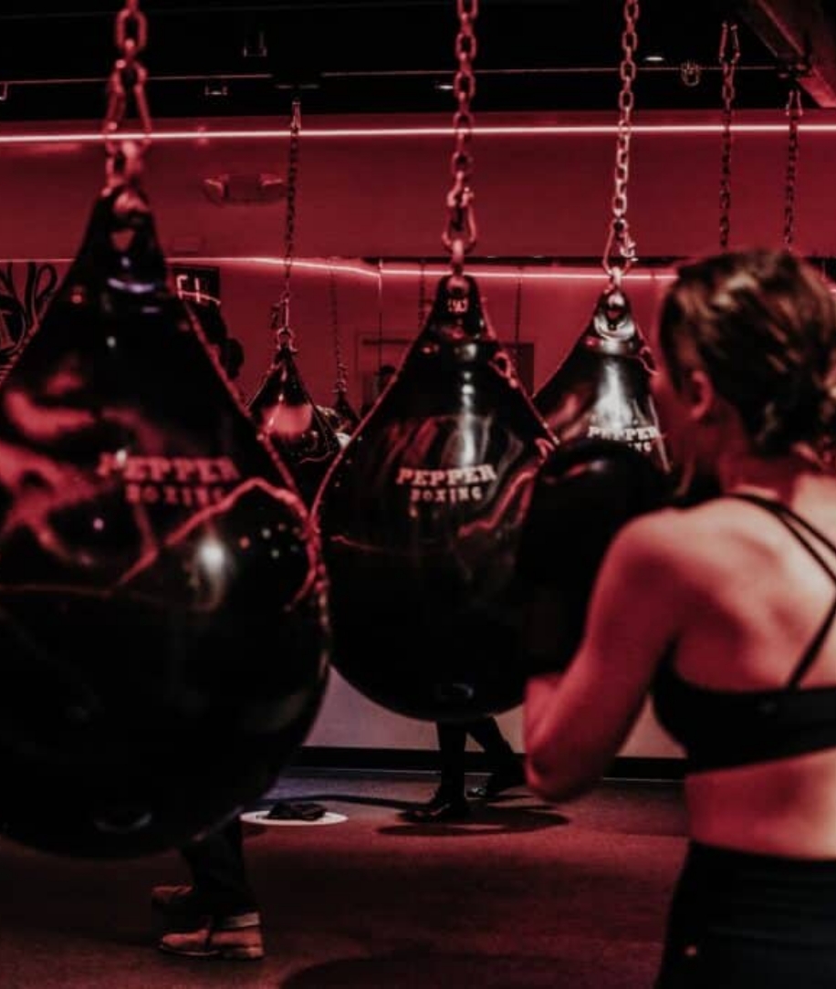

Metacake partnered with Pepper Boxing, a boxing fitness studio, to launch their business with a standout online presence. We designed and developed their website to showcase their unique, high-energy boxing workouts—featuring shadowboxing, heavy bag combos, and weighted exercises in a circular layout.
Learn More

Skillway is a small, boutique sales consulting firm based out of Nashville, Tennessee. They help their partners hit and exceed sales goals. President and Sales Coach, Dew, was looking to develop branding to fit their brand voice and style. Metacake worked with their team to understand and identify the core value proposition of the business and develop a distinct brand mark and style guide. The key elements of the style guide are logo anatomy and spacing, safety zone, brand typography, primary brand colors, and proper use of the logo.
Learn More

As a new brand, it was imperative that the design of Imayla Beauty would have strong cross-channel campaign integration, accessibility, flexibility, and ease of purchase at its core. With these goals, we built a new store for Imayla on the Shopify Plus platform. We created a high-quality ecommerce site experience for customers and enabled the expansion and growth of the business online.
Learn More

The team at Metacake created a WordPress website for Teasley, assisting in branding and messaging as well as site design, development and launch.
Learn More

Ginny Bea is a baby and women’s boutique located in Memphis, Tennessee. We selected an existing Shopify store theme and refreshed it to line up with Ginny Bea Boutique’s brand. We also assisted in the setup of the store including product, handled the launch of the new store, set up sales growth apps, and created initial marketing launch campaign.We assisted with the setup of Peggy Green’s online store including products and will setup and configure a group of key third party apps. We will also handle the launch of their new store.
Learn More

Metacake partnered with Sony Pictures to design and develop an engaging interactive website for the 2016 biblical drama “Risen,” starring Joseph Fiennes. Our team crafted a strategy to immerse users in the film’s unique perspective—a Roman soldier’s search for Jesus’ body post-resurrection—while driving ticket sales. We integrated captivating trailers and behind-the-scenes content to build excitement, alongside interactive features like Bible studies that tied into the film’s themes, appealing to faith-based audiences.
Learn More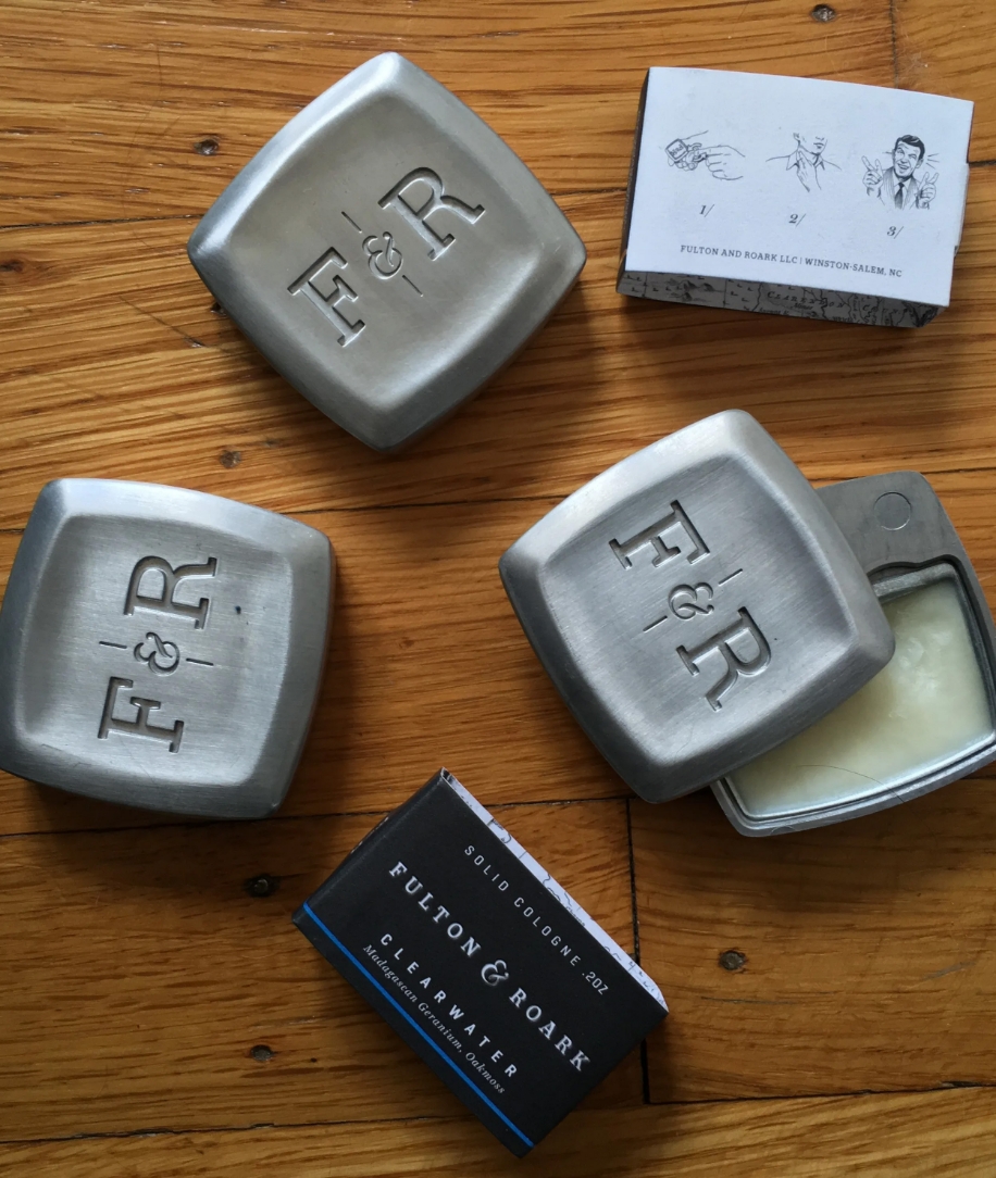

Metacake fine tuned some updates and development for Fulton & Roark's Shopify theme, leaving them with a squeaky clean and functional website. Along with the website development, Metacake also crafted and led a half-day photoshoot for the intended use of digital display advertising, social media, email campaigns, and print marketing materials. “Always extremely professional and super quick to jump on the project as well as finish it out. Great work all around!” – Fulton & Roark
View Site

Metacake transformed Southern Industrial Supply’s online presence by guiding them to the perfect Shopify store theme and customizing it to fit their brand. We made targeted design tweaks—adding branding, adjusting colors and fonts, and refining layouts for key pages like the homepage, product listings, product details, and standard content pages.
Learn More

Banded is a national headband and apparel company in Franklin, TN. Banded was primarily a B2B company that sold their products to big box retailers. They approached Metacake to design, build, and market a new B2C eCommerce store. After the new store was completed, we devised a marketing and optimization strategy over a long-term engagement to launch new product lines, drive new traffic and improve the customer experience, conversion rates, and average order value.
View Site

Vida Fuel has created a proprietary line of snacks that meet the nutritional needs of those with CKD and on dialysis, while tasting delicious. Metacake helped with their site design, store launch, and Facebook ads to improve their marketing and conversions.
Learn More

Metacake, an expert ecommerce and branding agency, collaborated with Randolph Business Resources to create a dynamic, integrated website that elevated their brand and attracted new clients. Our journey began with a strategic deep-dive into Randolph’s goals: showcasing their accounting expertise and appealing to small-to-medium businesses in Middle Tennessee. We crafted a strategy emphasizing clarity, trust, and scalability to reflect their mission of simplifying finances.
Learn More



Metacake helped BellaBlu by updating their ecommerce store experience to properly reflect their brand.
Learn More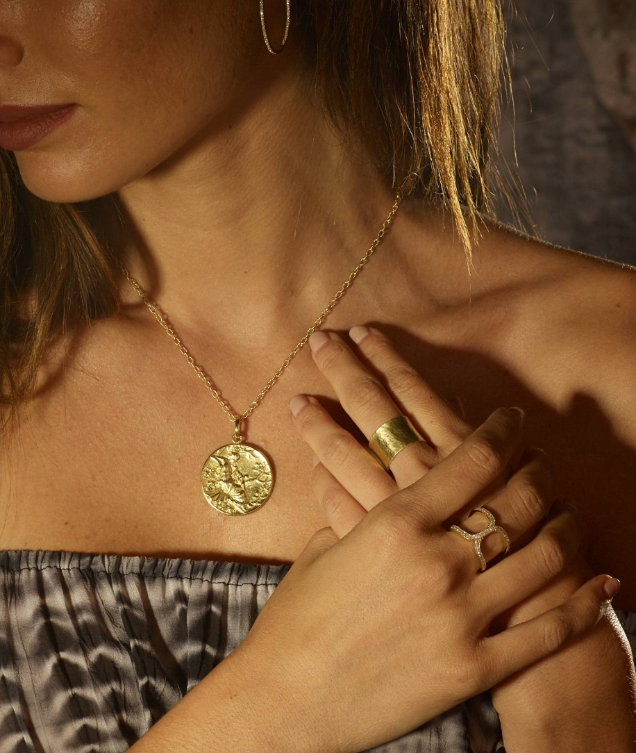

As a team, Metacake helped Anatra Jewel select an existing Shopify store theme and made design modifications to make the store consistent with Anatra Jewel’s brand. From there, we assisted with the setup of their store and handled the launch of the new store. After the store was completed, we launched an initial Facebook campaign to help project the store into the marketplace.
Learn More


Metacake partnered with Kraft Enterprise Systems (KES), a NetSuite Solution Provider, to enhance their market and service positioning and accelerate lead generation. We refined KES’s messaging to spotlight their NetSuite implementation and optimization expertise, targeting businesses scaling with ERP solutions. Our content strategy delivered compelling, SEO-optimized copy for their site and campaigns, establishing thought leadership and addressing client pain points.
Learn More


The government of Hawai’i’s film office approached the Metacake team as a trusted partner for rebranding and site design services for the Big Island’s film office. The site design encapsulates an easy-to-navigate, beautiful experience highlighting why filming on Hawai’i Island is the destination location for the most demanding film productions.
Learn More

Metacake partnered with Itta Bena, a sophisticated Southern dining gem above B.B. King’s Blues Club on Memphis’ Beale Street, to relaunch their brand and website. We dove into their unique identity—blending Delta-inspired cuisine with a speakeasy vibe—and crafted a refreshed brand that captured their charm and hospitality. Our team redesigned their website on a modern platform, enhancing its sleek, upscale feel with rich visuals and intuitive navigation.
Learn More

Kohanaiki boasts of real estate like no other. As the gateway to the most luxurious properties near Kailua-Kona, Hawaii, its agents facilitate a flawlessly tailored experience to their high end audience consisting of the world’s wealthiest and most famous. Thus Metacake was presented with the challenge of creating a luxury buying experience for their unique market of high profile individuals. We wanted to convey the experience of living on the island, with an enquiry as the end goal.
Learn More

The Metacake Marketing team devised a Facebook Business Advertising campaign strategy for Dury’s Camera. Through hyper-targeted Facebook audiences, we drove tens of thousands of website visitors that were qualified to Dury’s website. After testing several dozen ad variants, Dury’s saw significant sales increases immediately and is expanding their Facebook budget into other new verticals within their business.
Learn More

By SENS (Stores Energy Systems, LLC), MicroGenius 2 battery chargers combine the most advanced technology ever applied in their product class with SENS’ widely acknowledged expertise in designing and building the industry’s highest quality, most reliable products. We developed and launched several key marketing elements to support the launch of the new MicroGenius product, as well as designed and built microsite, data sheet, print ads, product photography, product videos and email template.
Learn More


Metacake has worked closely with Providence Auto Group (PAG) based in Franklin TN to develop a cutting-edge brand and auto sales website. PAG has a very distinct brand in the market loving their customers and the local community as well as their cars. PAG uses the vAuto platform inventory management platform and so Metacake designed and developed the website with a deep customized vAuto integration that complements their sales and merchandising process.


Metacake partnered with Quaker Books of Friends General Conference (FGC) to transform their online presence into a robust, integrated ecommerce store. Leveraging our expertise in strategy, design, and development, we crafted a tailored solution to meet Quaker Books’ mission of serving Quakers, meetings, and spiritual seekers.
Learn More
Metacake moved Above Par onto an improved commerce platform to setup the business for growth. We then assisted the client with selection of a Shopify store theme, made minor design modifications such as adding branding, changing colors/fonts, and tweaking layout for to up to 4 theme templates. We also designed the product template for the skirts and improved the gallery page experience by installing a Shopify app.

Metacake partnered with Lafayette’s Music Room in Memphis to launch a revitalized brand and website, breathing new life into the iconic venue. We kicked off with brand development, working with the LaFayette’s Team to craf an identity that honored its 1970s legacy—where legends like Billy Joel performed—while appealing to today’s crowd with Southern-inspired cuisine and live music seven nights a week.
Learn More
Metacake worked along side the client team to create Pique, a trailblazing media brand to connect movie studios with influential audiences. We developed Pique’s brand from the ground up, crafting a bold identity that emphasized curated screenings and social influence. Our team designed a sleek, memorable logo and cohesive brand style, reflecting Pique’s innovative edge.
Learn More
When approached with the Thoughtronix vision, at first it seemed an impossible task: to build an intelligent platform that would interact with users based on their individual preferences while analyzing and learning their behaviors to serve them better and provide deep analytics back to Thoughtronix clients for marketing and product development purposes. Piece of cake, right? Yeah…we didn’t think so either. Not to mention that the platform had to be built to scale up to 500 million users.
Learn More


Metacake teamed up with Aspiration Media to design and develop an interactive movie site for the 2014 biographical drama “Noble,” starring Deirdre O’Kane as Christina Noble. Our goal was to capture the film’s inspiring story and drive ticket sales. We crafted a visually compelling site featuring trailers that showcased Christina’s journey from hardship to heroism, paired with interactive content like timelines and character insights to deepen audience engagement. A key feature was the #sheisnoble campaign, integrated into the site with shareable graphics and calls-to-action, encouraging fans to spread the word on social media.
Learn More
Metacake set out to make it possible for high end real estate clients to be able to not only integrate property data into their sites and mobile platforms, but do so in a way that is both beautiful and usable without limitations on design, functionality, or reporting and analytics.
Learn More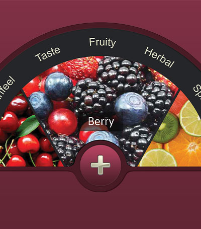
Wine with Friends wanted to create an app that demystified wine culture, making it more accessible to the current generation. We wanted to reinvent how people think and talk about wine…
Learn More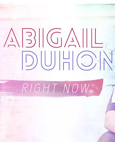
Abigail came to Metacake with the need to rebrand herself as a relevant teen artist and help develop her presence, both online and off. Once we had solidified her brand, we got to work on launching her brand and new album online and in stores. This involved designing her album art, designing and developing her new website on WordPress, writing marketing copy and creating a retail one sheet for Right Now, and designing apparel for her upcoming tour.
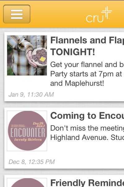
Goba Engage recognized a need for entities across the board to connect and engage with their audiences via a mobile platform. From large corporations to local nonprofits and startups, most companies feel the need to develop a mobile presence. However, the amount of time and money that goes in to developing a proprietary mobile app from scratch is often too much to undertake. Gobe Engage set out to develop a platform that would allow an entity to be up and running with their own branded mobile app in just 15 minutes.
Learn More

Metacake created a quick and engaging psychological quiz that determines your wine personality type. This quiz is both highly scientific and incredibly fun. Based on your answers to a few behavioral questions, it determines, with extreme accuracy, what type of friend you are. Are you the tipsy friend? The bubbly friend? Or are you one of the snobby, pushy, or bold friends? Want to find out your wine-friend type?
Learn More

G2 Wireless came to Metacake to redesign their online brand presence and organize their content to present clear and relevant information to both current clients as well as potential future clients. This involved a complete website redesign and rebuild using WordPress, setting up a custom accessories store on Shopify, and designing their self serve help desk platform that allows clients to have access to the most up to date information on any device issues or questions they might have.
Learn MoreSubscribe for FREE ecommerce growth tips from the experts, sent straight to your inbox.